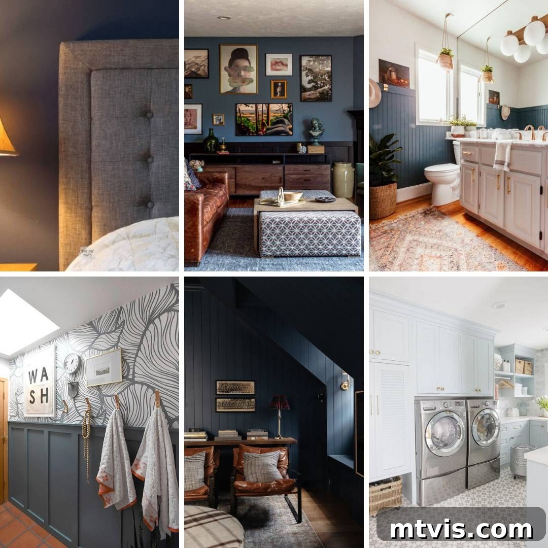
Blue has long held its prestigious position as a classic and universally cherished color, consistently ranking among the most popular choices in paint palettes. When this timeless hue is expertly blended with the subtle sophistication of gray, the result is a beautifully balanced and incredibly versatile spectrum of colors. A blue-gray paint shade can effortlessly transform any room into a serene sanctuary, serving as the perfect neutral backdrop that exudes both calm and character. Much like your favorite pair of blue jeans, which seamlessly pairs with almost any outfit, a well-chosen blue-gray paint color offers unparalleled adaptability in home decor. However, for those who, like myself, possess a deep appreciation for color, blue-gray provides a far more intriguing and dynamic neutral option than conventional beige or stark white, allowing for a space that feels both grounded and distinctively stylish.
Despite its inherent versatility, selecting the ideal blue-gray paint color for your walls can be a nuanced process. The interplay of light, existing furnishings, and even geographical location can dramatically alter how these complex hues appear. To help you navigate this exciting journey and pinpoint the perfect shade that resonates with your home’s unique personality, we’ve curated a list of popular and designer-favorite blue-gray options, accompanied by insights into their unique characteristics and best applications.
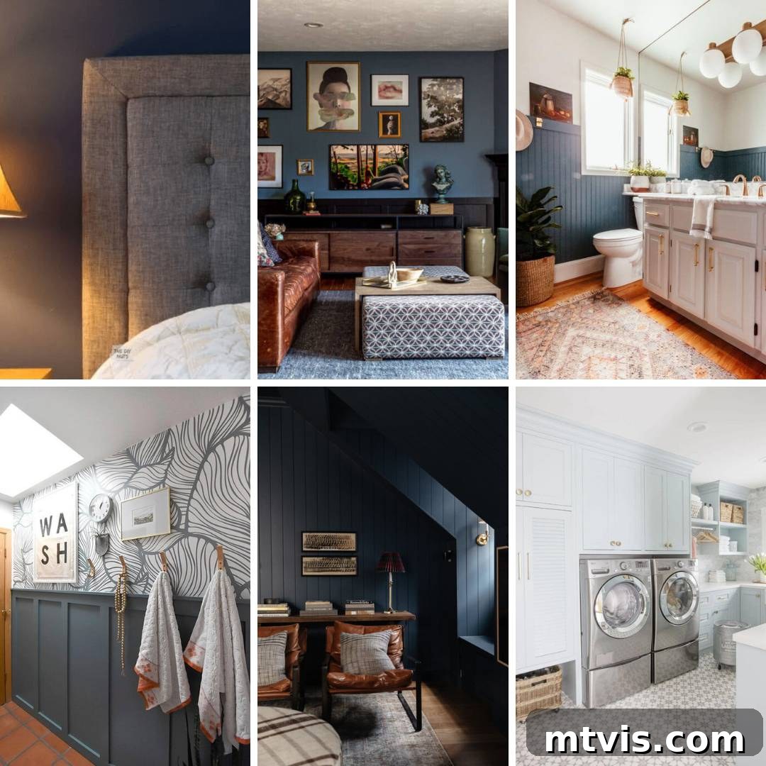
Table of Contents
Understanding Blue-Gray Paint Colors: A Versatile Neutral
At its core, a blue-gray paint color is precisely what its name implies: a hue that marries the calming essence of blue with the grounding neutrality of gray. The magic, however, lies in the infinite variations of this combination. Depending on the specific ratios and undertones, some blue-gray colors will lean more heavily towards gray, offering a subtle hint of color, while others will present as a distinctly blue shade softened by gray. This fascinating spectrum makes blue-gray incredibly dynamic. Its complexity means that factors like natural daylight, artificial lighting, and even the colors of adjacent furnishings can significantly influence its appearance, shifting from a cool, crisp blue to a warm, inviting gray in different settings.
Understanding Light Reflectance Value (LRV) is key when exploring these shades. LRV measures the percentage of light a color reflects. A higher LRV (closer to 100%) indicates a brighter color that reflects more light, making a room feel larger and more open. A lower LRV (closer to 0%) signifies a darker color that absorbs more light, creating a cozier, more intimate atmosphere. Most blue-gray paints fall in the middle to low range, offering varied levels of depth and mood. For anyone considering blue as a primary color in their home, a blue-gray offers a sophisticated and often more livable alternative to pure blue. If you’re exploring beyond blue-gray, I encourage you to delve into my comprehensive guide on beautiful blue paint colors that designers love and use, which covers a much broader array of blue tones.
Transforming Your Home: Ideal Spaces for Blue-Gray Paint
The beauty of blue-gray lies in its exceptional versatility; it truly can be used anywhere! While I have a deep affection for crisp white walls, such as Pure White by Sherwin-Williams, blue-gray offers a compelling and equally neutral alternative to popular choices like greige or standard white. Imagine the ever-changing beauty of a stormy sky—it’s a perfect, dynamic neutral backdrop that brings a sense of tranquility and depth to any space. This makes blue-gray an excellent choice for virtually any room in your home.
In a **bedroom**, blue-gray creates a calming and restful retreat, promoting relaxation and sleep. For a **living room** or **family room**, it provides a sophisticated and inviting ambiance, perfect for gathering and unwinding. In a **kitchen** or **bathroom**, these shades can evoke a fresh, clean, and spa-like feel, especially when paired with white cabinetry or fixtures. Even in a **home office** or **nursery**, blue-gray can foster concentration and serenity. Its ability to complement a wide range of decor styles—from modern farmhouse to coastal, traditional to contemporary—ensures that a blue-gray palette will enhance your home’s aesthetic for years to come. Consider its interplay with natural wood tones, brushed metallics, or vibrant accent colors; blue-gray seamlessly anchors diverse design elements.
Choosing Your Perfect Shade: The Best Blue-Gray Paint Colors Reviewed
Defining the “best” blue-gray paint color is inherently subjective, as personal taste, existing decor, and the unique lighting conditions of your home play a monumental role. That said, I am delighted to share a curated selection of my absolute favorites, colors that have proven themselves time and again in diverse settings and client projects.
However, before you fall in love with any of these beautiful blue paint colors, I implore you to review How to Choose Paint Colors for Your Home: 6 Simple Tips to Follow. This guide underscores one of the most crucial steps in paint selection: the absolute necessity of TESTING every single color you are considering directly within your own home! Paint swatches can look entirely different on a small card in a store versus a large wall in your specific lighting. Observe the color on various walls throughout the day, noting how it changes with natural sunlight and artificial light sources. For an incredibly easy and mess-free way to test, I highly recommend my favorite peel-and-stick paint samples from Samplize. Alternatively, purchasing small sample pots and painting large swatches directly on your walls is also effective. In the long run, this simple step will spare you immense heartache, stress, and wasted money. Learn from my own past mistakes—I once rushed into buying paint without proper testing and ended up repainting my kitchen three times! A stunning designer photo doesn’t guarantee the same effect in your house with your furniture, your unique lighting, and your personal style. Always try before you buy!
Benjamin Moore Water’s Edge (1635) LRV 31.48: Coastal Serenity
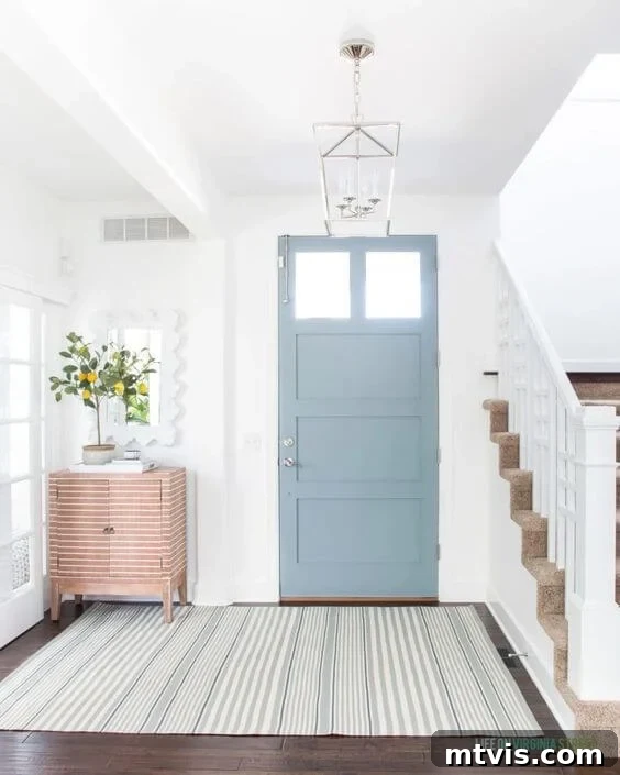
Stepping into this foyer feels like a breath of fresh, coastal air. The front door, painted in Benjamin Moore Water’s Edge, introduces a delightful pop of color that remains beautifully neutral and inviting. This particular shade masterfully balances its blue and gray components; the significant gray presence ensures the blue never feels overpowering or childish, instead creating a sophisticated and calming impression. With an LRV of 31.48, Water’s Edge offers a medium depth that reflects a comfortable amount of light without washing out. It’s a perfect choice not just for a statement front door, but would also create a stunningly serene atmosphere on bedroom walls, evoking a sense of peaceful retreat. Alternatively, consider it for kitchen cabinetry, where it would lend a bespoke, upscale feel, especially when paired with brushed brass hardware or crisp white countertops. This color shines in spaces seeking a touch of tranquility with understated elegance.
Behr Adirondack Blue (N480-5) LRV 23: Farmhouse Elegance
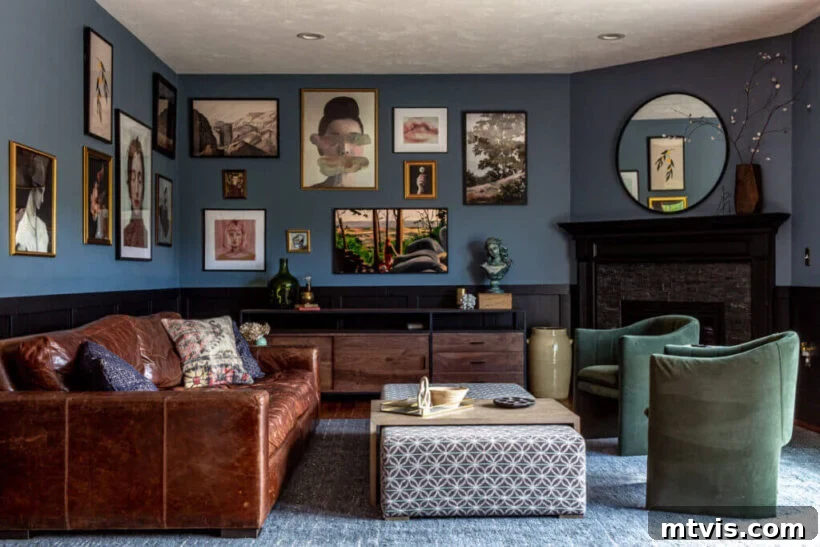
While some grayish-blue tones can lean into a charming farmhouse aesthetic, Behr’s Adirondack Blue elevates this perception to new heights. In this family room, the color feels incredibly sophisticated and refined, particularly when paired with striking black wainscoting. Brianna’s masterful use of this hue, combined with an artfully arranged gallery wall and carefully selected modern decor, achieves a seamless modern traditional design. With an LRV of 23, Adirondack Blue is a relatively deep color that brings significant visual weight and richness to a space without overwhelming it. Its depth creates a cozy envelope, making it perfect for living areas where comfort and style are paramount. This shade is particularly effective in rooms with ample natural light, where its blue undertones can truly shine, while in dimmer settings, its gray characteristics will become more prominent, creating a softer, more muted appearance. It’s a fantastic choice for those looking to infuse a classic, refined blue into their home, offering both character and a timeless appeal.
Sherwin-Williams Waterloo (SW 9141) LRV 13: Crisp & Inviting
Sherwin-William’s Waterloo is a beautifully nuanced blue-gray that offers remarkable clarity and crispness. Its prominent gray undertones ensure it feels grounded and sophisticated, avoiding any sense of being overtly bright or saccharine. This shade achieves a wonderful balance, providing a desired depth of color without becoming excessively rich or heavy, making it an excellent choice for creating an inviting yet refined atmosphere. With an LRV of 13, Waterloo is on the darker side of the spectrum, suggesting it will absorb a fair amount of light and create a cozy, enveloped feeling. It pairs exquisitely with natural wood elements, which introduce warmth and texture, and pristine whites, which enhance its crisp qualities and provide striking contrast. Consider this color for a dining room where it can set an elegant mood, or in a cozy reading nook where its depth can foster a sense of calm and introspection. Waterloo is ideal for those seeking a profound blue that still maintains a refreshing, clean aesthetic, making it a versatile contender for various residential spaces.
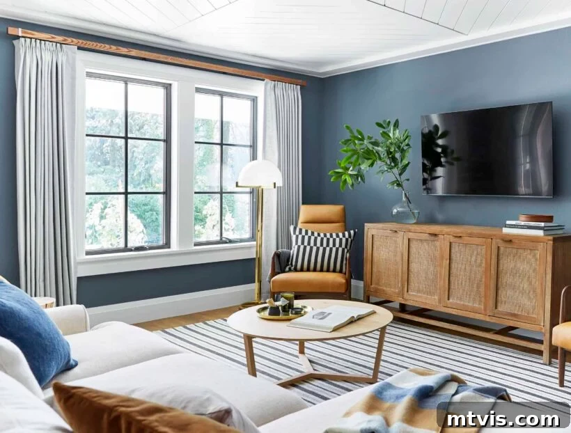
Benjamin Moore Philipsburg Blue (HC-159) LRV 19: Deep & Soothing
This particular blue-gray paint color holds a special place in my heart, so much so that we’ve incorporated it into two of our homes, a testament to its enduring appeal and adaptability. Benjamin Moore’s Philipsburg Blue is, in my opinion, an absolutely underrated and under-utilized gem in the paint world. We cherished its presence in the family room of our old home, where it enveloped the space in an atmosphere that was simultaneously moody and profoundly soothing. With an LRV of 19, this color strikes a perfect balance, providing a significant depth that feels intimate without being oppressive. Its complex undertones allow it to shift subtly between a rich blue and a deep gray depending on the light, creating an ever-evolving visual interest. Philipsburg Blue is ideal for spaces where you desire a sense of calm and sophisticated drama, such as a master bedroom, a cozy den, or a formal dining room. It pairs beautifully with both light and dark wood finishes, adding gravitas to traditional decor while also complementing more contemporary, minimalist styles. Its ability to create such a layered and comforting environment makes it a consistently reliable choice for those seeking a blue-gray that offers genuine character and warmth.
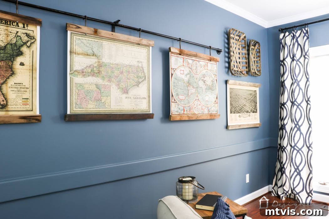
Benjamin Moore Smoke (2122-40) LRV 56: Airy & Sophisticated
Jillian courageously embraced Benjamin Moore’s Smoke, painting all the cabinetry in this laundry room, and the gamble undeniably paid off. This shade is a breathtakingly pale blue, infused with just the right touch of cool gray, making it an exquisite and sophisticated choice. With a relatively high LRV of 56, Smoke is a highly reflective color that will make any space feel bright, expansive, and airy. It offers a wonderful neutral alternative to traditional white, providing a hint of subtle color without sacrificing luminosity or feeling overwhelming. The serene quality of Smoke perfectly complements the brass pulls and the intricate, gorgeous tilework in the laundry room, confirming her excellent design decision. This color is ideal for smaller spaces that you want to lighten and brighten, such as bathrooms, entryways, or even ceilings, where it can mimic the softness of a clear sky. It’s also superb for cabinetry, adding a soft, custom touch that feels both fresh and timeless, proving that a delicate touch of color can make a monumental impact.
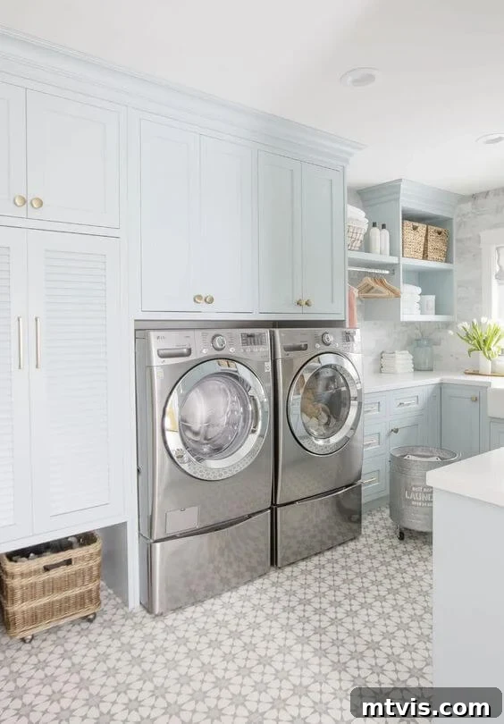
Behr Ink Black (N490-7) LRV 7: Dramatic Depths
If you’re searching for a dramatically moody, deeply captivating blue that is gently softened by a subtle hint of gray, then Behr’s Ink Black is the quintessential choice. Despite its misleading name, this color is undeniably a profound dark blue, not black, and it performs beautifully in creating a rich, enveloping atmosphere. With a very low LRV of 7, Ink Black absorbs a significant amount of light, making a room feel exceptionally cozy, intimate, and luxurious. Amanda masterfully utilized this shade in her bedroom to cultivate a profoundly calming vibe, perfectly setting the stage for restful sleep and deep relaxation. This deep blue-gray is superb for accent walls, bedrooms, or dining rooms where you desire to create an air of sophisticated drama and warmth. Its depth allows it to pair strikingly with metallic accents, rich textures, and lighter contrasting elements, ensuring the space feels curated and inviting rather than simply dark. Ink Black is a testament to how bold color choices can truly transform the mood and character of a room, offering an experience rather than just a backdrop.
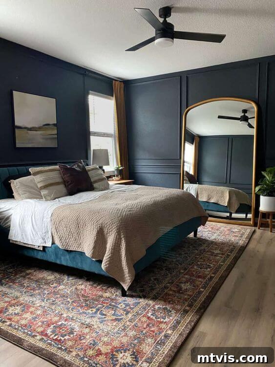
Sherwin-Williams Indigo Batik (SW 7602) LRV 8: Muted Navy Charm
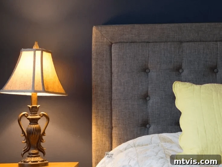
Sherwin-Williams’ Indigo Batik offers a magnificent bridge between a true navy and a softer, more muted blue. It presents as a lighter, more approachable navy, making it an excellent go-to option if you’re drawn to dark blue walls but feel hesitant to commit to an extremely profound shade. With an LRV of 8, it still provides substantial depth and contrast, yet it doesn’t carry the same dramatic intensity as some of its darker counterparts, allowing it to feel both rich and comfortable. Its subtle gray undertones are beautifully evident, softening the indigo and giving it a refined, lived-in quality. I particularly admire how gracefully it pairs with the upholstered gray headboard in this example, creating a cohesive and tranquil bedroom environment. Indigo Batik excels in spaces where you want to infuse a sense of depth and luxury without overwhelming the room. It works wonderfully in bedrooms, dining rooms, or even as an accent color on built-ins. This color is perfect for those who desire a sophisticated blue that feels both inviting and impactful, offering a timeless appeal that can anchor various decor styles with grace and understated elegance.
Farrow and Ball Stiffkey Blue (281) LRV 10: Bold & Moody
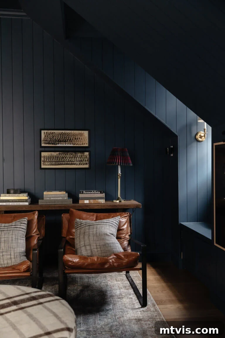
Farrow and Ball’s Stiffkey Blue is a masterclass in profound depth and moody sophistication, delivering drama in all the most desirable ways. Chris Loves Julia embraced this rich navy with remarkable courage, painting every single inch of their bonus room—walls, trim, and even the ceiling—in this immersive hue. This daring design choice, with an LRV of 10, creates an enveloping and intimate atmosphere, as the color absorbs a significant amount of light. Far from feeling overwhelming, this monolithic application actually highlights the room’s architectural features, drawing attention to the paneling, dormers, and window nooks. The inherent grayness in Stiffkey Blue prevents it from feeling stark or cold, instead infusing it with a soft, timeless quality. This shade is perfect for spaces where you want to make a bold statement, cultivate a sense of retreat, or emphasize architectural details. It harmonizes beautifully with natural textures like leather and wood, and pops against metallic accents. This audacious decision to embrace rich blues with neutrals elsewhere truly paid off, demonstrating the transformative power of a confident color choice in creating a truly unique and memorable interior.
Sherwin-Williams Smoky Blue (SW 7604) LRV 15: Teal Infusion
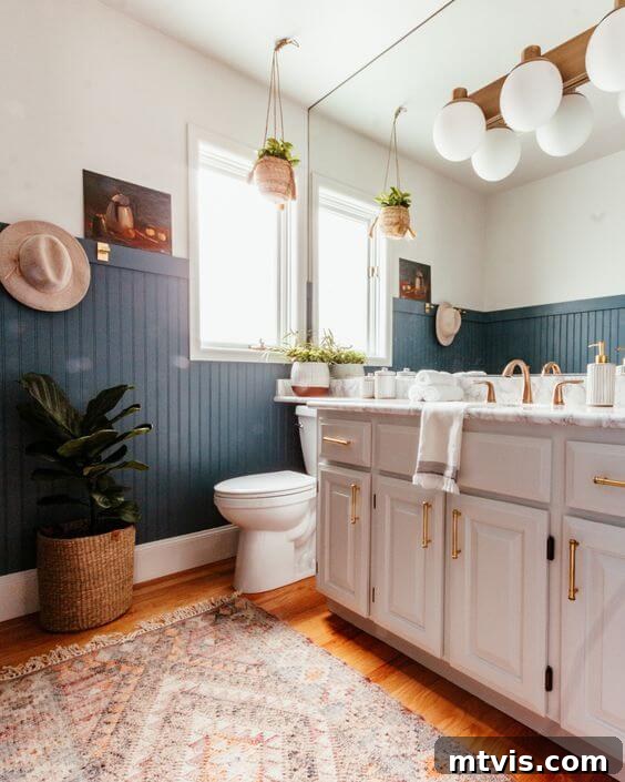
Venturing into the captivating realm where blue meets green, Sherwin-Williams’ Smoky Blue offers a unique twist on the traditional blue-gray. This moody hue presents almost as a dark teal, distinguished by its discernible smoky green undertone. With an LRV of 15, Smoky Blue is a deeply saturated color that will create a dramatic and enveloping effect in any space. It’s an excellent choice for those looking to introduce a sophisticated pop of color that feels both natural and slightly unexpected. In this bathroom, Smoky Blue creates a perfect, striking backdrop for crisp whites and other neutrals, allowing them to truly pop and feel refreshed. The color’s inherent complexity means it can read more blue or more green depending on the surrounding light, adding dynamic interest to the room. It’s particularly well-suited for bathrooms, powder rooms, or accent walls, where its dramatic flair can be fully appreciated. Consider pairing it with brushed gold fixtures for an opulent feel, or with natural wood and woven textures for a more organic, spa-like ambiance. Smoky Blue is for the adventurer in design, offering a rich, jewel-toned depth that is both captivating and refined.
Behr Dragonfly (PPU12-03) LRV 26: Earthy Teal Vibrance
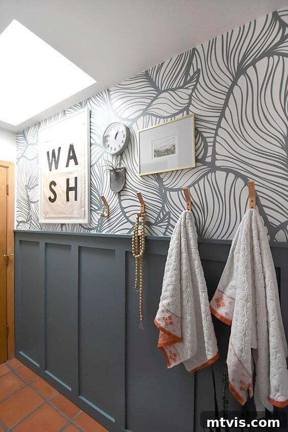
Continuing the journey into blue-greens, Behr’s Dragonfly is a captivating teal that was a popular trending color in 2020 and continues to enchant designers. This shade beautifully complemented Amy’s existing wallpaper, demonstrating its remarkable ability to integrate with diverse design elements. With an LRV of 26, Dragonfly offers a medium-dark depth that provides a soothing yet vibrant presence, reflecting a moderate amount of light to keep spaces feeling lively without being overly bright. It possesses an inviting boho and earthy vibe, which worked seamlessly with the terracotta color of her tile, a fixed element that needed to be accommodated. Dragonfly is perfect for creating an accent wall, adding personality to a bathroom, or even painting furniture for a unique, custom look. Its green undertones are more pronounced than in Smoky Blue, lending it a distinctly organic and refreshing quality. This color is a fantastic choice for those who love blue and green but want a sophisticated, muted version that avoids being too bold or childlike. It pairs well with natural materials, light woods, and crisp whites, and can be easily dressed up with metallic accents or kept casual with bohemian textures. Dragonfly brings an invigorating sense of nature indoors, making any space feel more vibrant and alive.
I sincerely hope this comprehensive guide and the inspiring images of these beautiful blue-gray paint colors have empowered you in your quest to find the perfect shade for your home. Remember, the right paint color can profoundly impact the mood and aesthetic of a space. If blue-gray paint colors, with their subtle complexities, don’t quite capture your vision, perhaps a bolder but equally versatile option might. Do explore our curated selection of navy blue paint colors that designers adore; these deep, rich hues can also serve as stunning, sophisticated neutrals in your interior design, offering a different kind of drama and elegance.
Explore More Paint Inspiration
SEE ALL PAINT POSTS
-
The Best Neutral Paint Colors for Kitchen Cabinets
-
Benjamin Moore Swiss Coffee: Is it Right For You?
-
Samplize Peel & Stick Paint Samples: An Unbiased Review
-
Sherwin Williams Pure White SW7005 Paint Review With Pictures
-
Navy Blue Paint Colors Designers Love
-
Beautiful Blue Paint Colors Designers Love & Use
Additional Home Decor and Paint Resources
- How to Choose Paint Colors for Your Home: 6 Simple Tips to Follow
- How to Match a Paint Color That’s Already On a Wall
- A Paint Sheen Guide & Reference Chart
Curious about my personal approach to transforming rooms and spaces within our home, from conceptualization to execution? Discover the streamlined and effective strategies I employ by checking out Designer in a Binder®. It’s an affordable and simple way to bring professional design principles into your own home, empowering you to create spaces you truly love.
And for those eager to receive exclusive content, behind-the-scenes glimpses, and the latest design inspiration delivered directly to your inbox, be sure to subscribe before you depart! Your journey to a beautifully designed home begins here.