For many homeowners, the quest for the perfect white paint can feel like a daunting journey. With an endless spectrum of shades and complex undertones, choosing the wrong white can transform a room from inviting to sterile. This is where Sherwin-Williams Pure White SW7005 emerges as a shining contender. Renowned for its beautiful, neutral character, Pure White is an exceptional choice for those desiring crisp white walls, trim, or ceilings that feel bright and airy without being cold or stark. Join us as we dive deep into Sherwin-Williams Pure White SW7005 to determine if it’s the ideal white paint for your living space.
In this comprehensive guide, we’ll explore every facet of Sherwin-Williams Pure White. We’ll examine its Light Reflectance Value (LRV), uncover its subtle undertones, analyze how it performs in various lighting conditions, and provide detailed comparisons with other highly sought-after white paint colors. Our goal is to equip you with all the insights needed to confidently select the perfect shade for your home.

Table of Contents
How I Fell in Love with Pure White
For years, I’ve advocated for white interior walls, recognizing their transformative power. White provides an unparalleled backdrop that allows colorful artwork, textiles, and decor to truly pop, creating a gallery-like effect within your home. My journey to embracing white began in our previous home, where I witnessed firsthand how a clean, neutral canvas elevated our vibrant furnishings.
When we embarked on moving into our new house, the decision to paint all interior walls white before moving in was an easy one. Choosing paint colors for an empty house can be overwhelming, and starting with a cohesive white palette offered a fresh, versatile foundation. While I anticipated eventually introducing pops of color in a room or two, white felt like the safest and most strategic starting point for every single space.
However, the crucial question remained: “Which white?” Our selection process was uniquely challenging because we wanted to complement the existing trim color, Sherwin-Williams Divine White. Interestingly, Divine White isn’t a true white; it leans more towards a subtle beige. This meant we needed a wall color that would subtly contrast and highlight the trim, rather than blend seamlessly with it.
Embracing non-white interior trim colors is a popular trend right now, and I was eager to try it for two main reasons: firstly, I find it incredibly beautiful and sophisticated, and secondly, it offered a significant cost saving by avoiding the laborious task of repainting all the existing trim and doors.
To make the best decision, we meticulously sampled several white paints against our Divine White trim. After careful consideration, our choices narrowed down to Sherwin-Williams Alabaster and Sherwin-Williams Pure White. While I initially leaned towards Alabaster, Pure White ultimately emerged as the clear winner. Its ability to create a harmonious yet contrasting effect with our trim was undeniable. We’ve been absolutely thrilled with our choice, and I’m excited to share more about this nearly-perfect white wall color with you.
Is Sherwin-Williams Pure White the Perfect Neutral?
Sherwin-Williams Pure White holds the distinction of being the brand’s most popular white, and for excellent reason. For those familiar with my review of Sherwin-Williams Alabaster, my choice of Pure White for our current home might come as a surprise. I confess, I was surprised myself! I had repeatedly told my husband that Alabaster felt like the obvious best choice. However, once we sampled Alabaster and Pure White directly against our existing trim color, Alabaster appeared unexpectedly yellow. It was at that moment I truly understood the unique brilliance of Pure White. It’s slightly cooler than Alabaster, delivering a crisp white that remarkably still feels soft and undeniably inviting.
One of Pure White’s most appealing attributes is its lack of obvious undertones – a topic we’ll explore in greater detail shortly. Despite this neutrality, it retains a creamy, soft quality that prevents it from feeling stark or cold. While it’s generally categorized as a warm white, I personally don’t detect any prominent yellow undertones, which can sometimes be visible in Alabaster. This subtle balance makes Pure White incredibly adaptable, harmonizing beautifully with a wide array of existing finishes and decor styles.
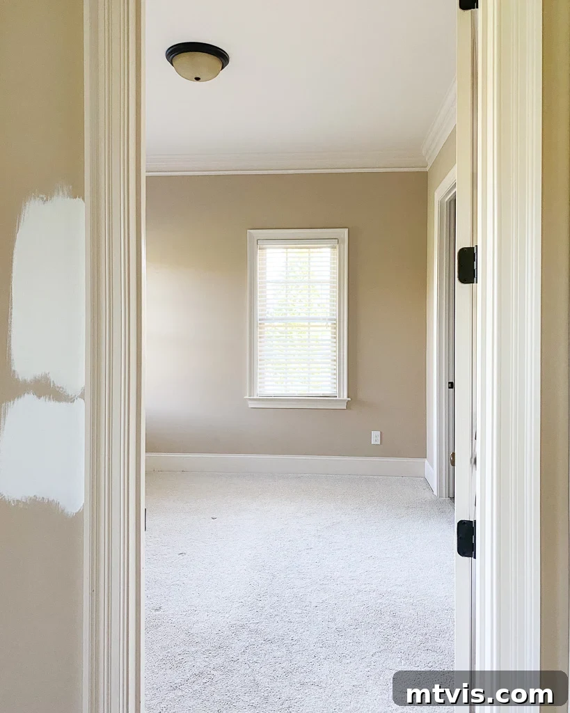
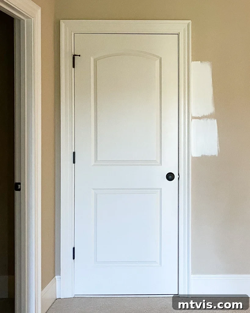
Observe the comparison photos below, featuring samples of Alabaster (top) and Pure White (bottom) tested in different areas of our home. While the difference isn’t dramatic, you can discern Alabaster’s slightly warmer, almost yellowish hue compared to SW Pure White, which consistently reads as a clean, balanced neutral. These images also serve as a crucial reminder that how a white appears can shift significantly based on the light exposure and angle, underscoring the importance of in-situ sampling.
Unraveling Pure White’s Undertones
If the concept of “undertones” is new to you, it refers to the subtle colors beneath the surface that influence how a main color is perceived. I delve into this in my detailed guide on choosing paint colors for your home. Essentially, when you ponder, “Is Sherwin-Williams Pure White warm or cool?” you are instinctively questioning its undertones.
Pure White is celebrated precisely because its undertones are almost imperceptible, contributing to its remarkable neutrality. However, the formula ingeniously incorporates a touch of yellow and a hint of black. The minuscule amount of yellow provides Pure White with a very slight warmth, which is crucial in preventing it from feeling stark or clinical. Let’s be clear: Pure White is far removed from a harsh, institutional white. The subtle gray undertones, derived from the touch of black, serve to balance this warmth, skillfully preventing any discernible yellowish cast. It is this delicate balance of warmth and coolness, largely attributed to these nuanced gray undertones, that truly distinguishes Pure White from other popular whites like Sherwin-Williams Alabaster, which can lean visibly warmer.
The practical result of these perfectly calibrated undertones is a bright, timeless white that adds depth and sophistication to any room. Unlike a basic builder’s white or even the somewhat stark Sherwin-Williams Extra White, Pure White offers a richness and inviting quality that makes it exceptionally versatile for walls, trim, and ceilings alike. It’s a testament to expert color formulation, creating a white that adapts beautifully to changing light conditions and complements a vast spectrum of decor styles without ever looking bland.
Understanding Pure White’s Light Reflectance Value (LRV)
A critical factor often overlooked when selecting paint colors is the Light Reflectance Value (LRV). The LRV measures the percentage of visible and usable light that a paint color reflects from its surface. This value ranges from 0 (absolute black, absorbing all light) to 100 (a perfect, reflective white). Sherwin-Williams Pure White boasts an impressive LRV of 84.
An LRV of 84 places Pure White on the higher end of the spectrum, signifying its exceptional ability to reflect a significant amount of light back into a room. This characteristic is precisely why Pure White is such a fantastic choice for creating spaces that feel inherently bright, expansive, and airy. For rooms that lack ample natural light, or for those desiring to maximize the light they do receive, Pure White acts as a natural brightener, making spaces feel larger and more open. This high reflectivity can also contribute to a sense of cleanliness and freshness, making it a popular choice for bathrooms, kitchens, and any area where a bright, uplifting atmosphere is desired. Beyond aesthetics, a high LRV can even have practical benefits, potentially reducing the need for artificial lighting during the day and making a home feel more energetic and welcoming.
Pure White in Action: Real Room Examples
Understanding how a paint color truly behaves requires seeing it in diverse real-world settings. Lighting conditions significantly influence a paint’s appearance, often revealing subtle nuances not apparent on a small swatch. Here’s how Sherwin-Williams Pure White transforms in different rooms within my own home:
Our bonus room, for instance, is a north-facing space. North-facing rooms typically receive cooler, more consistent indirect light throughout the day. In this environment, Pure White tends to appear closest to a true, crisp white, showcasing its inherent neutrality without leaning too warm or cool. The natural light beautifully highlights its clean qualities.
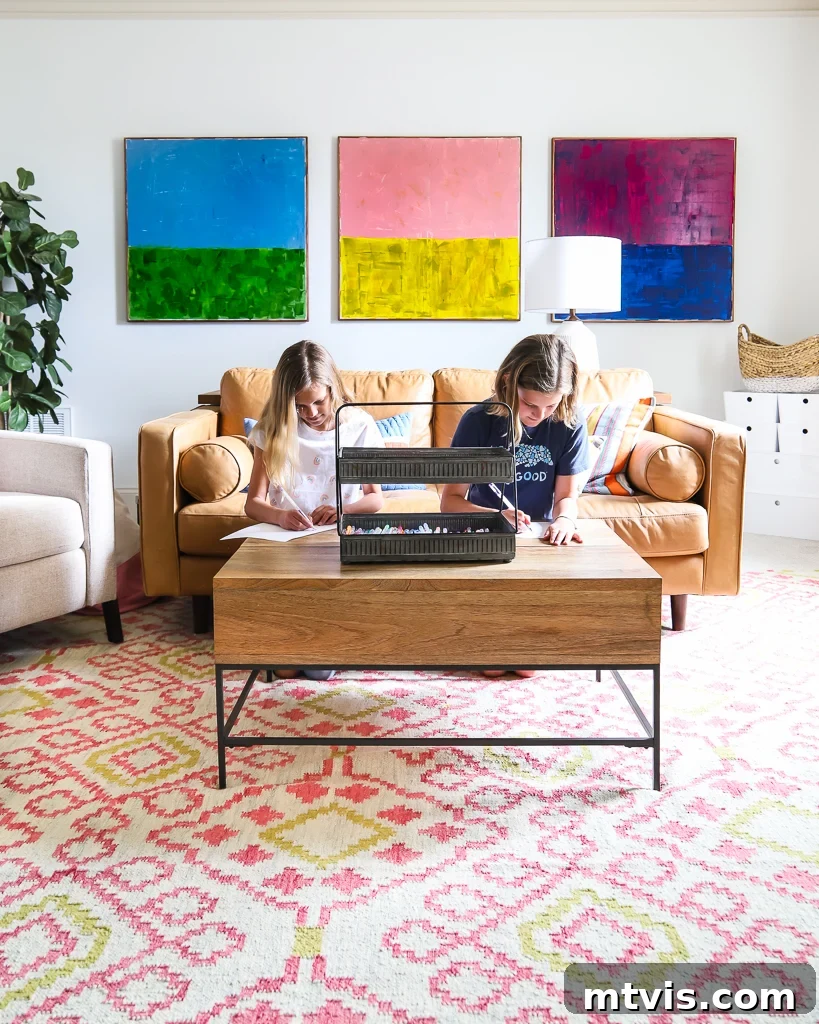
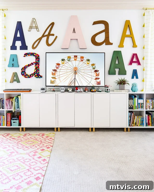
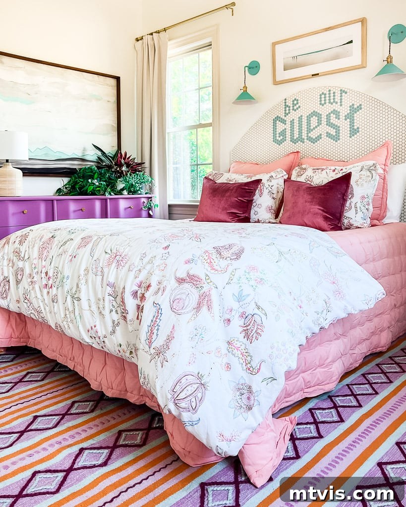
Similarly, our guest room is also north-facing. However, you’ll notice subtle variations in how Pure White appears depending on the time of day the photos were captured and the specific camera angle. This dynamic behavior of paint colors is why it’s absolutely essential to follow my comprehensive tips for choosing paint colors before finalizing your decision. A color is never static; it’s a living element that interacts with its environment.

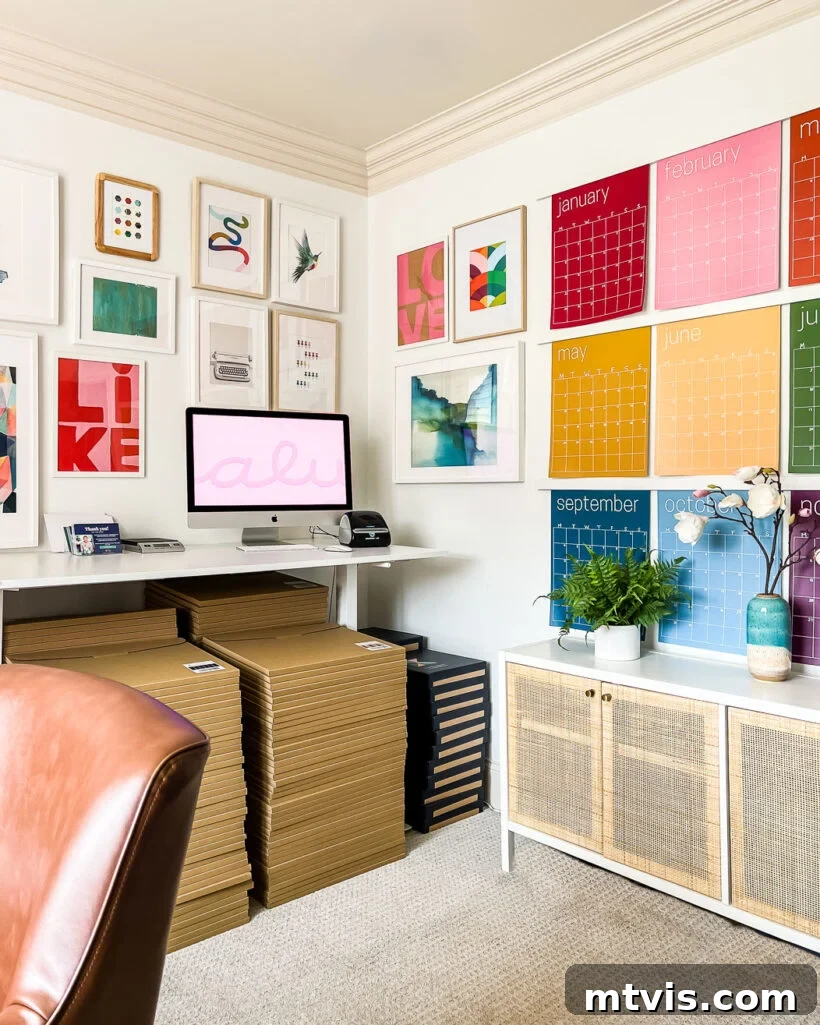
In contrast, south-facing rooms are characterized by consistently bright, warm light throughout the day. In such an environment, Pure White is most likely to exhibit its subtle warm undertones. This holds true for my home office, which is south-facing. Yet, despite the abundant warm light, Pure White maintains its balanced appeal and never reads as overly warm or yellow in this space. Its inherent neutrality beautifully tempers the intensity of the southern exposure.
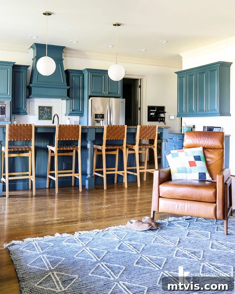
Our kitchen is an interior room, receiving only indirect light, primarily filtered from the south. In this scenario, the high Light Reflectance Value (LRV) of Pure White becomes particularly crucial. Its ability to bounce light around the room is vital for illuminating the space, especially against the dark cabinets I personally updated using this remarkably easy DIY cabinet painting method. The bright walls create a perfect contrast and prevent the room from feeling dim or confined.
Sherwin-Williams Pure White Compared to Other Popular Whites
Choosing the right white often involves understanding how different shades interact and compare. Here, we’ll place Sherwin-Williams Pure White alongside some of the most popular white wall and trim colors, offering insights to guide your decision-making process.
A quick note on viewing these comparisons: The photos below were taken against the brightest white surface available to provide the most accurate representation. However, please remember that the colors you perceive will inevitably vary based on your device’s screen settings. This variability is precisely why it is paramount to test paint colors in your actual home environment before making any final commitments.
Pure White vs. Alabaster vs. Extra White
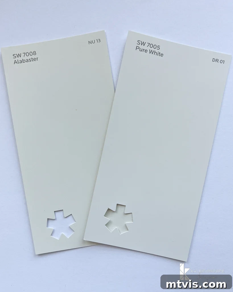
This comparison perfectly illustrates Pure White’s unique position in the white paint spectrum. When placed next to Sherwin-Williams Alabaster (SW 7008), Pure White clearly appears more neutral, lacking Alabaster’s creamy, slightly yellow warmth. Alabaster is a beloved warm white, exuding softness and comfort, often preferred in spaces seeking a cozy, inviting glow. In contrast, Pure White leans away from this warmth, offering a cleaner, more balanced feel without sacrificing softness. Its slight coolness allows it to stand apart from Alabaster’s more prominent yellow undertone.
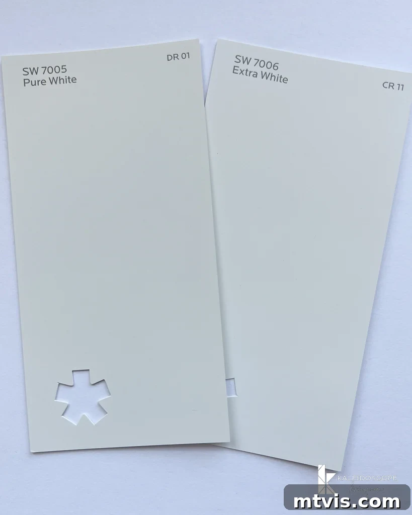
Then there’s Sherwin-Williams Extra White (SW 7006), which represents a starker end of the white palette. Extra White is Sherwin-Williams’ purest white base, often used as a standard for trim and ceilings due to its bright, almost clinical quality. While it delivers maximum crispness, it can sometimes feel too stark or cold for expansive wall surfaces, especially in rooms with less natural light. Pure White, with its subtly balanced undertones, avoids this harshness. When you hold Pure White next to bright white printer paper, you immediately see it’s far less stark than a “true white,” yet it maintains a brilliant luminosity that Extra White provides without the coolness. Pure White is a fantastic choice when you want that bright white look on your walls but desire a touch more softness and warmth than Extra White can provide, and less overt warmth than Alabaster.
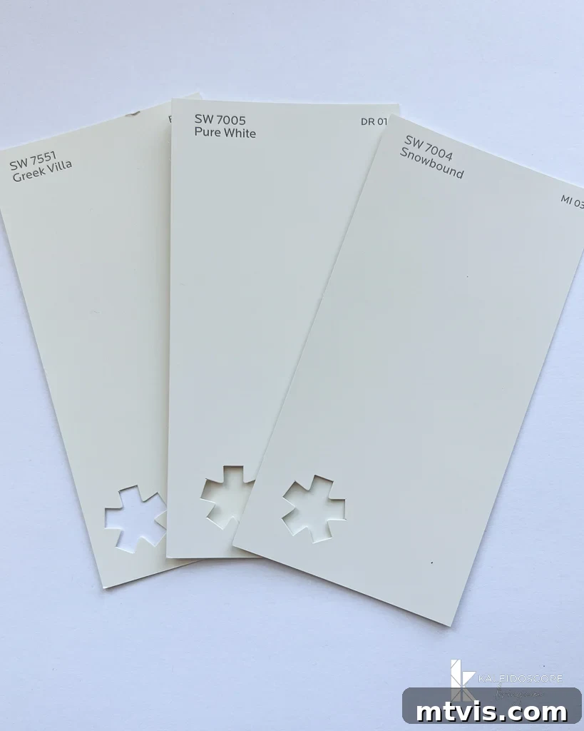
Pure White vs. Snowbound vs. Greek Villa
Expanding our comparison, let’s look at how Pure White stands against two other popular Sherwin-Williams whites: Snowbound and Greek Villa.
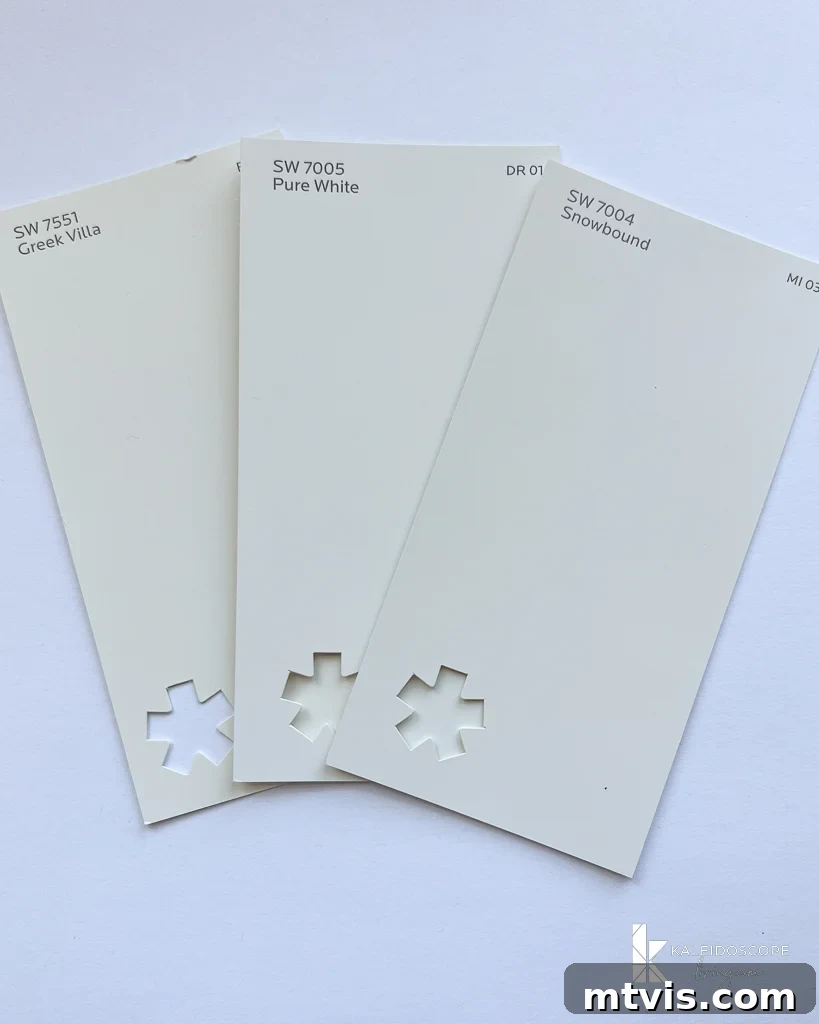
Sherwin-Williams Greek Villa (SW 7551) is distinctly warmer than Pure White. It carries a creamier, more evident yellow or beige undertone, making it ideal for spaces that aim for a cozy, sun-kissed feel. While Pure White has a subtle warmth, Greek Villa’s warmth is more pronounced, creating a different ambiance altogether. It can be a beautiful choice for traditional or Mediterranean-inspired interiors, or simply for those who prefer a noticeably softer, off-white appearance.
On the other hand, Sherwin-Williams Snowbound (SW 7004) offers a slightly different character. Snowbound is a soft, muted white that tends to have a more noticeable gray or greige undertone compared to Pure White. This gives Snowbound a sophisticated, subtle depth, making it a favorite for those seeking a white that isn’t too bright or too warm. It’s a tad less bright than Pure White, and its gray influence means it can sometimes read as a very light greige in certain lights. Pure White, with its cleaner and slightly higher LRV, generally appears brighter and more truly neutral, whereas Snowbound embraces a gentle hint of color.
Pure White vs. High Reflective White
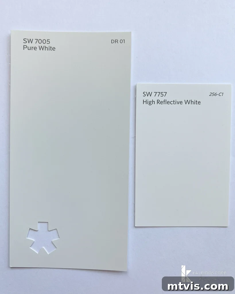
This particular comparison truly highlights Pure White’s unique balance and prevents it from being a “true” or stark white. Sherwin-Williams High Reflective White (SW 7757) holds the title of Sherwin-Williams’ brightest and most reflective white, boasting the highest LRV. It is a near-pure white, often carrying subtle blue or violet undertones that make it undeniably cool.
When you place Pure White alongside High Reflective White, the difference is striking. Pure White immediately appears much softer, more inviting, and less stark. High Reflective White, while excellent for achieving a crisp, modern, almost gallery-like aesthetic, can often feel too cold or overwhelming for entire living spaces, especially in rooms with cooler natural light. Its strong blue undertone can make it feel sterile rather than welcoming. Pure White, by contrast, maintains its bright, clean appearance while offering just enough warmth and neutrality to feel comfortable and livable. It’s the ideal choice for those who desire maximum brightness without sacrificing the softness that makes a home feel cozy and welcoming.
Pure White vs. Benjamin Moore White Dove
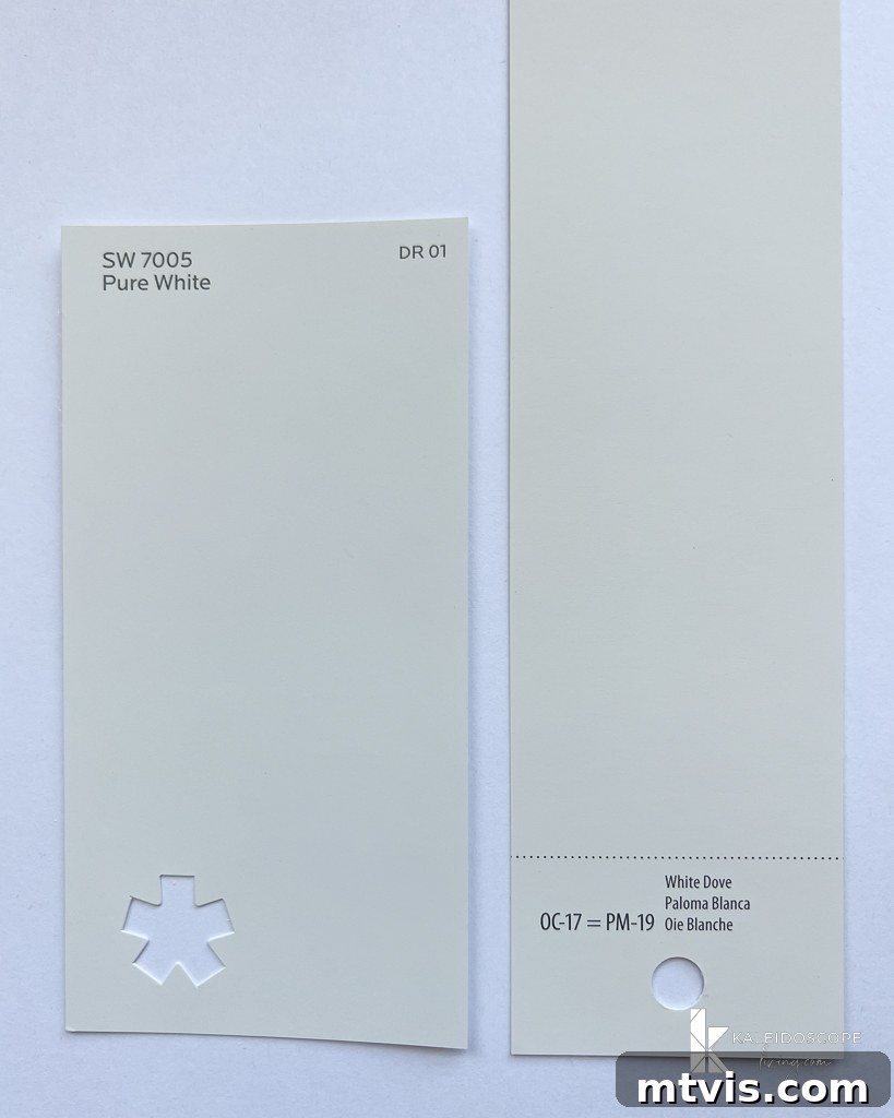
The comparison between Sherwin-Williams Pure White and Benjamin Moore White Dove (OC-17) is frequently sought after, as both are titans in the world of popular white paints. These two share many similarities, both celebrated for their versatile, soft white qualities. However, there are subtle yet important distinctions.
Benjamin Moore White Dove is often described as a soft, creamy white with a very slight greige or even a whisper of green undertone that can emerge in certain lighting conditions. It typically reads as slightly warmer than Pure White. I would position Benjamin Moore White Dove as falling squarely between the warmth of Sherwin-Williams Alabaster and the more balanced neutrality of Sherwin-Williams Pure White. Its LRV is also quite high, at around 85.38, making it equally effective at brightening a room.
While both are excellent choices, Pure White often feels a touch cleaner and more consistently neutral. Its subtle hint of black keeps it from veering into overtly warm territory, ensuring it remains a crisp, versatile backdrop. White Dove, while incredibly popular, might show its subtle greige/green undertones more readily, particularly in dimly lit rooms or when paired with very cool colors. Pure White, on the other hand, consistently delivers a bright, pure white experience that complements both warm and cool palettes with effortless grace. Choosing between the two often comes down to personal preference for that very subtle difference in underlying tone.
Pure White vs. Benjamin Moore Swiss Coffee
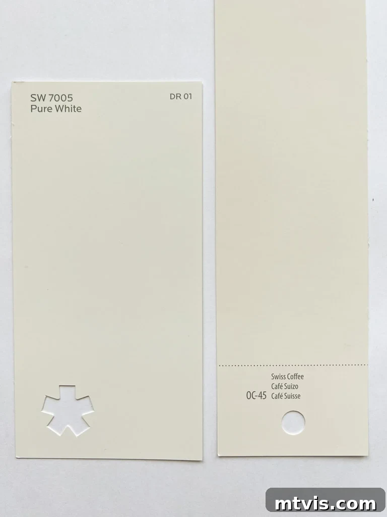
When comparing Sherwin-Williams Pure White to Benjamin Moore Swiss Coffee (OC-45), the difference in warmth becomes much more apparent. Benjamin Moore Swiss Coffee possesses a more pronounced yellow or creamy undertone. It’s significantly warmer than Sherwin-Williams Pure White, and even a bit warmer than SW Alabaster. This makes Swiss Coffee feel less like a pure white and more like a soft, off-white or a very light beige.
In terms of Light Reflectance Value, Pure White boasts an LRV of 84, while Swiss Coffee’s LRV is slightly lower at 81.90. This means Pure White will reflect more light and appear brighter and airier than Swiss Coffee. If your goal is a crisp, bright, yet not stark white, Pure White is the clear winner. If you prefer a noticeably creamier, cozier white with more significant warmth, then Swiss Coffee might appeal. However, as noted in my full review of Benjamin Moore Swiss Coffee (spoiler alert: it’s often my least favorite among the most popular white wall paint colors), its dominant yellow undertone can sometimes make it challenging to pair, potentially clashing with cooler decor elements or making rooms feel dated. Pure White, with its balanced neutrality, offers a much safer and more versatile choice for most modern interiors.
Should You Choose Sherwin-Williams Pure White for Your Home?
If you’re on the hunt for a truly neutral white paint color that delivers brightness without coldness, then Sherwin-Williams Pure White SW7005 should undoubtedly be at the top of your list. Its high LRV of 84 ensures that any room will feel instantly brighter, more open, and refreshingly airy – a quality highly desired by many homeowners, myself included. It is an exceptionally versatile color, making it an excellent choice for virtually any space, from bustling living rooms and family areas to serene bedrooms and functional bathrooms. Its inherent neutrality, devoid of any obvious distracting undertones, is what makes it so universally appealing.
The subtle touch of black in its formula is a masterstroke, preventing Pure White from ever feeling stark or overly clinical. This thoughtful formulation allows it to maintain a soft, inviting quality that seamlessly integrates with diverse design aesthetics. I can wholeheartedly affirm that choosing Pure White for our walls was a decision I have zero regrets about; it has consistently delivered a clean, sophisticated, and harmonious backdrop throughout our home.
Pure White excels as a choice for walls, trim, ceilings, and even cabinetry. Its adaptability across different surfaces and its consistent performance in nearly all lighting conditions solidify its reputation as one of the most versatile white paint colors available. It is my personal go-to white wall color and the one I most frequently recommend to those seeking my advice on paint choices.
However, the absolute best advice I can offer, especially when considering a white wall color, is to always grab samples of several whites – and emphatically, be sure to include Pure White! Remember that Pure White, like any paint color, will manifest differently in every home due to varying lighting conditions, existing finishes, and surrounding elements. Therefore, it is critically important to follow my recommendations in this post about how to choose paint colors. Specifically, test your samples on at least TWO different walls within the same room. Observe how the color shifts throughout the day as the light changes direction and intensity – what looks perfect in the morning sun might be entirely different in the afternoon shade.
For optimal results, using large swatches like Samplize Peel & Stick Paint Samples is always a brilliant idea. These convenient samples allow you to easily move them around your room and observe them under various lighting conditions without the mess of traditional paint pots. I’ve even written a full, unbiased review of Samplize Peel & Stick Paint Samples that you might find incredibly helpful! You can even cut them in half to test on even more surfaces. Just never, under any circumstances, select a paint color based solely on a tiny paint swatch or internet photos. That, my friends, is a recipe for design disaster.
Finally, keep in mind that the paint sheen you choose will also subtly influence Pure White’s appearance. For instance, Pure White in a semi-gloss finish on trim will likely appear slightly brighter and more reflective than an eggshell finish used on walls. For those curious, all of our Pure White walls throughout our home are finished in an eggshell sheen, which provides a lovely, soft matte appearance that works beautifully with its neutral character.
More Inspiring Paint Color Insights
-
The Best Neutral Paint Colors for Kitchen Cabinets
-
Benjamin Moore Swiss Coffee: Is It Right For You?
-
Samplize Peel & Stick Paint Samples: An Unbiased Review
-
Sherwin Williams Pure White SW7005 Paint Review With Pictures
-
Navy Blue Paint Colors Designers Love
-
Beautiful Blue Paint Colors Designers Love & Use
Curious about my holistic approach to transforming rooms and spaces in your home? Explore Designer in a Binder® – your comprehensive guide to affordable and stylish home decoration.
For exclusive content, behind-the-scenes glimpses, and the latest design tips, make sure to subscribe before you go!