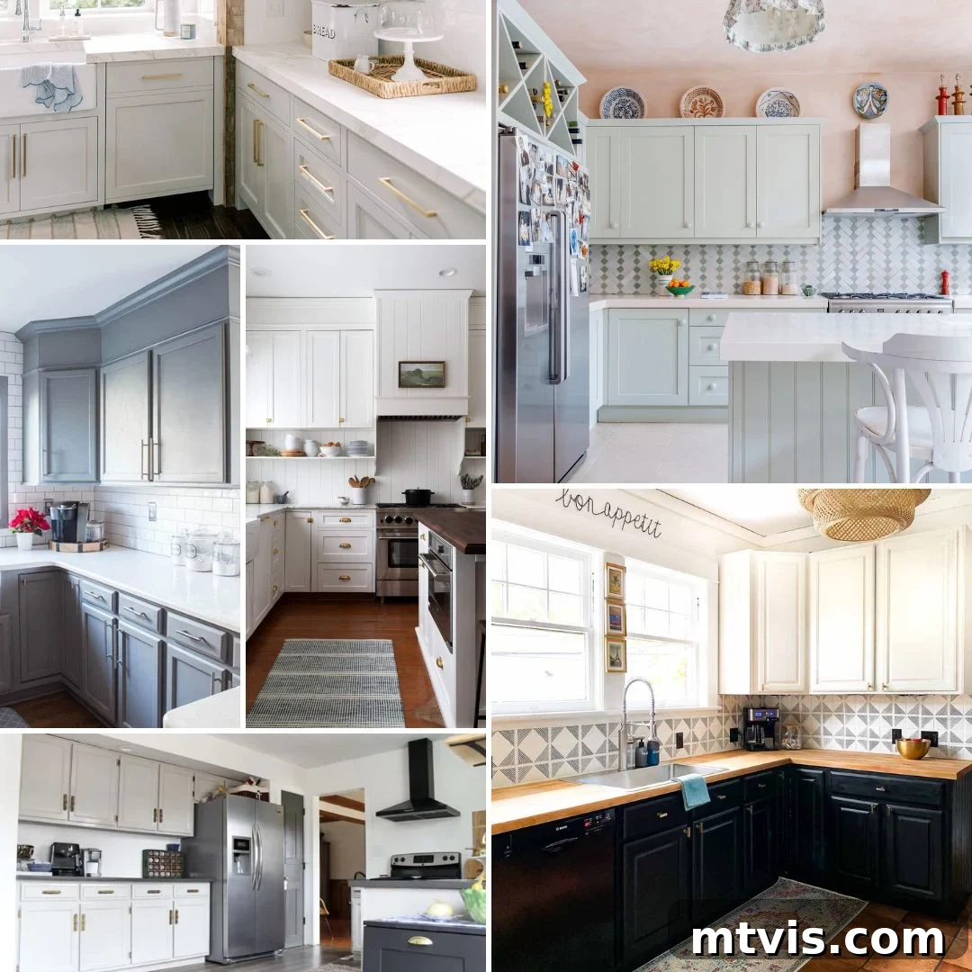
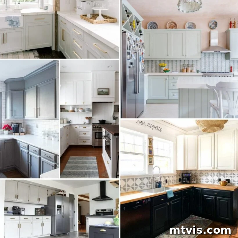
The Ultimate Guide to Choosing Neutral Paint Colors for Kitchen Cabinets
Your kitchen is undeniably the heart of your home, a vibrant hub where culinary creations come to life, cherished family moments unfold, and daily routines converge. Given its central and dynamic role, the color you choose for your kitchen cabinets holds immense power in defining the room’s entire aesthetic, mood, and even its perceived size. While bold, vibrant colors certainly have their place in personal expression, neutral paint colors remain an enduring favorite among interior designers and homeowners alike, and for exceptionally good reasons. Their unparalleled versatility and timeless appeal make them a safe yet remarkably stylish investment that can elevate any kitchen, from a cozy, rustic farmhouse to a sleek, minimalist modern abode. Neutrals provide a serene and sophisticated backdrop that allows other design elements—like intricate tile backsplashes, luxurious countertops, and distinctive hardware—to truly shine, offering endless possibilities for future personalization and decor updates. Moreover, neutral cabinets often contribute significantly to a home’s resale value, appealing to a broader range of tastes.
Whether you’re dreaming of cultivating a warm, inviting atmosphere, achieving a look of sophisticated elegance, or creating a fresh and airy vibe that brightens your space, the expansive world of neutral paint colors offers a dazzling spectrum of choices. In this comprehensive guide, we’ll delve deep into some of the most popular and universally beloved shades of white, beige, greige, and gray that have earned their coveted place as go-to options for transforming kitchen cabinets. Get ready to discover the perfect hue that speaks to your style and brings your dream kitchen to life.
This post contains affiliate links for your convenience. Click here for my full disclosure policy.
Popular White Paint Colors for Kitchen Cabinets
White cabinets are more than just a classic choice; they are a design cornerstone that never truly goes out of style. They offer unparalleled brightness, making any kitchen feel instantly larger, more open, and meticulously clean. While some might perceive white as a simplistic or uninspired choice, the reality is far more nuanced. White paints come in a dazzling array of undertones—from the coolest blues and grays to the warmest yellows and creams—each creating a subtly different ambiance and affecting the overall feel of your kitchen. Choosing the perfect white involves understanding these intricate nuances and carefully considering how they will interact with your kitchen’s unique natural light, artificial lighting, and existing fixed elements like flooring and countertops.
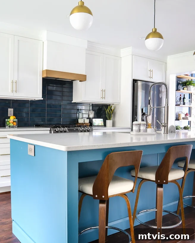
Simply White by Benjamin Moore
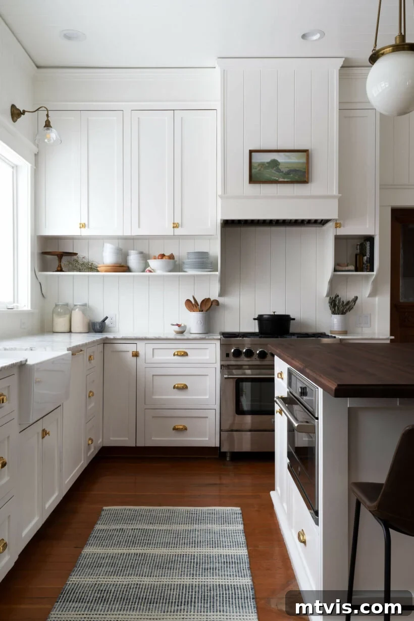
As its name elegantly suggests, Simply White by Benjamin Moore (OC-117) is a beautifully clean and remarkably bright white. It strikes an ideal balance, offering a crisp and fresh look without ever veering into stark or cold territory. This exceptionally popular shade carries a mild, inviting warmth, attributed to a subtle hint of yellow undertone, which adeptly prevents it from leaning too icy or sterile. It’s an outstanding choice for those seeking a fresh, airy, and truly welcoming feel, especially in spaces inspired by a modern farmhouse aesthetic, a timeless traditional design, or a charming remodeled-to-look-original kitchen. Simply White’s incredible versatility extends beyond just cabinets; it’s often lauded as a fantastic option for entire kitchen spaces, including walls and trim, creating a cohesive, expansive, and effortlessly chic environment.
Pure White by Sherwin-Williams
If you are meticulously searching for a crisp, yet soft white color for your kitchen cabinets, look no further than the immensely popular Sherwin-Williams Pure White (SW 7005). Pure White is renowned for being a perfectly balanced white that is beautifully soft and impeccably clean without ever being too stark, cold, or clinical. This exceptional quality makes it an incredibly popular choice for a wide array of interiors and, specifically, as a go-to kitchen cabinet color. In fact, it was the precise color we chose for our cabinets as an integral part of the total kitchen renovation we undertook in our old house. We absolutely adored the bright, clean, and refreshing look it imparted to our space. Its remarkable versatility is another key attribute—it works seamlessly as a flawless backdrop for both subtle, neutral decor and vibrant, colorful accents, allowing your personal design aesthetic to truly flourish.
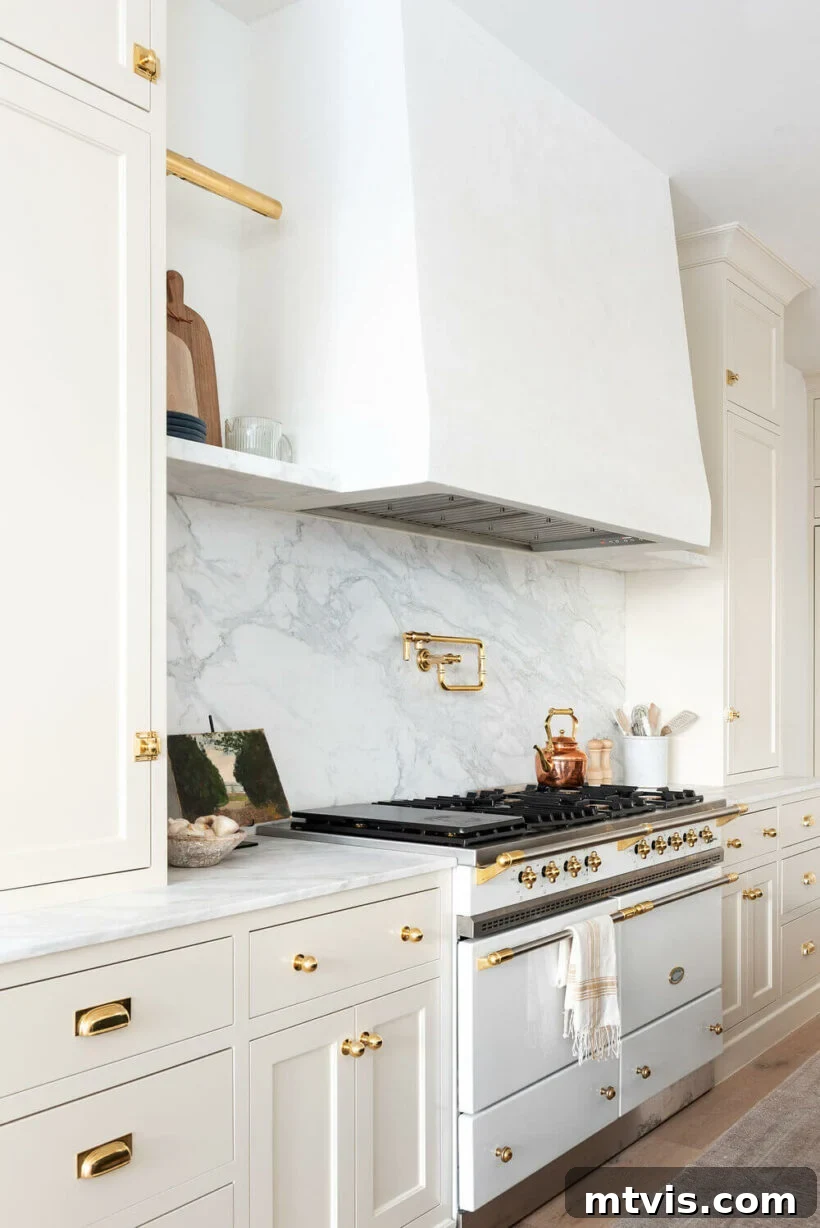
Creamy White by Benjamin Moore
Creamy White by Benjamin Moore (OC-7) offers a warm, inviting off-white hue, often described as a soft bisque. This exquisite color exudes a gentle warmth that instantly makes a kitchen feel more cozy, welcoming, and lived-in. You can distinctly observe the subtle yet captivating shade difference between a stark white range hood or pristine marble countertops and these cream-colored cabinets, and the resulting contrast is truly stunning, adding depth and visual interest without overwhelming the space. The soft, buttery tones of Creamy White also beautifully complement metallic accents like brass or aged bronze hardware, creating an elegant and sophisticated neutral color scheme that feels both timeless and perfectly contemporary, enhancing the kitchen’s overall charm and appeal.
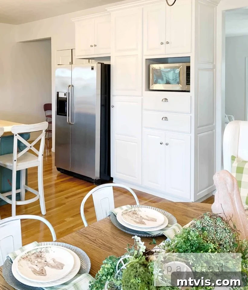
Alabaster by Sherwin Williams
Sherwin-Williams Alabaster (SW 7008) consistently ranks at the very top of the list for popular white paint colors, and its widespread acclaim is entirely justified. This gorgeous shade is a barely-off-white that radiates a profound softness and undeniable warmth, distinguishing itself beautifully from starker whites through its subtle, inviting beige undertones. It evokes a sense of comfort, serenity, and understated luxury, making it an impeccable choice for creating a cozy yet refined kitchen environment. Many esteemed designers enthusiastically embrace Alabaster for both walls and cabinetry, achieving a harmonious, enveloping effect that feels both opulent and incredibly inviting. This gentle white also pairs wonderfully with sleek modern elements like stainless-steel appliances, contributing to a fresh, clean, and effortlessly chic kitchen design that stands the test of time.
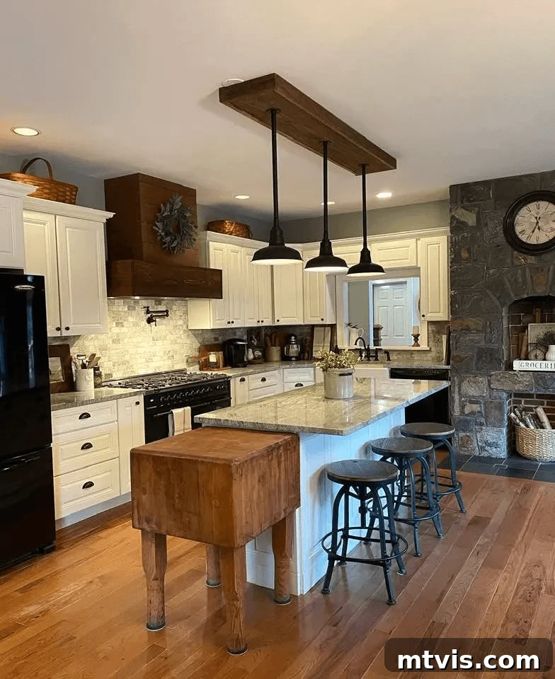
Ivory White by Benjamin Moore
For a beautifully soft off-white with distinct warm undertones, consider Ivory White by Benjamin Moore (925) on your kitchen cabinetry. This shade is absolutely perfect for infusing a rustic, organic, or traditional vibe into your kitchen design, bringing a sense of heritage and warmth. Its faint yellow tint gives it an inherently warm, inviting quality that is far from stark or cold, making it an excellent partner for natural materials. Imagine it paired with the rugged, timeless beauty of black iron hardware, rich, earthy wood accents, and textured stone elements – this combination creates a harmonious and grounded aesthetic that feels authentically charming. Ivory White provides a subtle yet significant departure from cooler whites, offering a cozy warmth that truly enhances the heart of the home and envelops it in comfort.
Raw Silk by Fusion Mineral Paint
For those undertaking a DIY cabinet makeover project, Raw Silk by Fusion Mineral Paint presents an absolutely delightful and highly effective option. This very light, creamy off-white is a personal favorite for its effortless charm, exceptional warmth, and beautiful coverage. It’s an ideal choice, especially for upper cabinets, where its luminous quality can truly brighten and open up a space without feeling sterile or stark. The subtle creaminess of Raw Silk adds a desirable layer of depth and softness, making it incredibly versatile for various kitchen styles, from traditional and transitional to even subtly contemporary designs. It also pairs beautifully with a wide range of countertop and backsplash materials, providing a harmonious and inviting base.
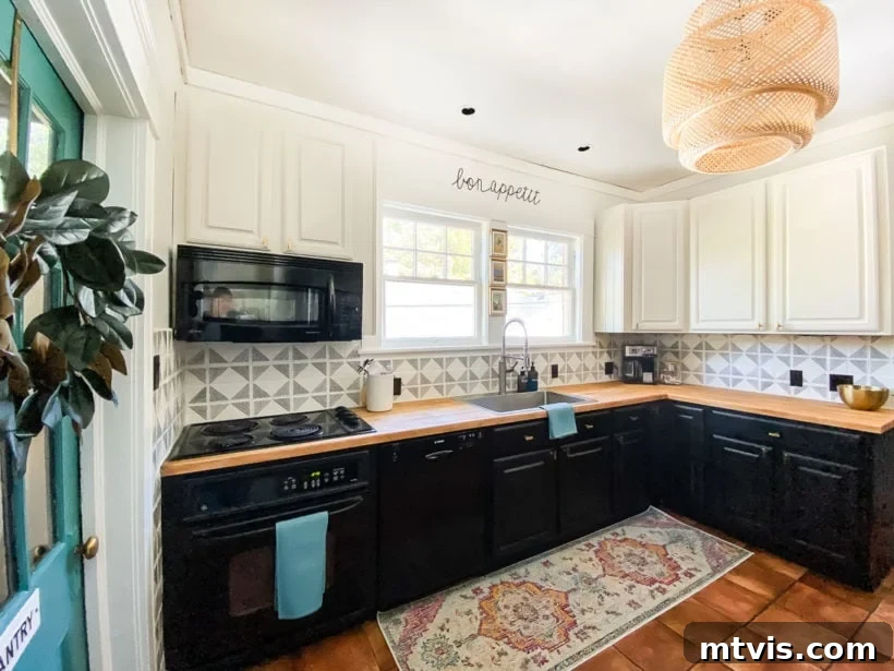
Popular Greige and Beige Paint Colors for Kitchen Cabinets
Stepping beyond the realm of pure white, greige and beige paint colors have experienced a significant surge in popularity for kitchen cabinets, offering a sophisticated and often more nuanced alternative that is both versatile and enduring. These neutral tones are highly praised for their ability to bring a touch more character, depth, and warmth than traditional whites, without ever venturing into overtly trendy or potentially fleeting territory. This means you can invest in them with confidence, assured that they won’t quickly go out of style, making them a wise choice for long-term satisfaction. Greige, a beautiful and balanced blend of gray and beige, provides a harmonious equilibrium of warm and cool, while true beige offers a more direct earthiness and inherent coziness. Both categories are wonderfully neutral, making them adaptable enough to seamlessly integrate with a wide spectrum of color palettes and diverse design aesthetics, from rustic and natural to sleek and minimalist, offering a rich and inviting canvas for your kitchen’s unique personality.
Accessible Beige by Sherwin Williams
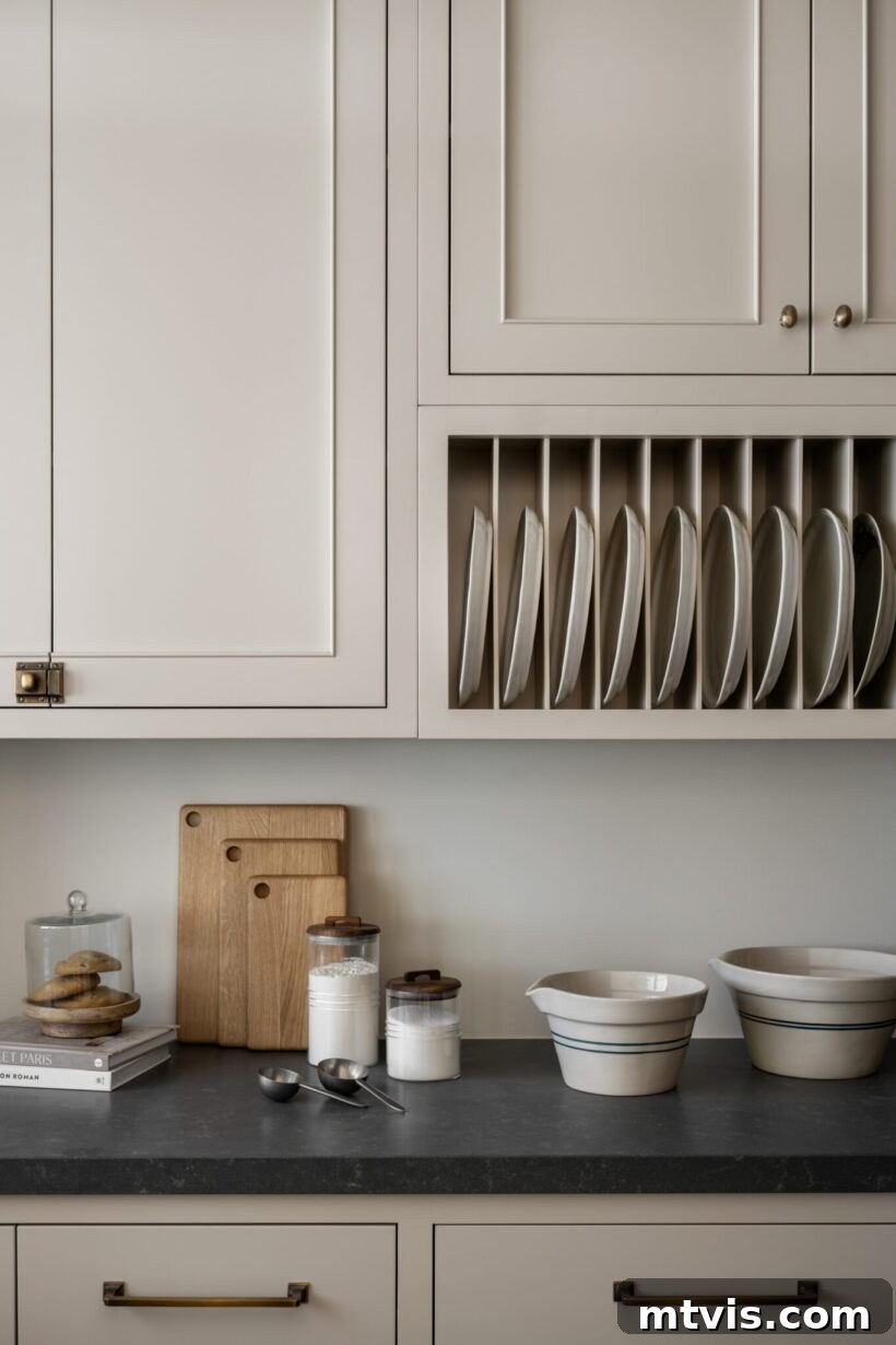
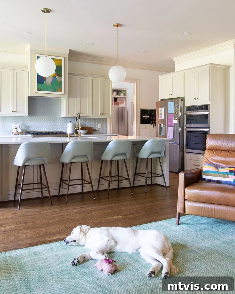
Accessible Beige by Sherwin-Williams (SW 7036) is widely celebrated as a perfectly balanced neutral. It offers just the right amount of warmth and depth, meticulously avoiding the common pitfalls of unwanted yellow or orange undertones that can sometimes plague other beige shades. Despite its inherent depth, it remains wonderfully light and airy, making it an excellent option for homeowners who appreciate the brightness typically associated with white kitchen cabinets but desire something with a subtle distinction and a touch more character. This precise, appealing balance is exactly why we personally chose it for the cabinetry in our own recent kitchen renovation after months of dedicated research and testing countless paint colors. It truly transformed our kitchen, proving that a neutral can be both distinctive and highly adaptable, bringing a sophisticated warmth without being overwhelming.
The inspiring image below was instrumental in our decision-making process, initially turning us on to Accessible Beige, and we are so incredibly glad it did! It perfectly showcased the potential of this versatile hue.
And you can see how Accessible Beige beautifully translates onto our kitchen cabinets below. You will notice that the color appears lighter in our kitchen compared to other examples. This perfectly illustrates a crucial point: as with any paint color, the specific lighting conditions (both natural and artificial), surrounding elements, and even the direction your room faces will significantly impact how it looks. This phenomenon underscores why it’s absolutely vital to test paint colors directly in your own space before committing to a final choice!
Natural Cream by Benjamin Moore
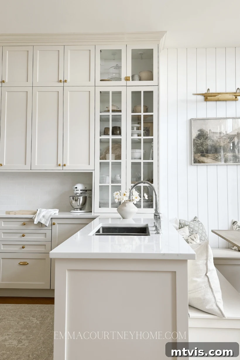
Natural Cream by Benjamin Moore (OC-14) is a soft, light greige/beige that has quickly become a steadfast favorite among discerning designers for kitchens. This elegant shade strikes a beautiful and sophisticated balance, offering the subtle richness of a cream without being overly yellow, and the grounded, muted feel of greige without leaning too cool or stark. It’s an incredibly versatile and inviting color that infuses a warm yet refined elegance into cabinetry. When strategically paired with contrasting elements like bright white walls or a lighter, textured backsplash, Natural Cream cabinets provide a cozy and anchoring presence. This is especially true when complemented by mixed metals in hardware, creating a sophisticated, layered, and utterly inviting aesthetic that speaks to understated luxury.
Repose Gray by Sherwin Williams
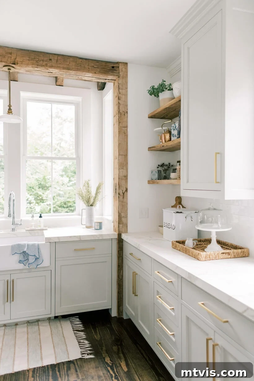
Repose Gray by Sherwin-Williams (SW 7015) is consistently ranked as one of Sherwin-Williams’ most popular and best-selling colors, and its widespread appeal is entirely justified. Classified as a true greige, Repose Gray masterfully balances cool gray tones with a comforting hint of warm beige, often revealing a very subtle violet undertone depending on the lighting conditions. This makes it a fantastic and highly sought-after choice for kitchen cabinets if you’re leaning towards a light gray that offers more depth, sophistication, and character than a stark white. It pairs exquisitely with luxurious elements like gleaming marble counters, where its nuanced gray provides a sophisticated counterpoint. When combined with natural wood accents, exposed beams, and open shelving, Repose Gray helps create a kitchen that feels both modern and inviting, offering a perfect, harmonious blend of warmth and cool sophistication.
Popular Gray Paint Colors for Kitchen Cabinets
Gray has evolved far beyond being just a simple “neutral”; today, it stands as a dynamic, incredibly versatile, and highly sophisticated choice for kitchen cabinets, offering a vast spectrum of shades that can dramatically alter the mood and style of your space. From the barely-there whisper of a light, ethereal gray to the impactful drama of deep charcoal, gray cabinets evoke a powerful sense of clean, contemporary elegance. The enduring beauty of gray lies in its extensive range, encompassing both warm grays (which typically carry subtle brown or yellow undertones, adding a cozy feel) and cool grays (which present with blue or green undertones, offering a crisp, modern edge). This remarkable diversity ensures that you can find a gray that harmonizes perfectly with your preferred decorating colors and overall design vision, creating a sophisticated and consistently modern foundation for your kitchen that is both stylish and enduring.
Dove Tale by Farrow and Ball
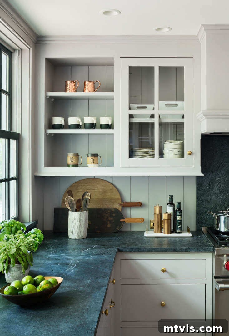
Dove Tale by Farrow & Ball (No. 267) is a wonderfully warm and inviting light gray that immediately distinguishes itself with subtle lilac-purple undertones. This unique characteristic gives it a soft, almost ethereal quality that is far from clinical or cold, making it a sophisticated, intriguing, and deeply comforting neutral choice for kitchen cabinets. The delicate undertones allow it to subtly shift its appearance with varying light conditions, adding impressive depth and visual interest to your space throughout the day. Dove Tale creates a harmonious and elegant contrast when purposefully paired with darker countertops, effectively grounding the kitchen with a gentle warmth. It offers a refined backdrop that supports both traditional and contemporary design elements with ease, serving as a testament to how gray can be both inherently elegant and profoundly comforting.
Cracked Pepper by Behr
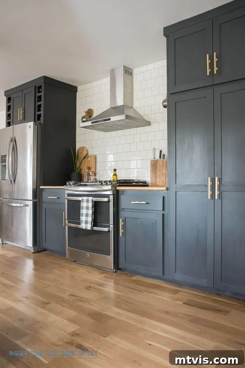
For those daring to embrace a bold, dark, and dramatically impactful aesthetic in their kitchen, Cracked Pepper by Behr (PPU18-01) is the quintessential choice for a truly unforgettable statement. This deep charcoal gray is so incredibly rich and saturated it meticulously borders on black, yet its subtle blue undertones expertly prevent it from feeling harsh, flat, or one-dimensional. It’s an exceptional and sophisticated option if you’re drawn to dark kitchen cabinet paint colors but prefer a nuanced and intriguing alternative to a true, unadulterated black. Cracked Pepper brings an unparalleled sense of sophistication, modernity, and luxurious depth to any kitchen. It looks absolutely stunning when paired with gleaming stainless-steel appliances, elegant gold or brass pulls, and a crisp white subway tile backsplash extending all the way to the ceiling, creating a striking contrast and a visually dynamic space that exudes undeniable luxury and contemporary flair.
Neutral Painted Cabinets with a Hint of Color
For those who deeply appreciate the steadfast reliability and timelessness of neutrals but crave a touch more personality, intrigue, and distinct character in their kitchen, a fascinating category of “hint-of-color” neutrals offers the perfect, sophisticated compromise. These exceptional shades provide subtle infusions of color—be it a muted green, a soft blue, or an earthy, warm brown—that gently elevate them beyond the traditional white, beige, or gray, without ever becoming overtly bold, trendy, or overwhelming. Some of these options lean towards dark neutrals, bringing a dramatic flair, impressive depth, and a grounded weight that can be incredibly captivating and luxurious. Others are lighter, creating an airy and fresh feel with just a whisper of unexpected color. If you’re looking to introduce a sophisticated twist to your kitchen cabinetry that feels both unique and enduring, offering a personalized touch without sacrificing versatility, these designer-approved picks are an excellent and inspiring starting point.
Vert de Terre by Farrow and Ball
Vert de Terre by Farrow & Ball (No. 234) is a truly exquisite muted sage green. Its soft, understated nature and subtle color depth allow it to comfortably sit within the neutral category, yet it introduces a fresh, organic, and intensely interesting dimension that plain white or gray simply cannot. This gentle green boasts delicate blue undertones, which significantly contribute to its soothing, sophisticated, and remarkably versatile character. Vert de Terre pairs beautifully with both warm and cool color palettes, making it incredibly adaptable to various kitchen styles and existing decor elements, from natural wood tones to brighter whites. It evokes a profound sense of natural tranquility and calm, perfect for creating a serene, inviting, and truly harmonious kitchen that feels elegantly connected to the outdoors.
Beguile by Valspar
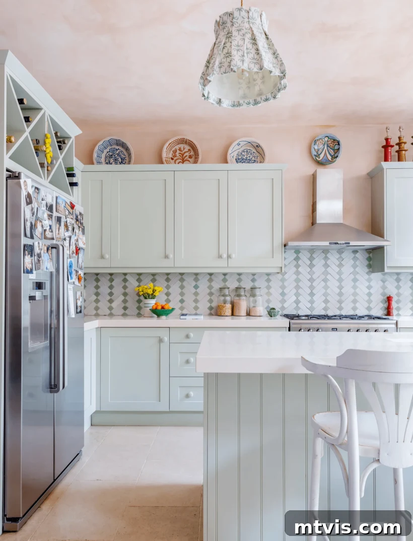
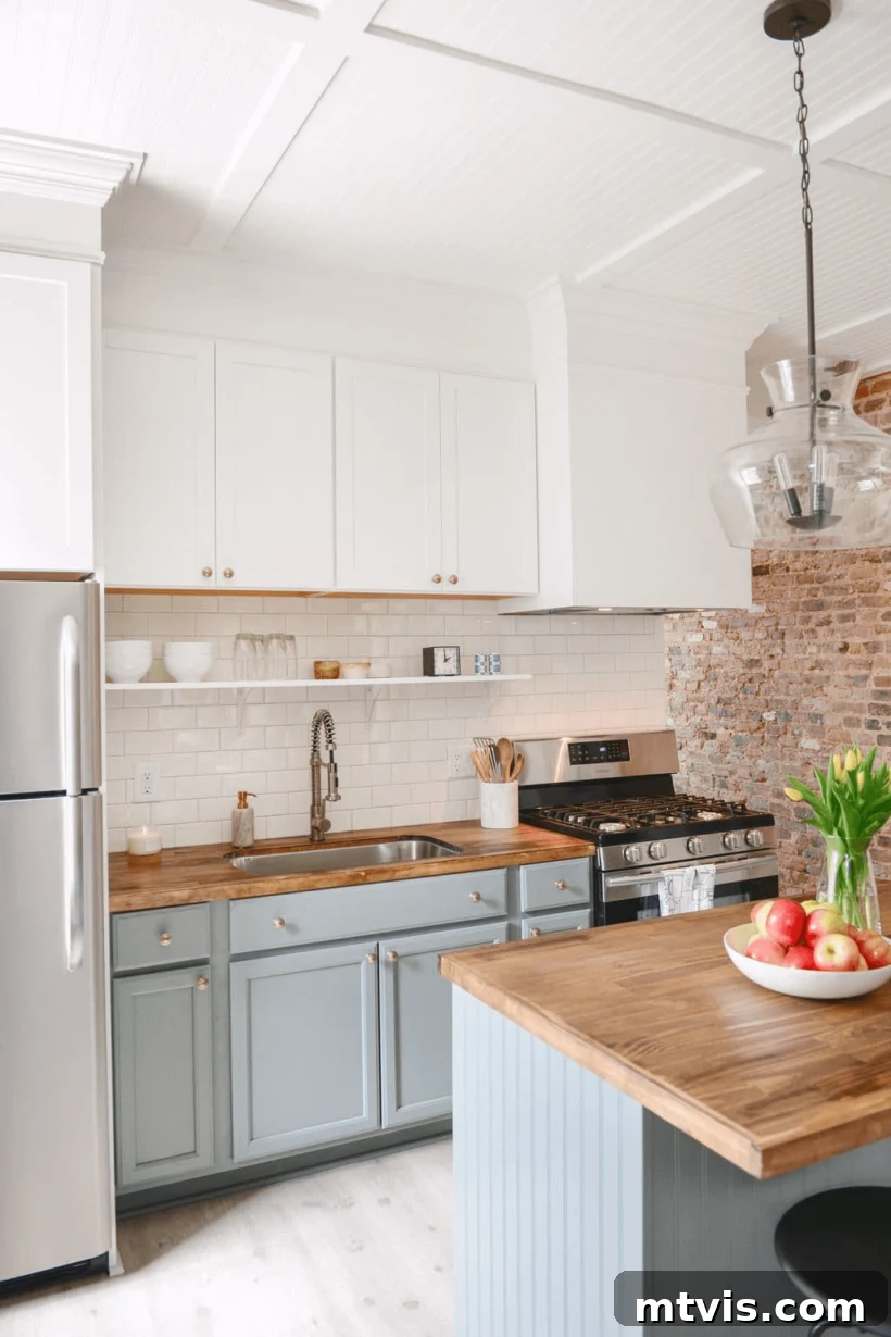
If you’re in search of a neutral paint color that truly plays the chameleon, adapting beautifully to its surroundings, look no further than Beguile by Valspar (5002-2A). This intriguing shade is officially described as a complex blue-green-gray, and its appearance can shift quite dramatically depending on the specific lighting conditions in your home—a classic and crucial example of why physically testing paint samples is absolutely paramount. In some settings, particularly on lower cabinets as pictured, it might lean more prominently blue, offering a serene, refreshing, and calming feel. In other lighting environments, or as depicted on Valspar’s official site, it can assume a more pronounced green-gray quality, presenting an earthy, sophisticated, and organic tone. This captivating versatility makes Beguile a truly beautiful and dynamic neutral that could be the perfect harmonious blend of blue and green you’ve been dreaming of for your kitchen cabinetry, offering depth and character that evolves throughout the day.
Evergreen Fog by Sherwin Williams
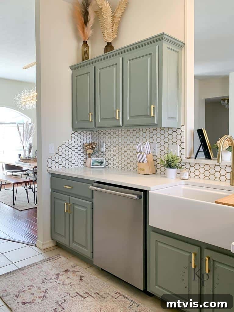
Evergreen Fog by Sherwin-Williams (SW 9130) captivated the entire design world as Sherwin-Williams’ highly anticipated Color of the Year for 2022, and it’s remarkably easy to understand why it garnered such immense acclaim. This exquisite soft sage green is a distinctive cool green with clear blue undertones, which imbue it with a sophisticated, subtle gray feeling. It masterfully balances freshness and lightness with a grounded, earthy quality that feels both serene and contemporary. Evergreen Fog demonstrates incredible versatility, pairing beautifully with off-white walls for a gentle, layered, and harmonious look, yet also looking utterly amazing and striking against the crisp brightness of a white sink and pristine counters. This makes it an incredibly adaptable neutral grey-green, perfectly capable of creating both serene and subtly striking kitchen aesthetics, suitable for a wide range of styles from sleek contemporary to charming traditional designs.
Tips for Choosing Your Perfect Neutral Cabinet Color
Selecting the ideal neutral paint color for your kitchen cabinets can feel like a daunting task with such an abundance of beautiful options available. To ensure you make a choice you’ll absolutely love and cherish for many years, consider these essential and highly practical tips:
- Consider Your Kitchen’s Fixed Elements: Before anything else, take a comprehensive look at your existing countertops, backsplash, and flooring. These fixed elements inherently possess undertones (which can be warm, cool, or even neutral) that your chosen cabinet paint color should harmoniously complement. A warm white, for instance, might clash unexpectedly with a distinctly cool-toned marble, creating an unbalanced look. Aim for a cohesive palette.
- Evaluate Your Lighting Conditions: Lighting is, arguably, the most critical factor influencing how a paint color appears. Natural light changes dramatically throughout the day and across seasons, and different artificial light sources (from warm, yellow-toned bulbs to cool, blue-toned LEDs) also profoundly affect a color’s presentation. A color that looks vibrant and perfect in a brightly lit showroom might appear entirely different in your own kitchen’s unique lighting environment.
- Always Test Samples Directly in Your Space: This step cannot be overstated enough. It is absolutely crucial. Purchase samples of your top two or three contenders and paint large swatches directly onto your existing cabinets, or utilize convenient peel-and-stick samples like those from Samplize. Observe these samples at various times of the day, under both natural and artificial lighting conditions. This diligent testing process will reveal the true undertones and the overall feel of the color in your kitchen’s unique environment, preventing costly mistakes.
- Think About the Overall Mood and Style: What overarching feeling do you want your kitchen to evoke? Do you desire it to feel cozy, warm, and inviting, or perhaps sleek, modern, and minimalist? Warmer neutrals (like creamy whites, beiges, and greiges with strong beige undertones) tend to create a more comforting and welcoming atmosphere. In contrast, cooler neutrals (such as grays and greiges with prominent blue or green undertones) can make a space feel more crisp, contemporary, and expansive.
- Choose the Right Paint Finish (Sheen): The sheen, or gloss level, of your paint also significantly impacts its appearance, durability, and ease of maintenance. For kitchen cabinets, satin or semi-gloss finishes are typically highly recommended. These finishes are not only easier to clean and more durable against daily wear and tear, but they also reflect light beautifully, helping the chosen color to pop and bringing a polished look to your cabinetry. Avoid flat or matte finishes on cabinets as they are difficult to keep clean.
Conclusion: Embrace the Timeless Beauty of Neutral Kitchen Cabinets
There’s absolutely no doubt that meticulously choosing the perfect neutral paint color for your kitchen cabinets can profoundly impact the overall aesthetic, functionality, and design vibe of your entire space. As we’ve extensively explored throughout this guide, the expansive world of neutrals offers an incredible array of sophisticated tones—from the crispest, most luminous whites to the deepest, most dramatic charcoals, and everything beautiful in between, including comforting beiges, versatile greiges, and even subtle hues infused with just a hint of color. These wonderfully versatile hues not only create a timeless, elegant, and universally appealing look but also provide an incredibly flexible foundation that pairs seamlessly with diverse countertops, backsplashes, hardware finishes, and evolving decor styles.
Whether your personal style leans decidedly towards modern minimalism, embraces cozy traditionalism, or favors a chic transitional blend, a well-chosen neutral cabinet color will help you achieve a sophisticated, harmonious, and enduring look that you’ll cherish for many, many years to come. Remember, before you embark on the rewarding journey of painting your cabinets, dedicate ample time to the crucial prep work of picking the absolutely correct color. As passionately discussed, I strongly recommend trying out large, physical samples of your chosen color options directly in your kitchen. Using Samplize Peel and Stick paint samples is a fantastic, mess-free, and highly accurate way to truly visualize and test your options. If you’re still uncertain about how to effectively narrow down your myriad choices, be sure to read my comprehensive guide, How to Choose A Paint Color, for all my expert tips and invaluable guidance!
More Paint Color Posts
SEE ALL paint color posts
-
The Best Neutral Paint Colors for Kitchen Cabinets
-
Benjamin Moore Swiss Coffee- Is it Right For You?
-
Samplize Peel & Stick Paint Samples: An Unbiased Review
-
Sherwin Williams Pure White SW7005 Paint Review With Pictures
-
Navy Blue Paint Colors Designers Love
-
Beautiful Blue Paint Colors Designers Love & Use
Other Kitchen Posts You May Enjoy:
- How To Paint Kitchen Cabinets Without Sanding or Priming
- How to Paint Your Tile Backsplash in 5 Simple Steps
- How to Paint Countertops to Look Like Marble
- 15 Affordable DIY Countertops That Will Blow Your Mind
Wondering how I approach transforming rooms and spaces in our home? Check out Designer in a Binder®.
And if you want exclusive content and behind-the-scenes sneak peeks, be sure to subscribe before you head out!