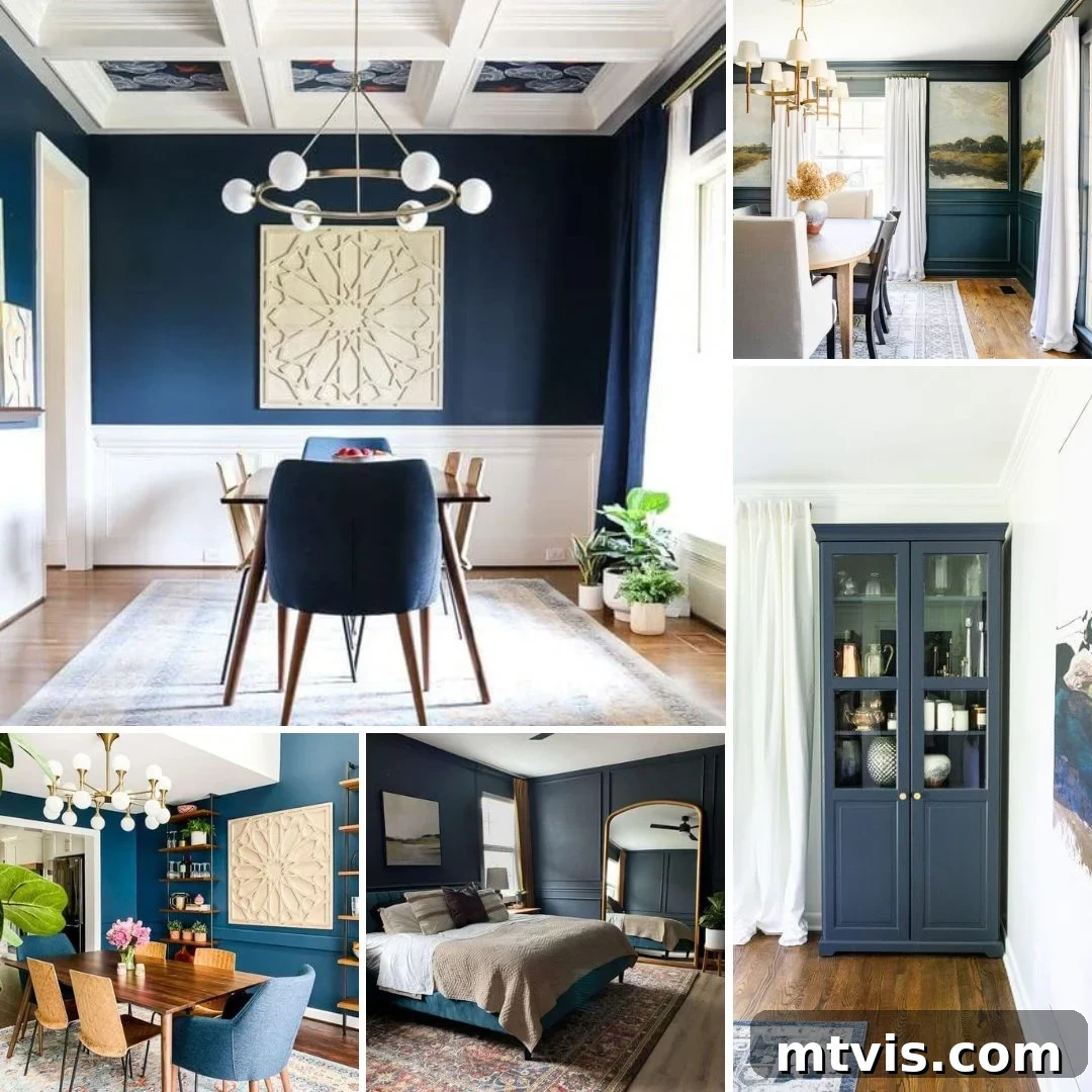
Discover the Enduring Elegance: The Best Navy Blue Paint Colors for Your Home
Navy blue. It’s a color that consistently captures the hearts of interior designers and homeowners alike, and for good reason. More than just a hue, navy blue is a statement of sophistication, timeless style, and versatile drama. Unlike stark black, navy offers a unique warmth and depth that can transform any space, making it feel both inviting and grand. Its inherent ability to pair seamlessly with almost any other color or material is akin to a classic pair of dark jeans – always fashionable, always reliable.
But the world of navy blue is far from uniform. There isn’t a single “best” navy paint color, as each shade brings its own distinct character and charm to a room. From the deep, classic navy that evokes maritime tradition to more muted, almost inky blues, the options are plentiful. This comprehensive guide delves into the most beloved navy blue paint colors from leading brands, offering insights to help you choose the perfect shade to elevate your home’s aesthetic.
Why Choose Navy Blue for Your Interior?
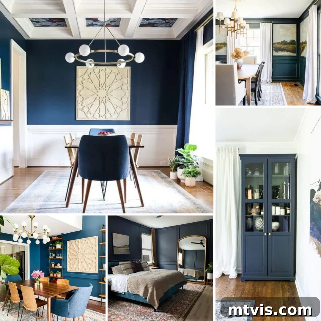
Navy blue’s popularity in interior design stems from its incredible versatility and the rich atmosphere it creates. It’s a color that can feel both traditional and modern, calming and dramatic, depending on its specific undertones and how it’s used. A deep navy can make a small room feel cozy and intimate, while in a larger space, it adds an undeniable sense of luxury and sophistication. It acts as a perfect backdrop for lighter furniture and vibrant accents, allowing them to truly pop, or it can be used monochromatically for an immersive, enveloping experience. Furthermore, navy is surprisingly timeless, ensuring your design choices remain elegant for years to come without feeling dated.
This enduring appeal makes navy an excellent choice for various rooms, from serene bedrooms and bustling dining areas to functional kitchens and inspiring home offices. Its psychological impact includes feelings of stability, trust, and peace, making it a wonderful color for spaces where relaxation or focused work is desired. Whether you’re aiming for a bold statement or a subtle backdrop, navy blue paint offers a spectrum of possibilities that can transform your home.
Benjamin Moore Navy Blue Paint Colors
Benjamin Moore is renowned for its expansive and nuanced color palette, and their navy blues are no exception. These shades often carry subtle undertones that can shift beautifully with the changing light, offering dynamic depth and character.
Polo Blue by Benjamin Moore
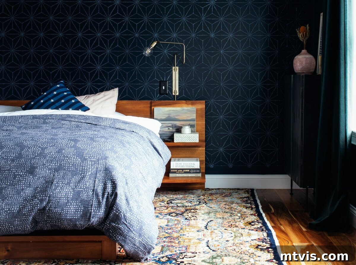
Benjamin Moore’s Polo Blue is a strikingly deep and moody hue that truly elevates a space. As demonstrated by Brianna’s bedroom transformation, applying a lighter blue stencil over dark walls can introduce an unexpected visual interest, preventing the room from feeling too enclosed. Polo Blue creates an incredible sense of calm and luxury, making it an ideal choice for a bedroom sanctuary. Its profound depth offers a cocooning effect, perfect for unwinding at the end of a long day, while the contrasting stencil adds a touch of playful elegance.
Hale Navy by Benjamin Moore
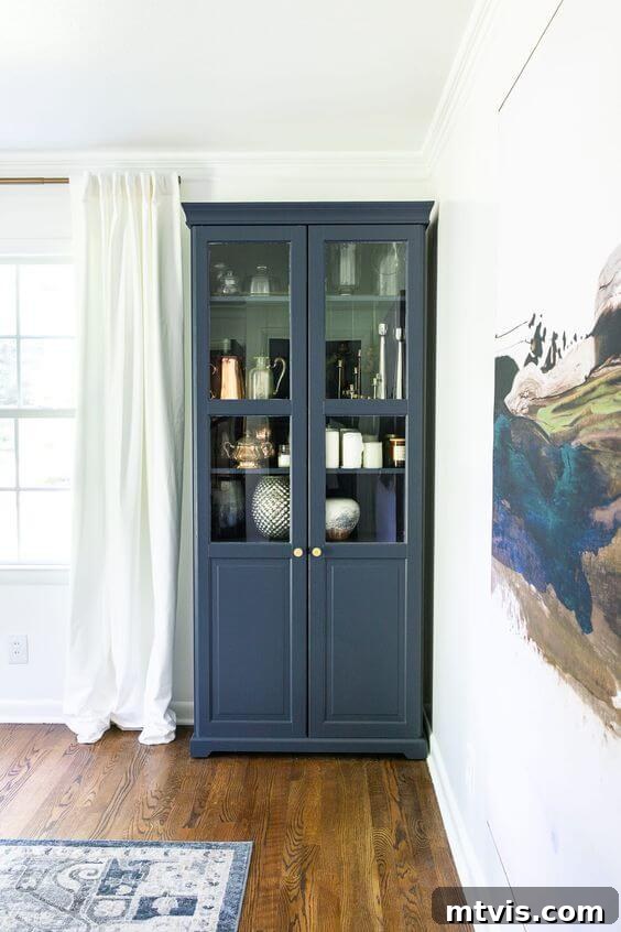
Beyond just walls, navy blue can dramatically enhance furniture, breathing new life into existing pieces. Benjamin Moore Hale Navy is a designer favorite for its remarkable versatility. This softer navy, with its subtle gray undertones, brings a sophisticated charm without being overly dramatic. Lauren’s ingenious use of Hale Navy on an IKEA cabinet in her dining room perfectly illustrates this. The paint revitalizes the furniture, turning a standard piece into a focal point. Its nuanced shade expertly picks up on the blue tones present in artwork and rugs, creating a cohesive and artfully curated look. Hale Navy proves that a touch of navy can go a long way in upgrading the aesthetic of any room, especially when applied to furniture with proper painting techniques for laminate.
Sherwin-Williams Navy Paint Colors
Sherwin-Williams offers a compelling collection of navy blues, each with distinct characteristics that cater to a wide range of design preferences. From the darkest, most luxurious blues to lighter, more vibrant navies, their palette provides ample choices for creating captivating interiors.
Moscow Midnight by Sherwin-Williams
Sherwin-Williams’ Moscow Midnight is a dramatically deep navy that borders on black, offering an incredibly luxurious and inviting feel. Zoe at Pine and Poplar masterfully used this shade as a sophisticated contrasting backdrop, allowing the natural wood tones of her furniture and bed to truly sing. The richness of Moscow Midnight evokes a velvety texture, creating a cozy, cave-like bedroom perfect for deep relaxation. Its profound depth provides a grounding effect and an atmosphere of refined elegance, making it an excellent choice for a statement wall or an entire room designed for intimacy and comfort.

Gale Force by Sherwin-Williams
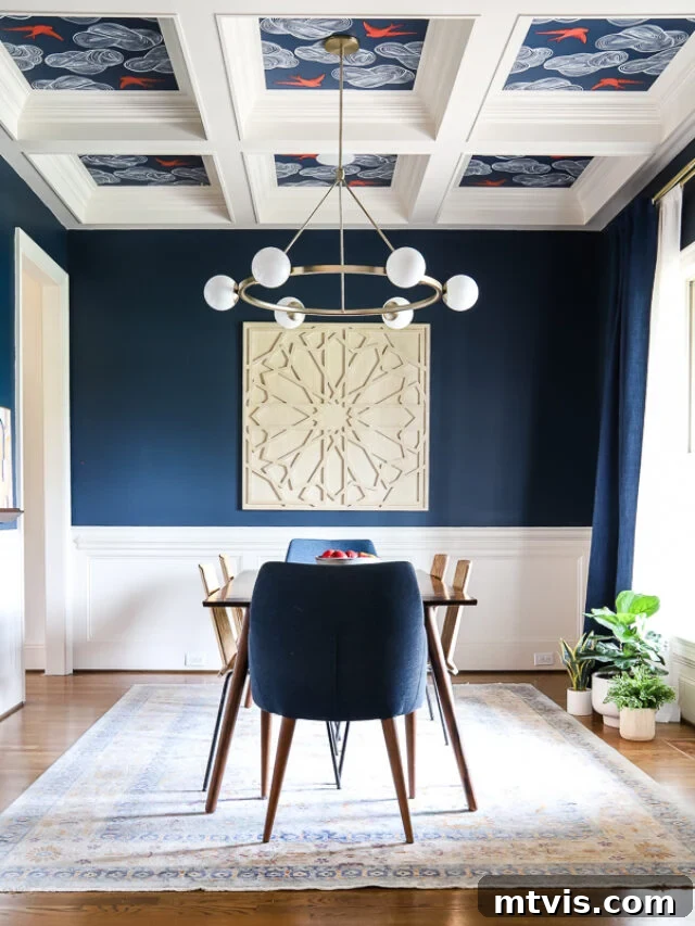
For those seeking a rich, true navy with significant depth, Sherwin-Williams’ Gale Force stands out as a top contender. When designing our own dining room, we rigorously tested various paint samples to find that perfect, profound navy that truly commands attention. Gale Force emerged as the clear winner, delivering a gorgeous, intense blue that infused the space with the exact level of depth and sophistication desired. Its vibrant yet grounded character makes it an excellent choice for areas where you want to make a bold, elegant statement, creating an inviting and visually striking environment.
Indigo Batik by Sherwin-Williams
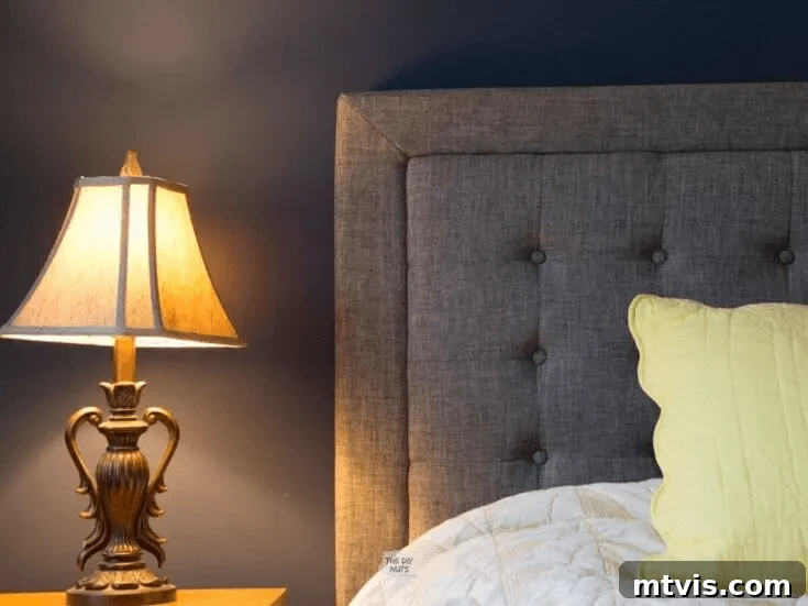
If you’re drawn to dark blue walls but feel a bit apprehensive about committing to the very darkest shades, Sherwin-Williams’ Indigo Batik offers a brilliant solution. This lighter navy provides ample contrast and a rich blue presence without feeling as overwhelmingly dramatic as some of its deeper counterparts. It’s a fantastic go-to for entire rooms, creating an enveloping atmosphere that is both serene and stylish. The versatility of Indigo Batik shines when paired with various textures and colors, such as the elegant gray of an upholstered headboard, demonstrating its ability to harmonize beautifully with other design elements while maintaining its distinct character.
Behr Navy Blue Paint Colors
Behr paints offer robust and captivating navy blue options that provide both style and durability. These colors are known for their strong pigments and ability to create impactful transformations in any space.
Ink Black by Behr
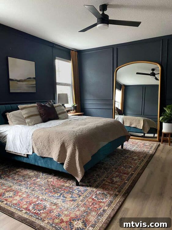
Despite its intriguing name, Behr’s Ink Black is, in fact, a deeply moody and sophisticated dark blue, not a true black. This color offers a subtle touch of gray, softening its intensity and adding a complex nuance that makes it incredibly appealing. It’s an excellent choice for those who appreciate the depth of dark blues but desire a hint of softness. Amanda brilliantly utilized Ink Black in her bedroom to cultivate a calming and serene environment, perfectly setting the mood for sleep and relaxation. Its rich, enveloping quality creates a tranquil retreat, proving that a deep blue-gray can be both dramatic and incredibly soothing, especially when paired with elegant accents like a giant gold mirror and neutral bedding.
Midnight in the Tropics by Behr
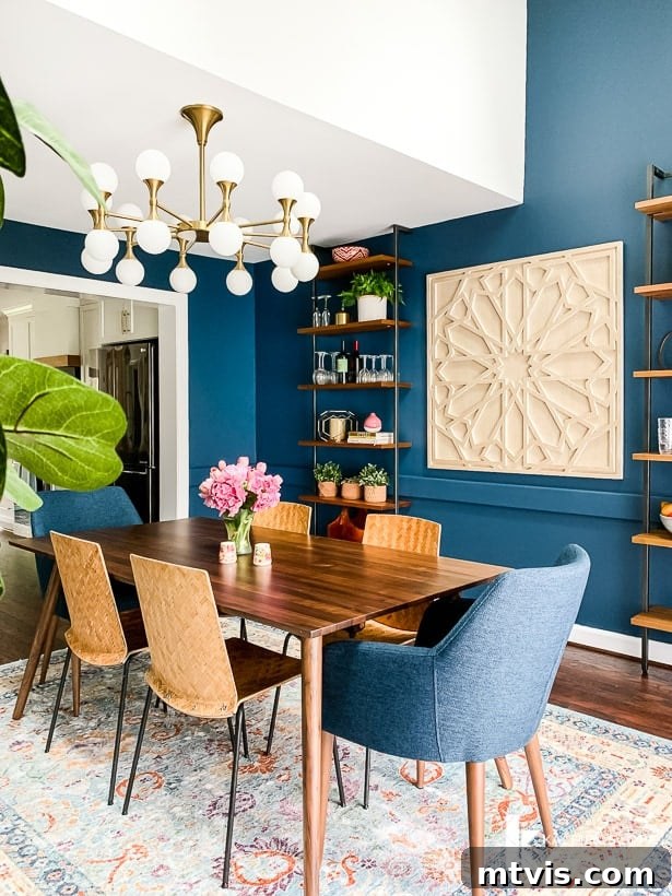
When embarking on a total kitchen renovation that opened into our dining room, we seized the opportunity to create the eclectic navy dining room of our dreams. Behr’s Midnight in the Tropics was the chosen shade for its captivating depth and a subtle, alluring hint of green undertone. This particular dark blue excelled in our space, appearing stunning in the natural light streaming through our windows and creating a striking contrast against crisp white trim. It’s a vibrant, deep blue that doesn’t feel overwhelming, bringing an exotic yet sophisticated touch that made our dining room truly unique and deeply cherished.
Other Dark Blue Paint Colors
Beyond the major brands, independent paint companies and specialty lines offer exceptional dark blue and navy shades that can provide unique character and designer flair to any space. These options often bring artisanal quality and distinctive depth.
Stiffkey Blue by Farrow and Ball
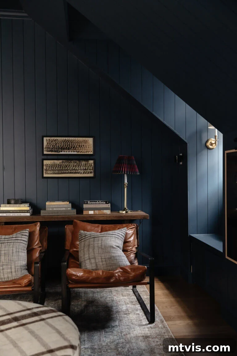
Farrow and Ball’s Stiffkey Blue is the epitome of dark and moody elegance. Chris Loves Julia boldly embraced this rich navy, painting not just the walls but also the trim and ceiling of their bonus room. This daring design choice profoundly enhanced the architectural details of the paneling, dormers, and window nooks, creating an immersive and cohesive environment. The result is a stunning space where the deep blue highlights textures and forms, proving that a monochrome approach with a rich, dark color can yield incredibly sophisticated and impactful results, especially when balanced with neutral furnishings and decor elements.
Blue Ridge Parkway by RomaBio Mineral Paints
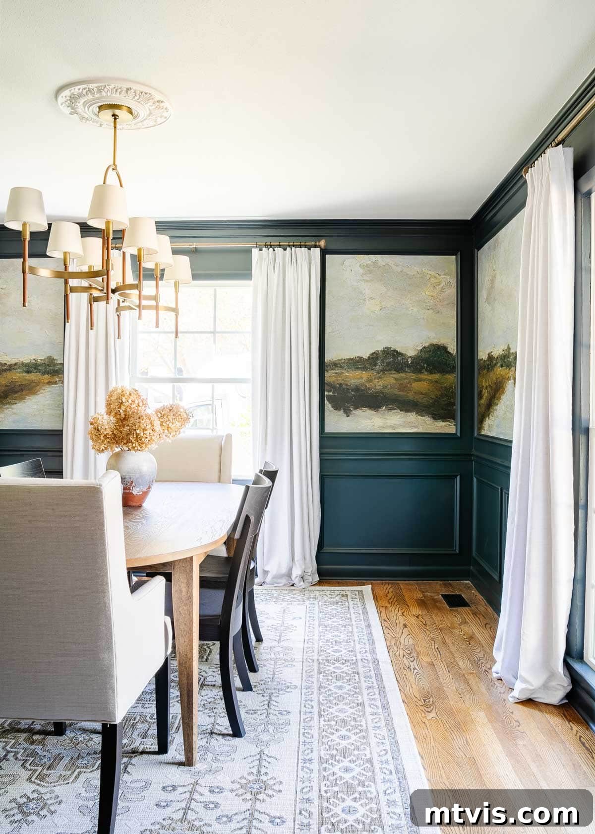
For those seeking an elevated and high-end designer aesthetic, RomaBio Mineral Paints’ Blue Ridge Parkway is an exceptional dark blue. Lauren’s dining room transformation beautifully showcases the power of this paint, combining it with peel-and-stick landscape murals and intricate molding. The synergy between the rich blue paint and the decorative elements creates a visually stunning and dramatic makeover. Blue Ridge Parkway provides a backdrop of elegant depth, allowing the mural to pop and the molding to stand out, culminating in a sophisticated and artful dining space that feels both grand and inviting.
Tips for Choosing Your Perfect Navy Blue Paint
Selecting the ideal navy blue requires careful consideration to ensure it harmonizes with your home’s unique characteristics. Each shade of navy blue, while inherently gorgeous, will react differently based on several factors. Here are some essential tips to guide your choice:
- Sample Extensively: This is perhaps the most crucial step. Never commit to a color based solely on a paint chip. Purchase samples and apply them to different walls within your chosen room. Observe how the color shifts throughout the day under varying natural light conditions and artificial lighting at night. The light source has a profound impact on how paint colors are perceived.
- Consider Undertones: Navy blues can have various undertones – gray, green, purple, or even a touch of black. These subtle nuances will influence how the color feels in your space and how it interacts with existing furnishings and finishes. For instance, a navy with green undertones might feel more earthy, while one with gray might feel softer.
- Assess Your Room’s Lighting: Rooms with abundant natural light can handle darker navies, which will still appear rich and vibrant. In rooms with less natural light, a very dark navy might feel too heavy or cave-like. In such cases, a lighter navy or one with brighter undertones might be more appropriate to prevent the space from feeling dim.
- Evaluate Room Size and Function: Darker navies can make large rooms feel more intimate and cozy. In smaller rooms, they can create a jewel-box effect, adding depth and sophistication. Consider the room’s purpose; a serene, deep navy is excellent for bedrooms, while a slightly brighter navy might be invigorating for an office or dining room.
- Coordinate with Existing Decor: Take into account your furniture, flooring, textiles, and artwork. Navy is incredibly versatile, but choosing a shade that complements your existing palette will ensure a cohesive and harmonious design. White trim offers a classic contrast, while cream or wood tones can soften the look.
To simplify the sampling process, consider using peel-and-stick samples like those from Samplize, which we found to be a total game-changer a few years ago. For more comprehensive advice, don’t miss our guide on How to Choose Paint Colors for Your Home: 6 Simple Tips to Follow! It’s packed with practical ideas to make selecting the perfect blue hues an enjoyable and effortless experience.
Creative Ways to Incorporate Navy Blue
The beauty of navy blue extends far beyond just painting your walls. Its incredible versatility means you can infuse this sophisticated hue into various elements of your home, creating visual interest and adding a touch of designer flair. Think outside the traditional decor box to discover exciting new applications for your favorite dark blue paint colors:
- Front Door: A navy blue front door makes a striking first impression, adding curb appeal and a sophisticated welcome to your home. It’s a timeless choice that stands out beautifully against lighter exteriors.
-
Kitchen Cabinets: For a modern and elegant kitchen, consider painting your kitchen cabinets navy blue. This creates a bold statement that pairs wonderfully with metallic hardware (gold, brass, or silver) and light countertops, offering a refreshing alternative to classic white or gray.
- Interior Doors: As seen in our old house where all interior doors were painted navy, this unexpected choice can dramatically elevate the look and feel of your home. It adds depth and character to hallways and transitions, turning functional elements into design statements.
- Accent Furniture: Give an old dresser, console table, or bookshelf a new lease on life with a coat of navy paint. This allows you to introduce the color in smaller doses and create unique focal points within a room.
- Trim and Moldings: While often painted white, painting your trim or crown molding in navy blue can create a dramatic, cohesive, and incredibly sophisticated look, especially when paired with lighter walls or even a darker, complementary wall color.
Navy blue truly is one of the most versatile colors in the design palette. By thoughtfully choosing the right shade and creatively incorporating it into your home, you can achieve a style and design that feels uniquely yours and effortlessly chic.
More Paint Posts
SEE ALL PAINT POSTS
-
The Best Neutral Paint Colors for Kitchen Cabinets
-
Benjamin Moore Swiss Coffee- Is it Right For You?
-
Samplize Peel & Stick Paint Samples: An Unbiased Review
-
Sherwin Williams Pure White SW7005 Paint Review With Pictures
-
Navy Blue Paint Colors Designers Love
-
Beautiful Blue Paint Colors Designers Love & Use
Other Posts You Will Enjoy:
- A Paint Sheen Guide & Reference Chart
- 5 Tips to Decorate With Color (Even When It Scares You)
- Sherwin-Williams Pure White Color Review with Pictures
- Best Furniture Painting Secrets
- Benjamin Moore Swiss Coffee- Is it Right For You?
- How to Match A Paint Color That’s Already On A Wall
Wondering how I approach transforming rooms and spaces in our home? Check out Designer in a Binder®.
And if you want exclusive content and behind-the-scenes sneak peeks, be sure to subscribe before you head out!