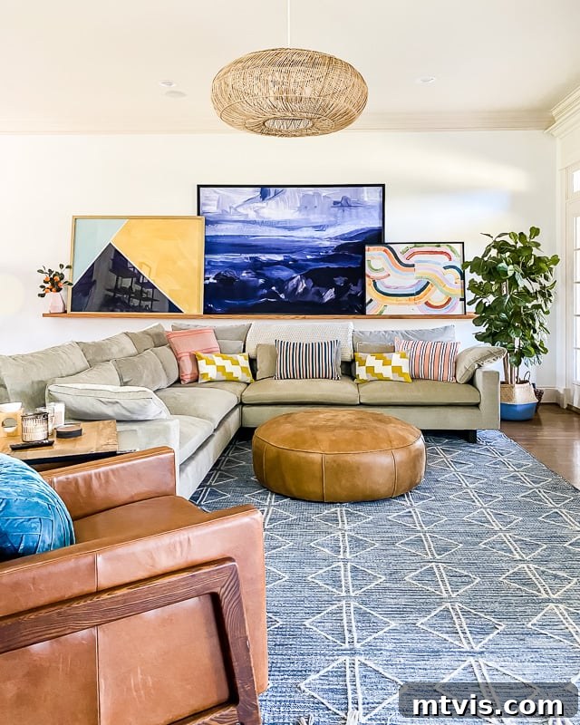
Transitioning from a soothing palette of neutrals to embracing bright colors or even subtle pastels can feel like a significant leap. For those accustomed to the understated elegance of whites, beiges, and greys, the thought of introducing vibrant hues into your living space might seem daunting. Yet, this step holds the immense potential to transform your home into a more dynamic, personal, and joyful sanctuary.
Many homeowners dream of a more colorful abode but are hesitant to take the plunge. They fear making costly mistakes, creating an unbalanced look, or simply choosing colors they might quickly tire of. This article aims to dispel those fears by offering practical, confidence-boosting strategies. We’ll explore how to seamlessly blend captivating colors into your existing neutral home, ensuring your space maintains the harmony and balance you originally sought, while gaining a fresh, energetic vibe. You’ll learn how to experiment with color without breaking the bank or committing to permanent changes.
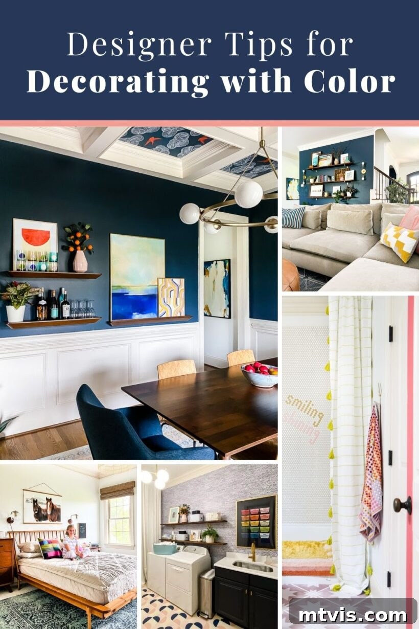
If you’ve followed my blog or Instagram for a while, you know I have a deep passion for decorating with vibrant pops of color. I certainly don’t shy away from incorporating bold hues into my home decor! However, I’ve also noticed a common thread among my audience: many are drawn to the allure of colorful rugs and lively gallery walls, but still hesitate to integrate such vibrancy into their own living spaces.
I frequently receive comments like, “I adore the color in your home; I wish I were brave enough to decorate with color,” and questions such as, “Do you have any tips for decorating with bright colors? I love them but I’m terrified to commit!” This recurring feedback highlighted a clear need for practical, low-risk advice. That’s why I’ve compiled this comprehensive guide on how you can confidently experiment with color in your home without a significant financial outlay or permanent alterations. These strategies are designed to make the journey into colorful decor less intimidating and far more enjoyable, allowing you to gradually build confidence and find your unique colorful style.
This post contains affiliate links for your convenience. Click here for my full disclosure policy.
6 Tips for Decorating With Color Fearlessly
Embracing color in your home decor is much like learning any new skill; it takes a little practice to master. The more you experiment, the more intuitive and confident you’ll become in mixing and matching hues. The beauty of the tips I’m about to share lies in their inherent flexibility and affordability. You can implement them without feeling overwhelmed or financially burdened. This low-stakes approach means that if, after some experimentation, you decide that neutral decor or even a monochromatic scheme is truly your preference, you won’t feel trapped by your choices because you haven’t invested a fortune in them. It’s all about exploring and discovering what truly resonates with your personal style, allowing your home to evolve with you.
Tip 1: Embrace Colorful Artwork
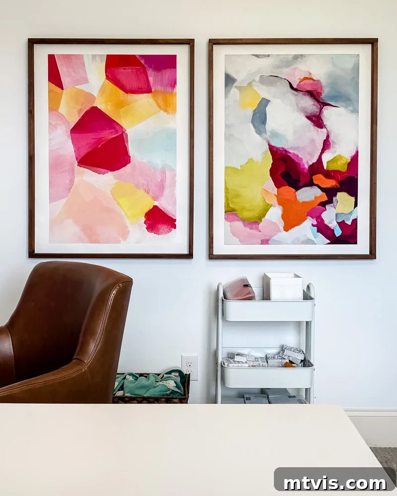
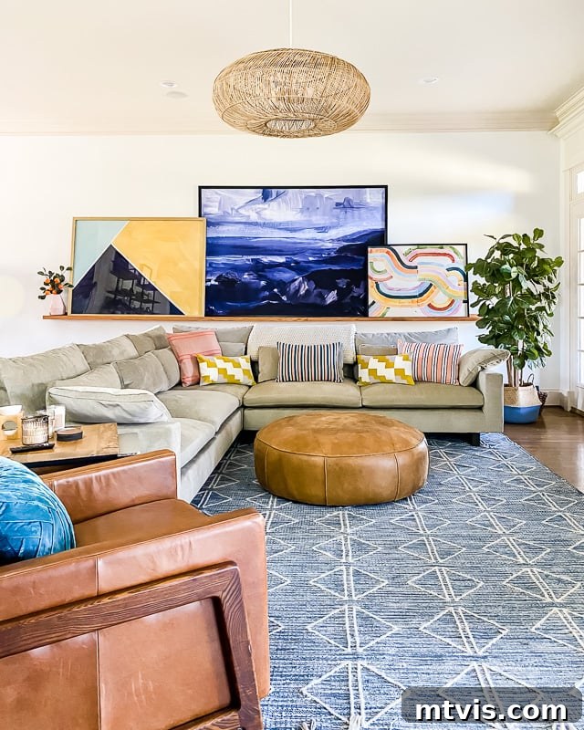
Despite my deep love for color, you might notice that most walls in my home are painted Pure White by Sherwin-Williams. This isn’t a contradiction; rather, it’s a strategic choice. I absolutely love how vibrant artwork truly *pops* against a clean, crisp white backdrop. A significant portion of the color that enlivens our home comes directly from the captivating art adorning our walls, turning them into dynamic focal points.
If you’re just beginning your venture into the world of colorful decor, the idea of splurging on expensive artwork can understandably be daunting. Fortunately, there are countless cost-effective ways to incorporate stunning, colorful pieces into your home. I frequently source affordable posters and art prints from popular online retailers such as Minted and Society6. For unique and vibrant options, I even design and offer colorful art prints in my own Kaleidoscope Living shop, making distinctive art accessible to everyone.
Beyond traditional prints, I encourage you to think creatively about what constitutes “art.” For instance, two striking pieces in the gallery wall gracing our bedroom are actually repurposed throw pillow covers, each purchased for a mere $10 and simply framed! This innovative approach shows that beauty and color don’t always come with a high price tag. By reframing everyday items, you can create truly personalized and budget-friendly decor.
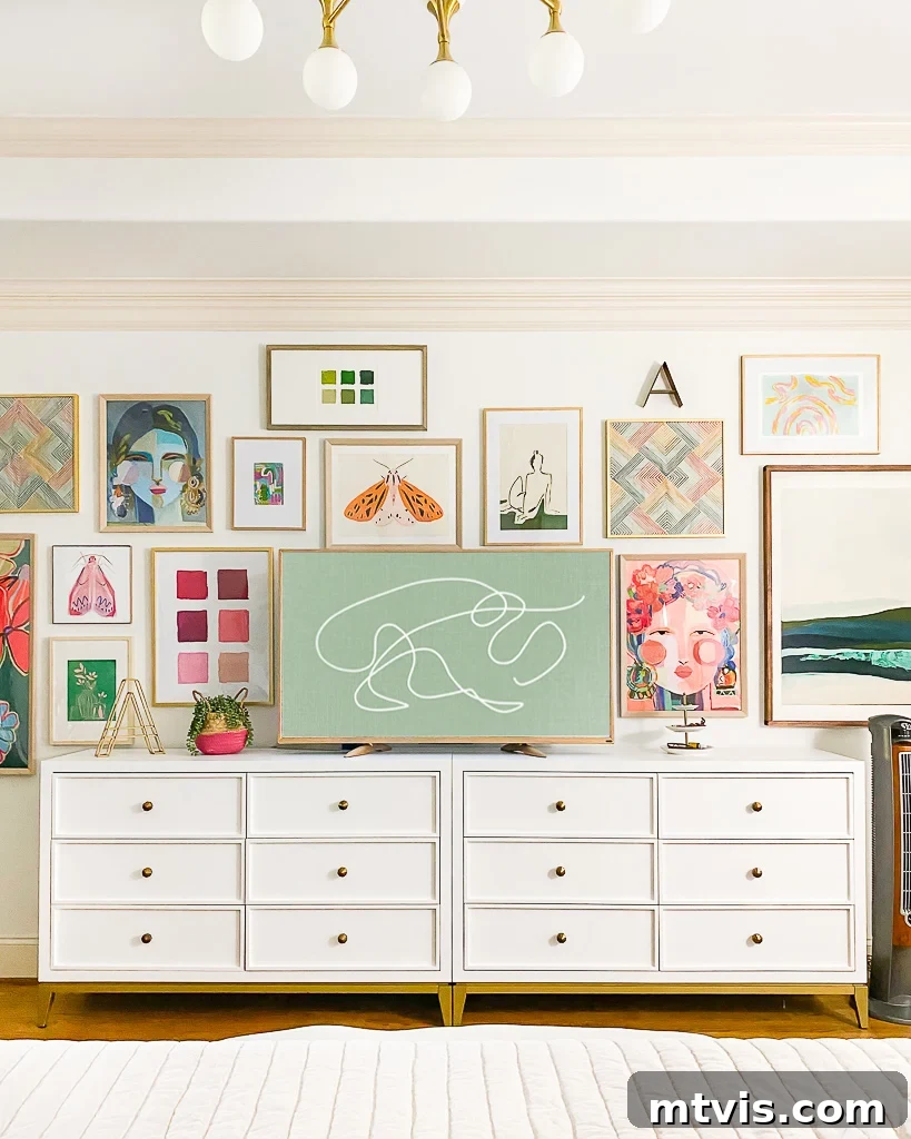
To achieve impactful large-scale art while adhering to a budget, consider having digital prints produced as engineering prints at an office supply store. These can cost less than $10 each! Simply pop them into inexpensive frames for a dramatic effect in any room. Furthermore, you can significantly stretch your art budget by crafting your own frames. My family and I almost always build our own DIY picture frames for under $20 each. This is an ideal method for experimenting with colorful artwork and making a grand statement without the grand expense, proving that artistic expression in your home is truly within reach.
Tip 2: Add Pops with Colorful Throw Pillows
Another wonderfully straightforward and budget-friendly method for infusing color into your decor is through the strategic use of colorful throw pillows. These decorative accents are relatively inexpensive and incredibly versatile, making them perfect for those who are hesitant about committing to bright colors. If you’re curious how a splash of vibrancy would feel in your predominantly neutral space, simply introduce a few colorful throw pillows into the mix and observe the immediate transformation and your reaction to it! This low-commitment approach allows for easy experimentation and swift changes if your preferences evolve.
Even for color enthusiasts like myself, it’s essential to balance vibrant hues with grounding neutrals. Consider our family room, for instance. We opted for our West Elm Harmony sectional sofa in a timeless, neutral shade. The vivid throw pillows provide the energetic burst of color I desire, without the significant financial commitment of a boldly colored sofa that I might eventually grow tired of. If my color preferences evolve, changing out the throw pillows is a simple, affordable solution that offers instant rejuvenation and a fresh look for the entire room.
This approach beautifully illustrates how an otherwise neutral room can come alive with color, primarily through elements like carefully chosen artwork displayed on our DIY art ledge and, of course, the ever-adaptable throw pillows. Together, they create layers of interest and personality that are both inviting and easy to update.
Tip 3: Experiment with Wallpaper in Small Spaces
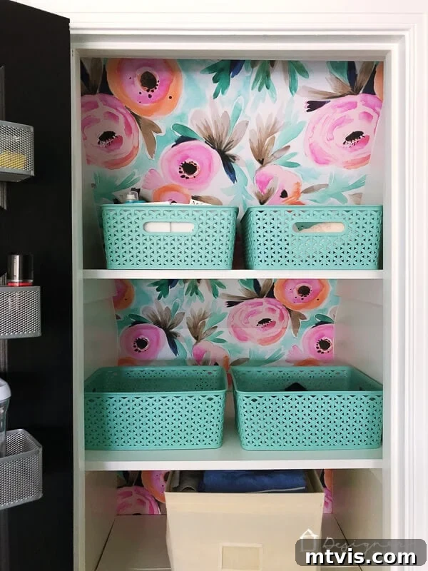
Wallpaper, with its myriad patterns and colors, stands out as one of the most impactful ways to introduce significant color and visual interest into a space. This might come as a surprise, but I once harbored a genuine fear of wallpaper. The thought of adorning an entire wall or room with a bold, colorful pattern felt incredibly overwhelming. However, I discovered that the apprehension diminishes dramatically when you apply it to a smaller, less committal area, such as a closet or a powder room. These hidden gems are perfect canvases for bold design choices without the pressure of being on constant display.
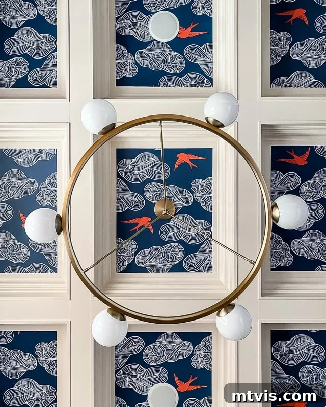
My very first wallpapering project was our linen closet. I specifically chose removable wallpaper, which offered the reassurance that it could be easily taken down if we didn’t like it. The small scale of the project also meant it didn’t cost a fortune, minimizing any financial risk. As it turned out, we absolutely adored the result, and this tiny triumph gave me the confidence needed to tackle more prominent areas of our home, including the dining room ceiling! This step-by-step approach proves that even the most timid decorators can find their adventurous side.
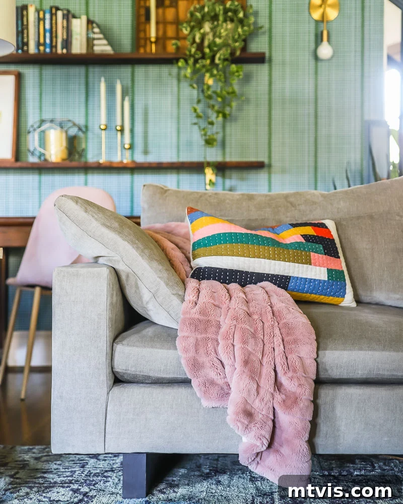
Remarkably, I still haven’t wallpapered an entire room! Instead, I opted to wallpaper the staircase wall that forms the backdrop for our family room using this ingenious DIY renter-friendly wallpaper method. This ensures we can easily remove it whenever we desire, making it perfect for those who like to frequently refresh their decor. It’s a relatively small area and the sole wall in our family room not painted plain white, yet I absolutely love the vibrant color and captivating pattern it introduces into the space, making a bold statement without overwhelming the room. This targeted application demonstrates how even a single accent wall can dramatically alter a room’s aesthetic.
Tip 4: Discover Colors That Act as Neutrals
While classic neutrals like white, grey, and greige are widely recognized for their versatility, some colors possess a remarkable ability to function as neutrals within your home decor. Blues and greens, in particular, often fall into this category, offering a grounding and harmonious foundation without the starkness of traditional neutrals. These nature-inspired hues bring a sense of calm and continuity, much like the elements they mimic.
I wholeheartedly embrace blue as a neutral in my own home. Many might initially question, “How can blue be neutral? It’s not like beige or gray!” But consider the natural world and everyday fashion: Jeans, a staple in almost every wardrobe, effortlessly complement nearly every other color, don’t they? Similarly, the expansive blue sky and lush green grass provide a breathtaking backdrop for all the diverse colors we encounter in nature. These colors offer a sense of calm and ubiquity that allows other hues to shine without clashing.
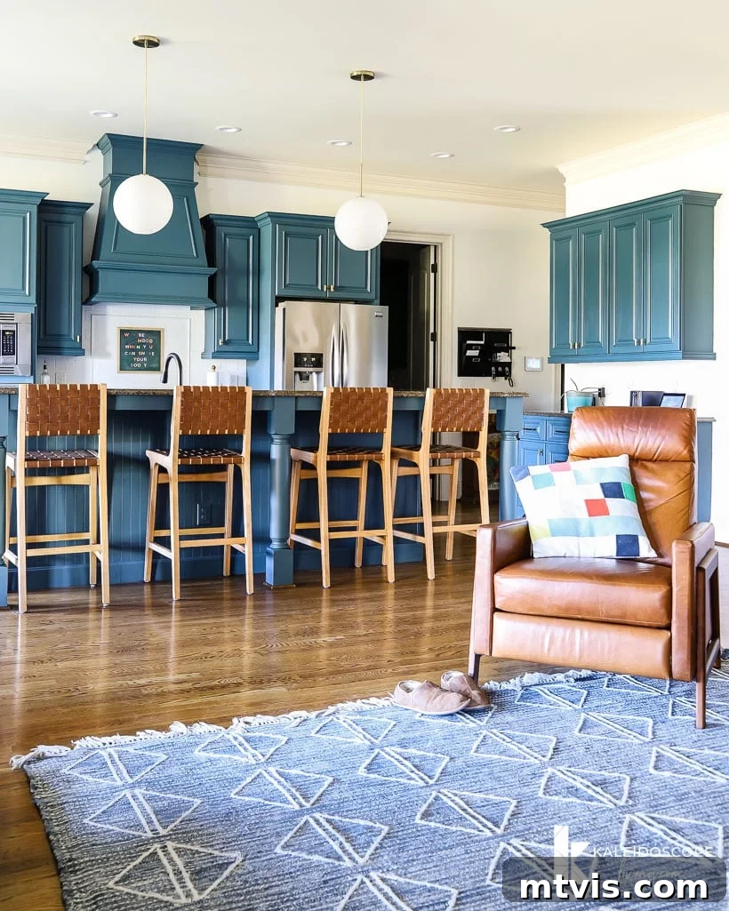
If the intensity of bright colors makes you apprehensive about decorating with a full spectrum, begin by experimenting with the calming blues and greens found in nature. You might discover that these shades feel inherently “neutral” and surprisingly un-intimidating, offering a gentle entry point into colorful decor. For instance, I painted our kitchen cabinets a beautiful blue-green color, and to me, they feel perfectly neutral, providing a serene backdrop that allows other colorful elements, from dishware to accessories, to pop with effortless charm.
Tip 5: Harness the Power of Colorful Rugs
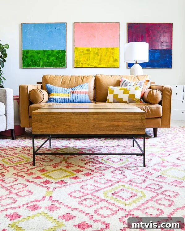
Never underestimate the transformative power of a well-chosen rug. Area rugs are incredibly effective at grounding a space, defining zones, and, most importantly, injecting significant color and pattern without requiring any permanent changes to your walls or furniture. They are like large-scale artwork for your floor, capable of setting the entire mood and style of a room. We have incorporated many different colorful rugs throughout our home, and each one unequivocally makes a distinct statement, acting as a focal point and a source of personality.
The good news is that rugs have become significantly more affordable in recent years, making them an accessible way to introduce a burst of color without a substantial investment. This means you can experiment with different styles and palettes without commitment anxiety, easily swapping them out if your taste changes. The vibrant rug you see below, gracing our bonus room, is undeniably the star of the show. Its lively pattern and rich colors tie the entire space together, demonstrating how a single element can profoundly influence a room’s aesthetic and mood, making it feel complete and cohesive.
Tip 6: Leverage Colorful Textiles and Decorative Objects
When it comes to adding color to your home on a budget and with minimal commitment, colorful textiles and decorative objects are your absolute best friends. Small, easily interchangeable items like kitchen towels, placemats, throw blankets, and tablecloths can make a surprisingly big impact. These elements allow you to introduce seasonal color changes or experiment with different palettes without a large investment. Excellent places to discover inexpensive yet stylish textiles include popular retailers like Target, Wayfair, Amazon, and World Market, where you can find a vast array of options to suit any palette.
For those feeling a bit more adventurous, consider DIY projects. The delightful DIY tassel curtains featured in my daughter’s room, for example, began as simple, plain white IKEA curtains and were incredibly easy to customize with a burst of color. There are countless simple ways to create DIY curtains that look expensive and introduce a wonderful burst of color, allowing for a truly personalized touch that reflects your unique style and creativity.
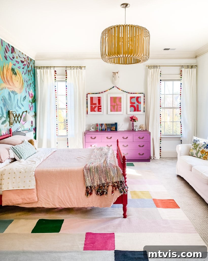
Beyond textiles, colorful canisters, vases, and other decorative objects offer another fun and low-risk avenue for adding splashes of color. These small accents can be strategically placed on shelves, coffee tables, or countertops to break up neutral areas and draw the eye. The vibrant canisters you see adorning the blue dresser in our home coffee bar area have been cherished for almost 10 years and still bring me joy. They prove that lasting style doesn’t require constant change, just thoughtful selection of pieces that resonate with you.
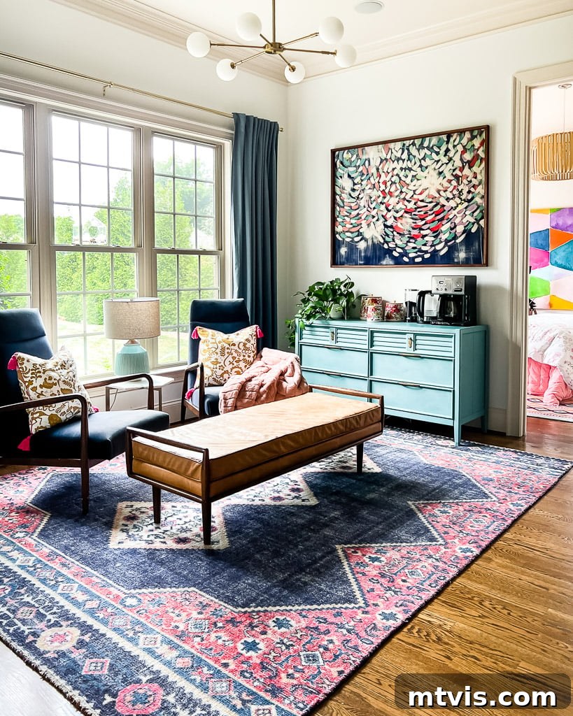
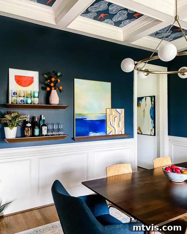
Our navy blue dining room is one of the few spaces in our home that doesn’t feature white walls. However, as previously mentioned, I treat this sophisticated navy blue as a neutral backdrop, allowing other elements to truly pop. Here, a delicate light pink vase holding a faux orange blossom branch introduces a surprising, yet harmonious, pop of color despite its small size. Similarly, the collection of colored glass barware adds another layer of vibrant personality, demonstrating how even minor elements can significantly enhance a room’s colorful narrative and overall design aesthetic.
It’s important to remember that my home is currently brimming with color because I’ve had *years of experimenting* and gradually building up my collection and confidence. Your personal journey of integrating color into your home will likely take time, and that’s perfectly normal and expected—mine certainly did! The most crucial step is to start small and observe how you feel as you introduce modest doses of color into your living environment. If you find yourself loving the new vibrancy, gradually layer in more color over time, adjusting until your home feels absolutely perfect to you. After all, you are the one living in your space, so as long as you adore it, who cares what anyone else thinks? Embrace your unique style and let your home reflect your personality joyfully.
So, there you have it! I sincerely hope the insights and practical tips shared in this post make the prospect of decorating with color feel considerably less intimidating and far more achievable for you. By following these accessible strategies, you’ll be well on your way to taking confident, small steps toward creating a home you deeply love—a space filled with precisely as much or as little color as brings you immense joy and reflects your unique personality. Start your colorful journey today and watch your home transform!
Explore More Interior Design Wisdom
SEE ALL design & decorating posts
-
6 Tips for Decorating With Color When You Are Used to Neutrals
-
Space Planning Basics: How to Create a Space Plan
-
The Dos and Don’ts of Using Area Rugs on Carpet
-
How To Make a Mood Board: A Step-By-Step Guide
-
How to Choose Paint Colors for Your Home: 5 Simple Tips to Follow
-
Interior Trim Color Ideas (That Aren’t White)
Other posts you may enjoy:
- How to Choose Paint Colors for Your Home
- How to Choose the Perfect Paint Sheen
Curious about my approach to transforming rooms and spaces in our home? Explore Designer in a Binder® for an affordable and simple way to decorate your home.
For exclusive content and behind-the-scenes sneak peeks, be sure to subscribe before you leave!