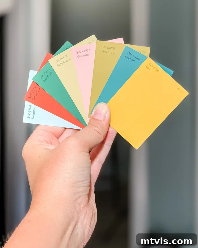
Without a doubt, one of the most common questions I get from readers is, “How do I pick paint colors for my home? I am so overwhelmed. I don’t even know where to start!” If that’s how you feel, let me assure you that you aren’t alone. I have been there myself, navigating the vast sea of color swatches and making my fair share of painting mistakes.
I wish I could tell you that I’ve always been an expert at choosing paint colors. But oh, the stories I could tell you about paint color blunders over the years! Fun fact: I painted the kitchen of the first home we bought (way back in 2003) THREE different times because I kept picking the wrong shade. It was a frustrating and costly learning experience!
I have learned so much about choosing the perfect paint colors since then, and now I feel confident in my choices every time. This expertise comes only from learning through all my mistakes and experiences over the past two decades. Read on for all my best designer tips to keep in mind when choosing paint colors, ensuring you make informed decisions and create a home you love.
Table of Contents
How to Choose Paint Colors for Your Home: 5 Easy Designer Tips
Tip #1: NEVER choose your interior paint colors first–let your “crucial element” guide you.
The biggest mistake I see people make is trying to choose a paint color BEFORE making any other design decisions for a space. While painting your walls is one of the most impactful ways to transform a room, rushing to the paint store can lead to endless frustration. It’s far easier to select a paint color that complements an existing design plan than to build an entire room’s aesthetic around a pre-selected wall color.
I go through this principle in depth in my interior design system, Designer in a Binder®. But here’s the short version. I recommend that everyone always start any room design by choosing something I call a “crucial element.”
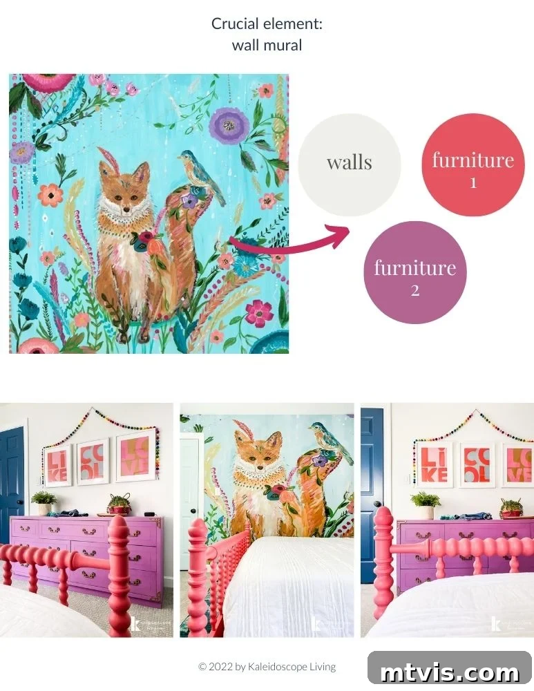
A crucial element serves as your primary inspiration for your entire design. Ideally, it will feature several colors, providing a ready-made palette. This could be a beloved rug, a significant piece of art, a vibrant throw pillow, a unique fabric, or even a cherished piece of furniture. Your crucial element should be that ONE THING you absolutely adore and must have in the room, setting the tone and guiding all subsequent choices. To visualize this, I also recommend putting together a digital mood board that clearly showcases your crucial element.
Why is this so effective? Because once you’ve chosen your crucial element, its inherent color palette will naturally guide your paint color choice(s) for the space. The hard work of combining colors harmoniously has already been done for you by the artist or designer of that element!
If you prefer neutrals for your wall color, look to the pattern’s whites, grays, or beiges. If you’re eager to introduce a pop of color, select one of the accent hues present in your crucial element. This approach ensures your wall color integrates seamlessly into the overall room design.
Let me give you a concrete example. Below you can see how the crucial element (the colorful wall mural) in Attley’s old bedroom enabled me to easily choose a complementary paint color for her walls (by referencing the neutrals within the mural) and select coordinating furniture. A crucial element actually helps establish a design far beyond just choosing paint colors, which is something I teach extensively in Designer in a Binder®.
Tip #2: Understand how to read and interpret paint swatches.
Paint color chips can be incredibly confusing, right? They’re tiny squares that don’t always translate accurately to a full wall. Here’s what you need to know to decipher them effectively.
The most important part of any paint swatch, particularly those with multiple shades on one card, are the darkest hues. Why? Because the darkest hue will give you the clearest idea of the true color undertones that will be present, even in a lighter shade, once it’s on your wall. These undertones are often less obvious in the tiny, lighter samples.
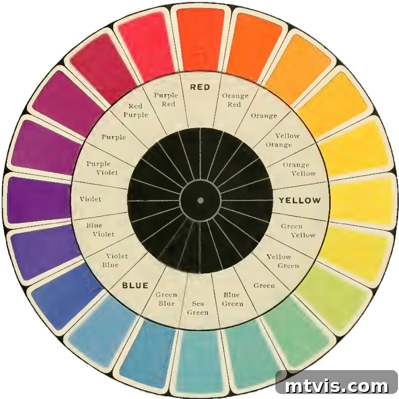
What exactly is a paint undertone? I’m so glad you asked! Undertones are subtle colors that emerge when more than one pigment is combined in a paint formula. The dominant color (the one you immediately see, like “blue” or “gray”) is the overtone. The undertone is the secondary color you might not consciously notice until it’s on a large surface or next to other colors. Undertones can be either warm (think subtle reds, oranges, or yellows) or cool (think blues, greens, or purples). Understanding the difference is crucial, as illustrated by the color wheel below.
The undertone of a paint color can truly make or break a design! For instance, if you choose a “neutral” paint color that has a prominent warm undertone (like a beige with yellow notes) but all your furniture, textiles, and crucial elements have cool undertones (like blues or grays), the two will clash, making your walls look out of place or even “dirty.”
The problem is that most people don’t know how to identify the undertone of a paint color. But it’s actually quite simple to tell and should be a critical consideration every single time you choose a paint color.
See how in the photo below, all of the lightest hues on the paint swatch cards look relatively similar? They are similar enough that it would be challenging to confidently choose between those three light pink colors, right?
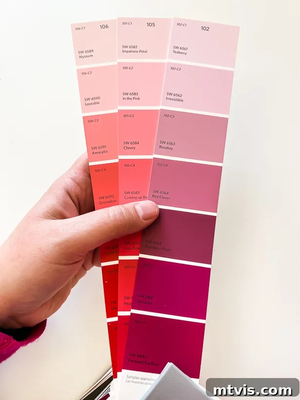
But now, look closely at the darkest hues on those same swatches…
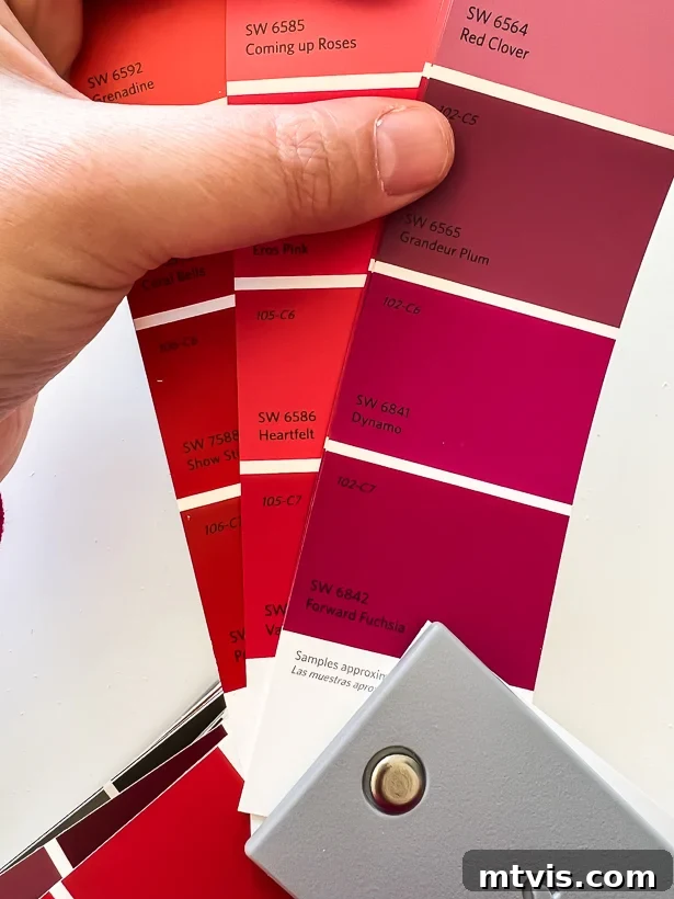
When you focus on the darker color hues on the cards, chances are you’ll think, “There’s NO WAY I would paint that on my walls!” about some of them. If you have such a strong negative reaction to the darkest hue on a card, do not use any of the hues on that same card. Trust me. Once lighter hues are painted on a large wall, the true undertones, which are most visible in the darker hues, will show up more prominently, and you won’t like the result.
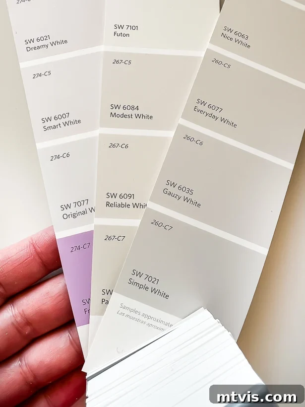
You also need to be very careful with undertones in neutral colors, especially when picking a white wall color. Just look at the darkest hues on these paint chips of white colors! Do you see how distinctly purple the undertone of the darkest hue on the paint swatch on the left is?! You would probably never choose that specific purple color for your walls, so I would advise avoiding all colors on that same paint swatch, even the lightest whites.
And there’s something else you need to know about reading paint chips! Each color swatch provides the Light Reflectance Value (LRV) of the color. The LRV is typically printed on the back of the paint chip (see an example below).
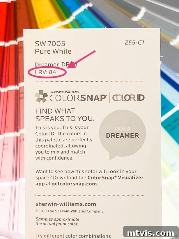
Here’s what to keep in mind about LRV and why it matters for your home’s ambiance:
- The higher the LRV number (ranging from 0 to 100), the lighter the color. Conversely, the lower the LRV number, the darker the color.
- Colors with an LRV above 50 are considered lighter and will bounce back more light than they absorb. These colors are excellent for creating a bright, open, and airy feel in a room, making small spaces appear larger and more inviting.
- Colors with an LRV lower than 50 will soak up more light than they reflect. These shades are perfect for achieving a dark, cozy, and moody atmosphere, ideal for spaces where you want to foster relaxation or intimacy.
- Want to make a space feel like it has more natural light? Pick a color with a high LRV to maximize light reflection.
- Want to make a space feel moody and cozy, perfect for a library or a dramatic bedroom? Pick a color with a low LRV to absorb light and create depth.
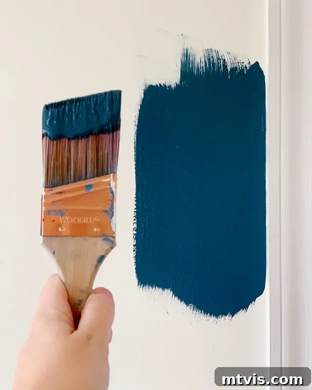
Tip #3: Test paint color samples in your home!
I promise you that even if you absolutely LOVE a paint color in someone else’s home, or even in a picture online, you may not like it in your own home! The unique lighting conditions of your space are paramount. Even if you are considering colors that look very similar, I strongly recommend getting samples of each and painting sample squares of EACH color on at least two different walls in the same room. Paint colors can look drastically different depending upon how the light hits them throughout the day, so you want to be thorough with this step. Be sure to observe how the samples look at different times of the day (morning, noon, evening) and in various kinds of light (natural daylight, overhead artificial light on/off, lamps on/off, etc.). After living with the samples on your wall for a couple of days and observing them under all these lighting scenarios, you’ll be much more confident in making your final selection and painting your room.
If you are considering the same paint color for adjacent rooms (perhaps because they each have a crucial element that shares the same color you are pulling out for your paint color), be sure to test paint samples in all the rooms. The paint colors will be significantly affected by the type of natural light each room receives! South-facing rooms tend to have warmer, often yellow-toned light filtering into them, which can make colors appear a bit softer or more yellow than they truly are. North-facing rooms generally have cooler, often blue or gray-toned light filtering into them, which can make colors seem more crisp or even slightly blue/gray.
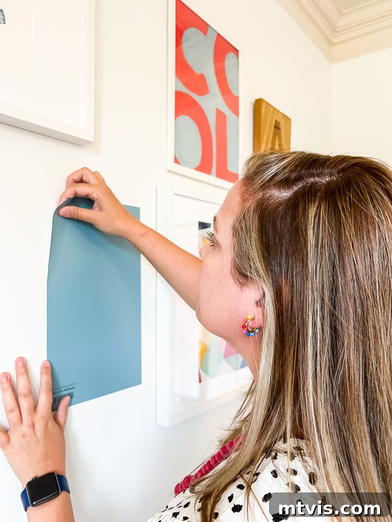
I highly recommend ordering peel-and-stick samples from Samplize! It’s a much more economical and far easier solution than buying a bunch of paint cans and painting squares directly on your wall (or on paper to then tape on your wall). I also love that you can reposition them effortlessly—it makes it super easy to try a color on different walls or in various rooms without commitment. You can even cut them in half to test on multiple surfaces if you prefer. Samplize offers paint samples for popular brands like Sherwin-Williams, Farrow & Ball, Benjamin Moore, and PPG (which you can find at Home Depot). Most importantly, these are actual paint samples, not merely printed paint chips, which are far less accurate in representing true color.
Tip #4: Match the color to the feeling you want to have in the room.
Colors have a profound impact on your mood, emotions, and the overall energy you experience when you are in a space. This isn’t just anecdotal; there’s an entire field of study dedicated to the psychology of color! For example, shades of blue and green tend to have a calming and serene effect, making them ideal for bedrooms or bathrooms, while reds, yellows, and oranges tend to be more energizing and stimulating, often preferred for dining rooms or creative spaces.
In general, warm colors (found on the right side of the color wheel, like reds, oranges, and yellows) will feel inviting, comforting, and can even stimulate conversation and appetite. On the other hand, cool colors (on the left side of the color wheel, such as blues, greens, and purples) generally evoke a sense of calm, relaxation, and spaciousness. Consider the primary function of the room and the desired emotional response when selecting your palette.
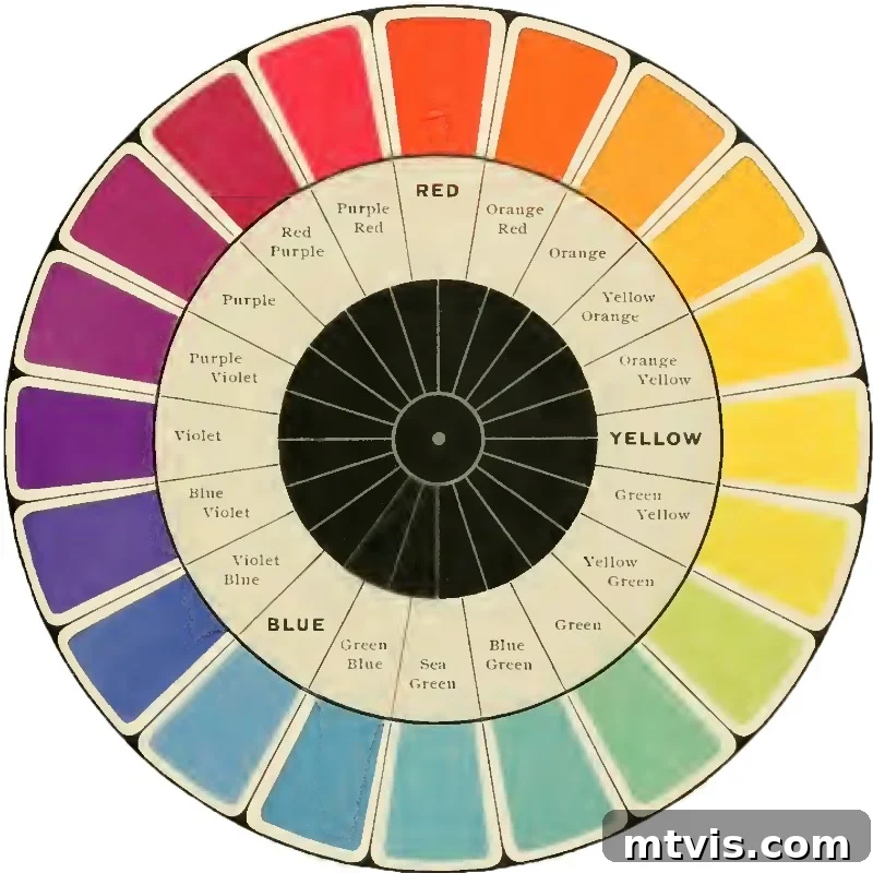
Here’s a general breakdown of how individual colors typically affect moods and emotions:
- Red– Energizes, excites, and stimulates passion. Great for dining rooms or accents.
- Orange– Stimulates enthusiasm, encourages socializing, and adds warmth. Consider for creative spaces or family rooms.
- Yellow– Boosts enthusiasm, happiness, and optimism. Excellent for kitchens or areas needing a cheerful lift.
- Green– Balances, evokes feelings of safety, stability, and harmony, connecting us to nature. Ideal for bedrooms, living rooms, or home offices.
- Blue– Reduces stress, creates calmness, serenity, and a sense of order. Perfect for bedrooms, bathrooms, or quiet study areas.
- Purple– Uplifts, encourages creativity, luxury, and spirituality. Suitable for creative studios, bedrooms, or accent walls.
- Pink– Increases pulse, motivates action (in vibrant shades), and conveys softness or romance (in pastel shades). Often used in bedrooms or nurseries.
- Gray– Creates a sense of composure, sophistication, and modernity. Can depress energy if too stark; best when balanced with warmer tones.
- Tan/Beige– Stabilizes, suppresses extreme emotions, and provides a classic, versatile backdrop. A safe choice for almost any room.
- Black– Empowers, evokes a sense of sophistication, elegance, and drama. Best used as an accent or in very well-lit, bold spaces.
Remember, how color affects you is highly personal and can vary greatly from person to person! If you aren’t sure how certain colors make you feel, pay attention to the colors you wear most often. Chances are you choose those colors because you like how you feel when you are in them. So, let your wardrobe be a subtle guide if you’re uncertain about your preferred color palette.
Tip #5: Pay attention to the sheen of your paint.
Believe it or not, the sheen (or finish) that you choose for your paint will significantly impact how the color looks in your space. If you painted half of a wall in flat paint and the other half of the same wall in the exact same color but with a gloss or semi-gloss finish, you might genuinely believe they are two entirely different paint colors. Crazy, huh? This is because different sheens reflect light differently. I’ve written an entire post about how to choose the right paint sheen, covering all the crucial things you should consider.
For the purpose of picking a wall color, do your best to test samples in the specific sheen you are considering for your final application. Most paint stores only offer small samples in eggshell or satin finishes, as these are the most common for interior walls. However, if you want to be absolutely certain about your choice, especially if you’re opting for a flat, semi-gloss, or high-gloss finish, you may want to buy a quart in the exact finish you are wanting to sample on your own walls. This extra step ensures there are no surprises once the full painting project is underway, as the sheen affects both the color’s appearance and the paint’s durability and cleanability.
Frequently Asked Questions About Picking Paint Colors
Only if you want to and if that aligns with your design vision! While a single color can create a seamless flow, I generally recommend aiming for about 3 to 5 total paint colors throughout your home, including whatever color you choose for your interior trim and doors. This allows for variety and definition between spaces without feeling chaotic. I even have a whole post dedicated to interior trim ideas that aren’t just white, encouraging bolder choices.
As mentioned, I suggest a total of 3 to 5 interior paint colors for a cohesive yet dynamic look. These typically consist of the following:
1) A foundational neutral for your trim and ceilings. Most homeowners opt for some shade of white for their ceilings and trim due to its versatility and crispness. In our current house, we’ve chosen a slightly contrasting neutral for trim and ceilings, but it’s still technically a “white”—specifically, Divine White by Sherwin-Williams. This provides a soft, warm boundary to our wall colors.
2) A primary neutral wall color. This can be a versatile tan, a sophisticated gray, or even a beautiful blue (yes, beautiful blue paint colors can absolutely function as neutrals—think how jeans go with everything!). This foundational color helps tie everything together in your home and is an excellent default for connecting spaces like hallways, where you might not have a strong crucial element. We’ve used Pure White by Sherwin-Williams in most of the rooms of our current home (Sherwin-Williams Alabaster and Benjamin Moore Swiss Coffee are also popular white paint choices). You can see it in our entryway below. We love it as a bright, neutral backdrop for the vibrant pops of color we introduce with colorful artwork and decor.
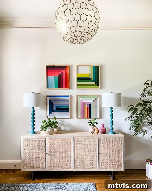
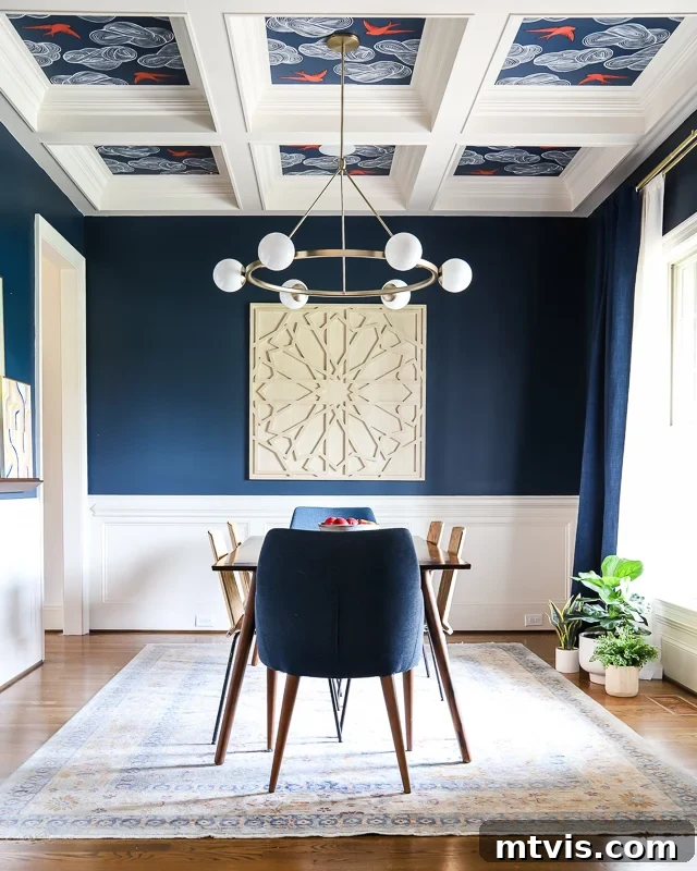
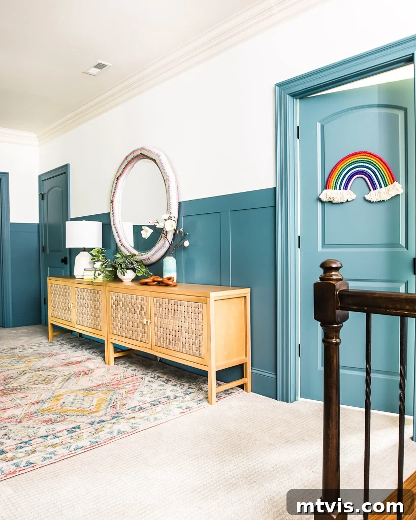
3) No more than three additional accent colors. These are the bold, intentional colors that add personality and distinction to specific rooms. So far in this house, we’ve only used 2 other wall colors. We painted our dining room a dramatic dark navy blue, specifically Gale Force by Sherwin-Williams, creating an elegant and intimate atmosphere. Additionally, we painted the DIY board and batten accent wall in our upstairs hallway with Refuge by Sherwin-Williams, adding a touch of sophisticated character.
I hope these comprehensive tips for picking paint colors have you feeling more confident and less overwhelmed as you embark on your next home transformation project!
More Paint Posts
SEE ALL PAINT POSTS
-
9 Life-Changing Painting Hacks Everyone Should Know
-
How Durable are DIY Painted Kitchen Cabinets?
-
How to Paint Kitchen Cabinets (From a DIYer Who Has Done it 3 Times)
-
How Have Our Painted Countertops Held Up?
-
The Best Neutral Paint Colors for Kitchen Cabinets
-
How to Paint IKEA Furniture and Mistakes to Avoid
-
Benjamin Moore Swiss Coffee- Is it Right For You?
-
How Much Paint Do I Need for My Room?
-
How to Touch Up Wall Paint
Wondering how I approach transforming rooms and spaces in our home for a cohesive, beautiful result? Check out my comprehensive system, Designer in a Binder®.
And if you want exclusive content, behind-the-scenes sneak peeks, and more design inspiration delivered straight to your inbox, be sure to subscribe before you head out!