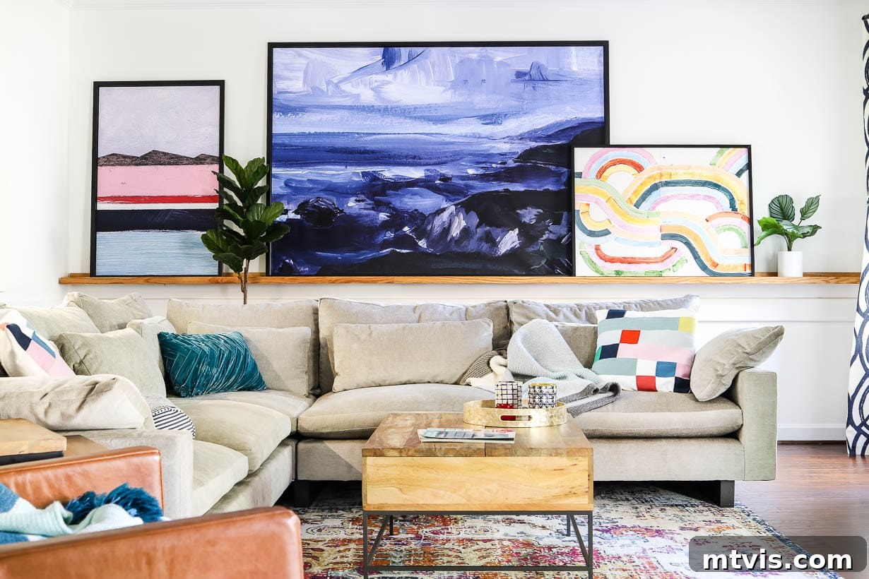
Mastering Interior Design: Avoid These Common Decorating Mistakes & Transform Your Home

It’s a familiar scenario for many: you’re browsing a home store, perhaps captivated by a stunning decorative piece, like a unique lamp. You envision it perfectly complementing your bedroom, so you excitedly purchase it. Rushing home, you place it on your nightstand, only to realize with a sigh of disappointment that it’s all wrong. It looks too small, completely lost in the room, fading into the background instead of enhancing the space. The thought of returning it, navigating busy stores and long lines, feels like an unwelcome chore in an already packed schedule.
Where did things go astray? It seemed so ideal in the store! The truth is, the misstep often occurs right at the very beginning of your design journey. To truly achieve a beautifully designed and harmonious room, it’s essential to develop a cohesive interior design plan before you make a single purchase. Most people, however, tend to buy items they like and hope they’ll “match,” attempting to piece everything together intuitively. Unfortunately, this approach rarely yields the desired results.
A successful design plan necessitates thoughtful pre-planning. This includes carefully considering your color palette, lighting scheme, room dimensions, furniture scale, and optimal placement. These foundational steps are frequently overlooked, which is precisely why comprehensive resources like Designer in a Binder exist. By understanding and actively avoiding common interior design pitfalls, you’ll be remarkably better equipped to craft an effective and appealing design plan for any room in your home. In this comprehensive guide, we’ll walk you through the 8 most common interior design mistakes and provide practical, easy-to-implement solutions to fix them, ensuring your space reflects your style and functions beautifully.
Table of Contents
The Biggest Mistakes People Make When Decorating + How to Fix Them
Decorating Mistake No. 1: Your home is full of clutter.
One of the most fundamental errors in interior design is attempting to decorate a home that is already overwhelmed with clutter. This approach is inherently flawed, as “clutter” is defined as a crowded, disorderly, or confused collection of items. A space filled with disarray can never truly be beautiful or serene, no matter how exquisite your decor items are. Before embarking on any decorating project, the absolute first and most crucial step is to declutter. This process isn’t just about tidying up; it’s about creating a clean slate, allowing your carefully chosen design elements to truly shine. A clutter-free home provides a sense of peace and order, making it infinitely easier to implement any design scheme. Beyond aesthetics, decluttering offers numerous compelling benefits for your well-being, with beautiful decoration being just one of them. For a systematic approach to transforming your home, resources like my affordable design systemDesigner in a Binder® emphasize the critical importance of decluttering as the foundation for any successful design.
Decorating Mistake No. 2: The scale of your furniture and home decor is totally off.
Scale refers to how objects within a room relate to each other and to the room itself in terms of their size and visual weight. When the scale of furniture or decor is incorrect, it creates an unsettling imbalance, making the entire space feel “off.” Imagine a small, cozy family room dominated by an enormous sectional sofa, or a vast living area where a tiny loveseat and an even tinier coffee table appear dwarfed and insignificant. These are classic examples of how mismatched scale can undermine a room’s aesthetic. Achieving proper scale is about creating visual harmony, where every piece feels right-sized for its surroundings.
Here are some practical tips to guide you in selecting furniture and decor with the appropriate scale for any room:
- Generally, larger rooms can accommodate substantial furniture and larger decorative pieces without feeling overcrowded. Conversely, smaller rooms benefit from furnishings and decor (such as delicate table lamps, slender side tables, and compact accessories) that are more modest in size and visually lighter. This prevents the space from feeling cramped or overwhelmed.
- The largest piece of furniture in a room typically establishes the baseline for the scale of everything else. For instance, if you have a grand, imposing sofa, tiny, delicate floor lamps beside it will look disproportionate and out of place. Ensure that secondary pieces are proportionate to the main anchor piece, creating a cohesive visual relationship.
- Never overlook the height of your room. High ceilings invite taller, more substantial furniture, artwork, and window treatments that draw the eye upwards, emphasizing the room’s grandeur. Rooms with lower ceilings, however, require furniture with a lower profile and decor that doesn’t overwhelm the vertical space, maintaining a sense of openness.
- Always remember to incorporate “white space” or negative space within your room. This refers to the empty areas around and above furniture, as well as uncovered portions of your floor and walls. Overstuffing a room, even with appropriately scaled items, can make it feel cluttered and visually heavy. Strategic white space allows your chosen pieces to breathe and stand out, contributing to an airy and well-designed feel.
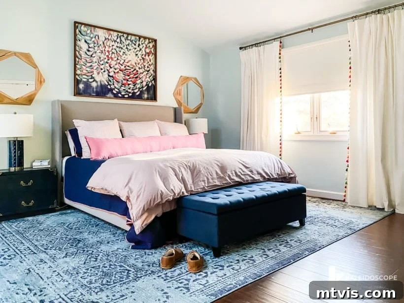
Our master bedroom, for example, is quite spacious, allowing for truly large artwork in the sitting area. Yet, we deliberately maintained ample “white space” to ensure the area feels expansive and inviting, not congested.
Decorating Mistake No. 3: All of your furniture is pushed up against your walls.
One of the most prevalent space planning errors I frequently observe is the tendency to push every piece of furniture against the room’s perimeter walls. This strategy is often employed with the intention of making a room appear larger. However, the opposite effect is usually achieved. When all furniture hugs the walls, it creates a disconnected and unwelcoming atmosphere, resembling a waiting room rather than a comfortable living space. This arrangement disrupts natural flow and eliminates opportunities for intimate conversation areas.
The solution is surprisingly simple yet incredibly impactful: pull your furniture away from the walls, even if it’s just by a few inches. This small adjustment can dramatically transform the feel of a room, instantly making it more inviting and dynamic. By creating a slight gap, you allow the room to “breathe” and develop distinct zones. For a more significant transformation, consider floating larger pieces of furniture, like sofas or armchairs, further into the room. This technique defines conversation areas and creates better traffic flow.
In our family room, for example, all furniture is intentionally floated away from the walls. Similarly, in the sitting area of our master bedroom (as shown in the image above), the furniture is positioned to create a cozy and intimate grouping in front of the DIY fireplace. This not only enhances the room’s aesthetic but also fosters a more functional and comfortable environment, proving that thoughtful furniture placement is key to a well-designed home.
Decorating Mistake No. 4: Your wall decor is all wrong.
Decorating walls often presents a challenge for many, from selecting the right pieces to determining their optimal placement. (If you find yourself struggling, I’ve shared comprehensive insights on how to choose artwork that flows beautifully throughout your home in a dedicated blog post).
Explore these posts for more guidance on selecting artwork:
- Bedroom Wall Art: Top Designer Picks
- Living Room Art: Top Designer Picks
- Dining Room Wall Art: Top Designer Picks
The most frequent errors I observe regarding wall decor are twofold: first, the artwork or decor pieces are often incorrectly sized (typically far too small for the space they occupy); and second, they are hung significantly too high, detaching them from the furniture below and the human eye level.
Let’s address how to correct these prevalent interior design mistakes effectively.
When considering the appropriate size or scale of artwork, a few key principles are important. If you are arranging several pieces of art or constructing a gallery wall, treat the entire collection as a single, cohesive unit for determining scale. The scale of this unified piece should be proportional to the furniture it accompanies. A good guideline is for the art piece or collection to be between 50% to 75% of the width of the furniture below it. Because this concept can be challenging to articulate, I’ve provided illustrative diagrams below.
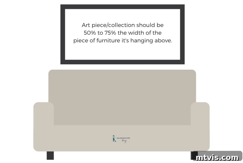
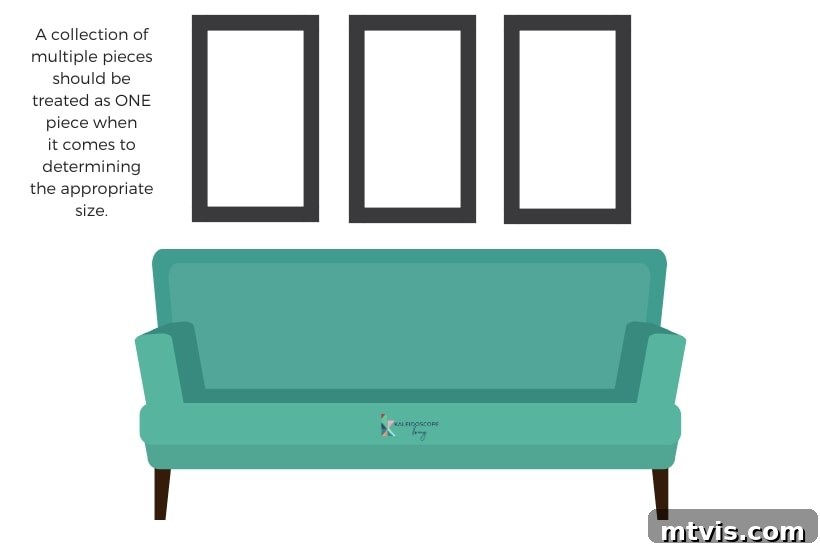
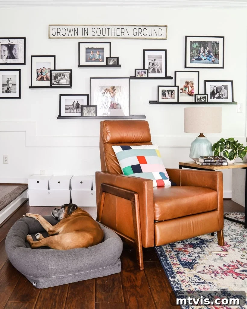
A prime example of treating a collection of smaller items as one large “piece” can be observed in the gallery wall of our family room, where multiple frames combine to create a significant visual presence.
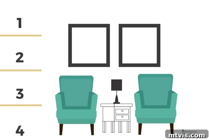
Now, let’s discuss the ideal height for hanging your artwork. While the “eye-level” rule is a common and generally helpful guideline, its effectiveness can vary significantly based on individual height or rooms with non-standard ceiling heights. For a more universal approach, I prefer to conceptualize dividing a wall vertically into four equal sections. Your artwork should then be hung so that its bottom edge roughly aligns with the bottom of the second quadrant (the section just below the halfway point). It’s perfectly acceptable for the top of the art to extend into the uppermost quadrant. This method ensures that the art is visually anchored to the room and interacts harmoniously with the space, regardless of ceiling height or personal stature. Refer to the diagram below for a clear visual representation of this principle.
Decorating Mistake No. 5: Your room doesn’t have a focal point.
Every well-designed room should possess at least one distinct focal point—a prominent feature that immediately draws the eye and anchors the space. Larger rooms, such as our expansive master bedroom, may even benefit from multiple focal points. A focal point serves as the room’s visual centerpiece, guiding attention and establishing a clear sense of direction and purpose. In many rooms, focal points are naturally occurring architectural features. For instance, a majestic fireplace often acts as an effortless focal point in a living room, while the bed itself typically takes center stage in a bedroom. This is certainly true in our bedroom. However, given its generous size, the sitting area within the room features a second, equally important focal point: the DIY fireplace we installed. Additionally, we incorporated skylights, adding architectural interest and drawing the eye upward.
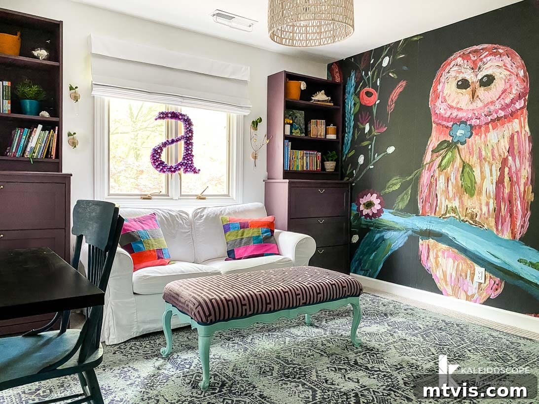
Rooms that lack inherent permanent features like fireplaces or built-ins present a more creative challenge, requiring you to actively create your own focal point. But there’s no need to panic; a captivating focal point can be surprisingly simple to establish. It could be a dramatic, oversized painting, a striking tapestry, or even an accent wall painted in a bold color or adorned with unique wallpaper. The key is to select something visually commanding that draws the eye. In Avery’s room, for example, the DIY built-in bunk beds, cleverly tucked into what was once a closet, didn’t naturally command attention. To address this, we opted for a vibrant wall mural, which successfully transformed the space and became the perfect, captivating focal point. This allowed us to strategically arrange the surrounding decor to highlight the mural. The crucial takeaway is this: identify or create your room’s focal point before deciding on your furniture placement. All subsequent furniture arrangements and decorative choices should revolve around and enhance this central visual element, creating a harmonious and thoughtfully designed space.
Decorating Mistake No. 6: You picked your paint color first.
When it comes to selecting paint colors for your home, there are several crucial tips and tricks to follow. However, the single most important piece of advice is: NEVER choose your paint color as the very first step! I confess, this was a mistake I frequently made in the past, leading to countless hours spent repainting rooms. Avoid this common pitfall at all costs. Furthermore, once you do reach the stage of selecting a paint color, always ensure you test paint samples directly on your actual walls. Relying solely on small paint chips is insufficient, as they aren’t even made from real paint and thus cannot accurately represent how the color will appear in your unique lighting conditions.
Instead of rushing to pick a paint color you adore right at the outset of your design process, I highly recommend identifying what I call your “crucial element” first. Simply put, find that one item that truly excites you and let it serve as the foundational inspiration for the entire room. This crucial element could be a stunning rug, a captivating piece of artwork, a unique furniture item, or even a vibrant throw pillow. The advantage of this approach is immense: it is significantly easier to select a complementary paint color based on an existing “crucial element” than it is to scour stores for elements that perfectly match a paint color you’ve already applied to your walls. I promise, this method will save you time, effort, and potential re-paints. Unless your goal is an entirely neutral room, ideally your “crucial piece” will feature a captivating pattern and a variety of colors. This rich palette will then provide you with a clear roadmap for choosing the perfect coordinating paint color, ensuring a harmonious and cohesive design.
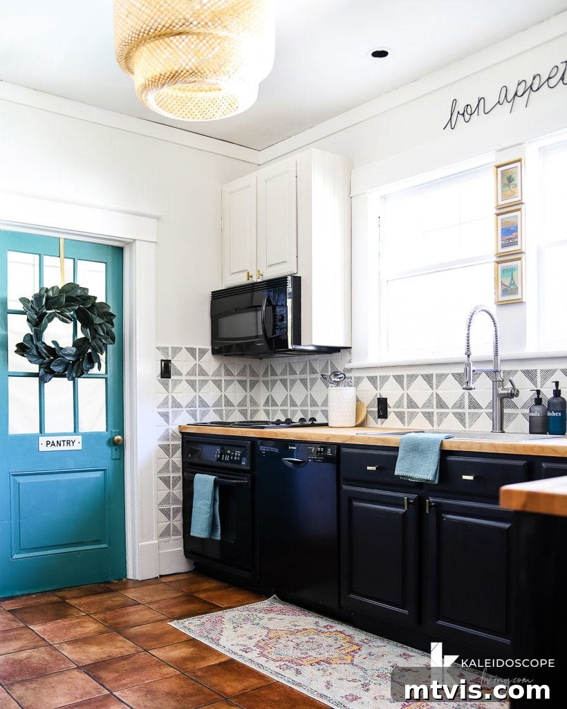
For Thea’s kitchen, the design journey began with her beautiful runner. This runner proved to be the perfect crucial element, providing an inspiring jumping-off point for all subsequent decisions, including her wall color, cabinet colors, fixtures, backsplash, and various decorative touches. The runner’s patterns and colors guided the entire scheme, resulting in a cohesive and stylish kitchen.
Similarly, in Attley’s room, her charming fox mural was designated as the crucial element. Once this decision was firmly established, I was able to effortlessly design the entire room around it—from selecting the ideal paint colors and furniture to incorporating special decorative accents like the playful pom-pom garland and coordinating pillows (you can find all the sources for Attley’s room here). Every element in the room feels perfectly unified and cohesive because the fox mural served as the guiding inspiration and starting point for the entire design process.
Decorating Mistake No. 7: Your curtains are hung poorly (making your windows look smaller than they are).
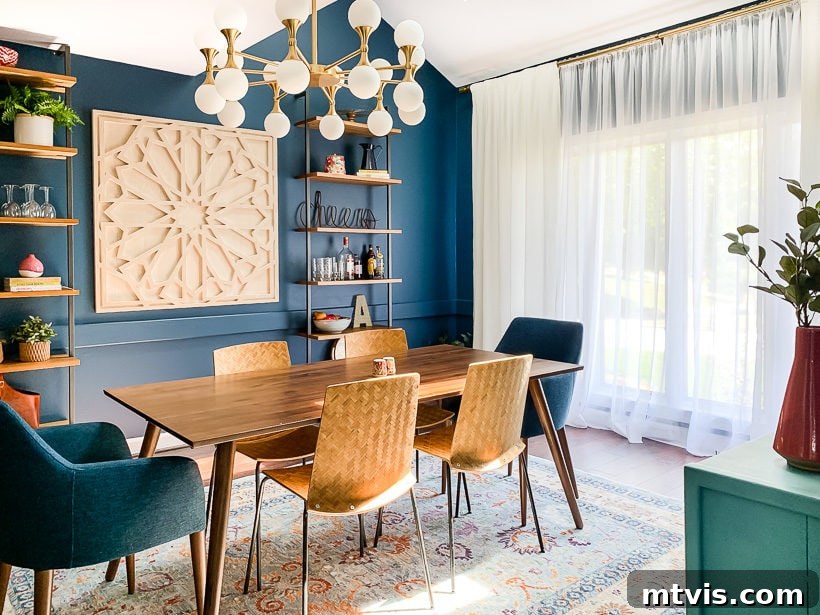
Proper curtain installation is a subtle yet incredibly powerful design technique that can profoundly impact the perceived size and grandeur of your windows and, consequently, your entire room. A common mistake is hanging curtains directly at the top and outer edges of the window frame, which effectively limits the visual expanse of the window. The transformative secret lies in hanging your curtains higher and wider than the actual window whenever possible. This technique is particularly effective when you’re aiming to make a small room appear larger, as it creates an optical illusion of grander windows and higher ceilings.
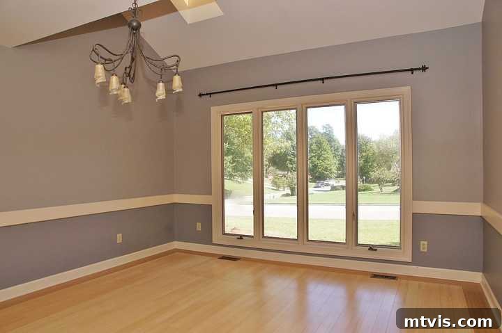
To implement this, position your curtain rod as close to the ceiling as aesthetically pleasing, ideally 6-12 inches above the window frame (or even higher if your ceilings allow). Furthermore, extend the curtain rod beyond the width of the window itself, allowing the curtains to frame the window and cover portions of the wall on either side when open. This means the fabric is mostly off the glass, maximizing natural light and making the window appear much wider and taller than it actually is. You can clearly see this principle in action in the “before” and “after” photos of our dining room below.
The “before” photo below clearly illustrates the original size and placement of the window.
Observe in the “after” photo how the curtains are hung significantly higher than the window frame. Also, notice how they extend well beyond the window’s actual width, embracing parts of the adjacent wall. These two strategic “tricks” work in concert to make the windows appear considerably larger and more imposing than their true dimensions, adding a touch of elegance and spaciousness to the dining room.
Decorating Mistake No. 8: The patterns in your décor and fabrics are too similar.
Have you ever admired those impeccably designed rooms featured in design magazines or on television? A common thread among them is the masterful incorporation of a diverse mix of patterns and textures. When executed skillfully, blending patterns and textures elevates any room, imparting a sophisticated and high-end, designer aesthetic. Failing to do so, however, is a major design faux pas.
A significant decorating mistake is choosing patterns for upholstery fabrics, rugs, curtains, throw pillows, and other decor items that are too similar in style, scale, or visual weight. While these patterns should ideally share a complementary color palette to ensure cohesion, they absolutely need to vary in their characteristics to prevent monotony and add depth. For example, balance busy, intricate patterns like florals or toile with simpler, more linear designs such as stripes or subtle geometrics. Alternatively, experiment with mixing unstructured, organic patterns, like ikat, with a bold and structured geometric design.
Equally important is varying the size or scale of your patterns. In my opinion, every well-designed room should feature at least one large-scale pattern. This could be anything from oversized floral motifs to wide, commanding stripes. The key is its substantial visual presence. When introducing a second pattern, it should generally be roughly half the size of the initial large-scale pattern. A third pattern can then be even smaller, acting as an accent or a subtle layer within the room’s scheme. This layering of patterns, differing in both type and scale, creates visual interest, movement, and a professional, curated feel that is a hallmark of sophisticated interior design.
You will also enjoy these posts with similar content:
- 16 Gallery Wall Ideas (and Tips) To Inspire You
- How to Make a Small Room Look Bigger
- How to Choose Paint Colors for Your Home: 6 Simple Tips to Follow
- The Best Paint for Kitchen Cabinets: 10 Successful Cabinet Transformations
- Sherwin-Williams Alabaster Color Review With Pictures
- How to Choose An Area Rug: Rug Placement & Size Guide
- How to Decorate With Color Even When It Scares You
Curious about my personal approach to transforming rooms and spaces in our home? Discover the strategies and insights within Designer in a Binder®. It’s designed to simplify the complex world of interior design, making it accessible and enjoyable for everyone.
For exclusive content, behind-the-scenes glimpses, and the latest design inspiration delivered straight to your inbox, be sure to subscribe to our newsletter before you go!