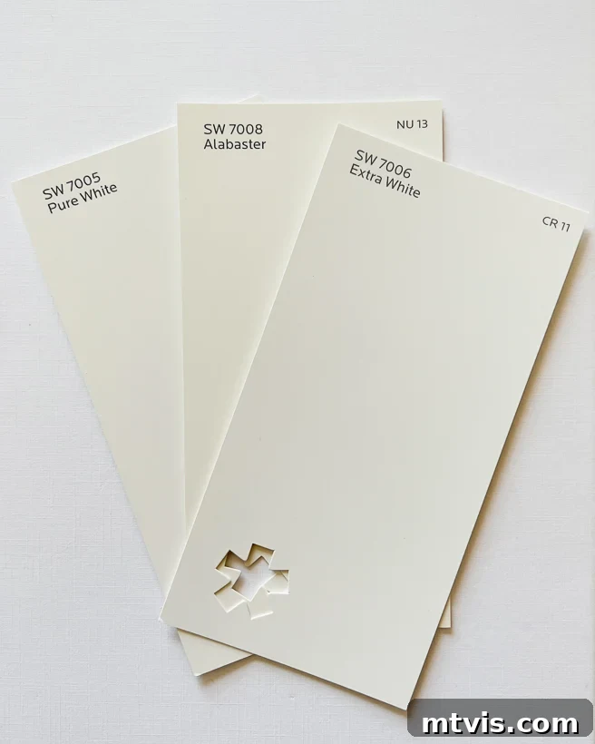
The timeless allure of white walls in interior design is undeniable, offering a canvas that complements virtually any aesthetic. Among the myriad of white paint colors available, Sherwin Williams Alabaster (SW 7008) consistently stands out as a leading choice, cherished by homeowners and designers alike. This creamy white shade possesses a remarkable depth that adds character without overwhelming a space, making it far more intriguing than a sterile, stark white. In this comprehensive review, we’ll delve into everything you need to know about Sherwin Williams Alabaster, exploring its unique characteristics, undertones, and how it compares to other popular white paints, all supported by practical photo examples.
For those who appreciate vibrant artwork and colorful decor, white walls provide the ultimate backdrop, allowing your carefully selected pieces to truly pop and command attention. This transformative power is why many, including myself, have embraced white interiors and never looked back. Approximately four years ago, I transitioned to white walls throughout my home, discovering firsthand how they enhance every element of design and create an atmosphere of light and serenity.
Why Sherwin-Williams Alabaster (SW 7008) Is a Top Choice
In my extensive search for the perfect white paint, I’ve encountered countless samples and spent considerable time analyzing various shades. One color that consistently appeared, and whose reputation preceded it, was Sherwin Williams Alabaster (SW 7008). Its popularity isn’t fleeting; it was crowned Sherwin Williams’ Color of the Year in 2016, and its appeal has only grown stronger since then, making it a perennial favorite.
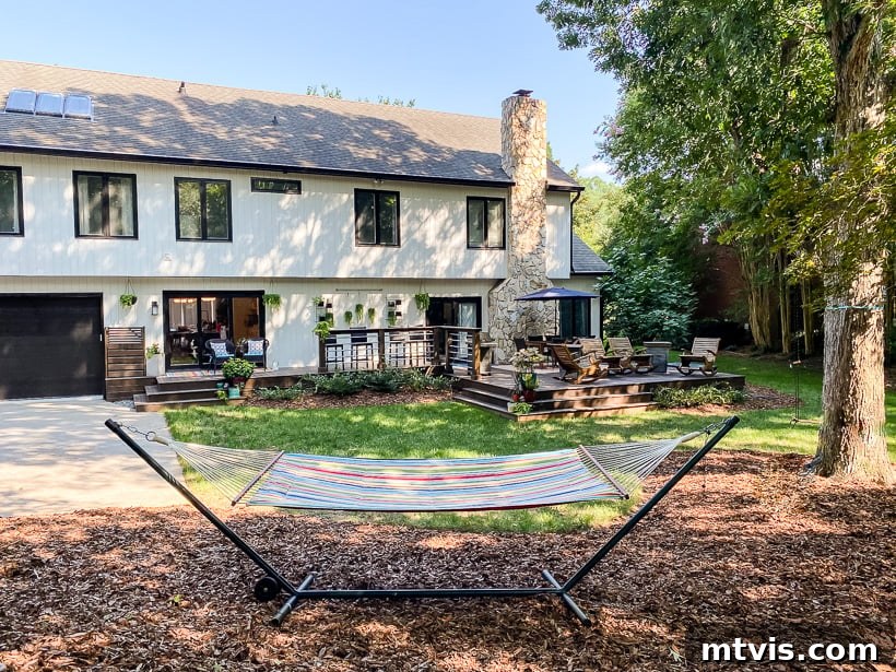
Having experienced Sherwin Williams Alabaster firsthand, both in its widespread application and on our former home’s exterior, I can confidently attest to its enduring charm. This beautifully balanced white is neither excessively cool nor overtly warm, a harmonious blend that makes it an exceptionally versatile choice for both interior and exterior applications. When we painted the exterior of our previous residence, Alabaster was the clear winner. It provided the exact soft, creamy white aesthetic we desired, creating an inviting and sophisticated curb appeal that seamlessly blended with the surrounding landscape.

Understanding Alabaster’s Undertones
If you’re new to the concept of paint undertones, think of them as the subtle, almost imperceptible hues within a color that influence how it appears in different lighting conditions and alongside other shades. These are the underlying elements that give a color its unique character, often revealing themselves as a hint of red, blue, green, yellow, or grey. Choosing the right paint color for your home often hinges on understanding these elusive undertones.
Many people ask, “Is Sherwin Williams Alabaster warm or cool?” This question essentially probes into its undertones. The beauty of Alabaster lies in its finely balanced, neutral base. It doesn’t strongly lean into one color family, possessing both a soft yellow/beige (warm) presence and a delicate touch of grey (cool). This unique combination often translates to what is best described as a “greige” undertone—a subtle blend of grey and beige. In my experience, the most successful neutral paint colors achieve this delicate equilibrium of warm and cool elements, providing adaptability and sophisticated depth.
Does Sherwin Williams Alabaster Have Yellow Hues?
Given Alabaster’s warm undertones, a common concern is whether it will appear overtly yellow on the walls. The short answer is no; Alabaster does not typically read as yellow. Instead, what your eye perceives is a soft, creamy white that exudes a gentle warmth. This warmth ensures the color feels inviting and cozy, steering clear of the stark, clinical feel often associated with pure whites found in hospitals or office environments.
While some might categorize Alabaster as an off-white or even a cream color, I find these labels don’t fully capture its essence. When observed in isolation, or as the dominant color in a room, Alabaster presents itself as a beautifully soft white. It’s truly a testament to its balanced undertones. Its ability to create a serene yet welcoming atmosphere is beautifully illustrated on the shiplap walls in a foyer, where it enhances architectural details without being too bright or too dark.
Photo by Nautilus Company, LLC –
Browse entryway photos
It’s crucial to remember that every paint color, including whites, can transform based on the natural light it receives. In rooms with north-facing windows, Alabaster tends to appear closest to a true white. This is because northern light is typically cooler and more muted, neutralizing some of Alabaster’s inherent warmth and allowing its softer, less saturated qualities to shine through. Always consider your room’s specific lighting conditions when selecting paint.
Alabaster’s Light Reflectance Value (LRV)
An often-overlooked yet critical factor in choosing paint colors is the Light Reflectance Value (LRV). This metric, ranging from 0 (absolute black) to 100 (pure white), quantifies how much light a color reflects. Sherwin Williams Alabaster boasts an LRV of 82. This is a significantly high LRV, indicating that Alabaster will reflect a substantial amount of light back into a room, making spaces feel exceptionally bright, open, and airy. For any room where you aim to maximize natural light and create a luminous atmosphere, Alabaster’s high LRV makes it an outstanding choice. It helps to bounce light around, creating a sense of spaciousness and vibrancy, even in rooms that might otherwise feel dim.
Sherwin Williams Alabaster vs. Other Popular Whites
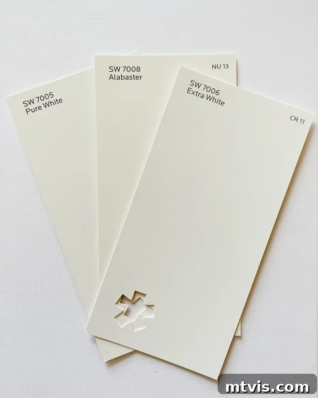
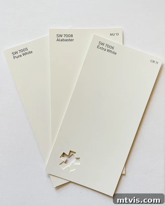
Note: The comparison photos below were captured on the brightest white surface available to ensure the most accurate color representation. However, please remember that colors can appear differently on various screens. This underscores the vital importance of testing paint colors in your own home under your specific lighting conditions before making a final decision.
SW Alabaster vs. SW Pure White vs. SW Extra White
When you place Alabaster alongside Sherwin Williams’ cooler whites like SW Extra White or SW Pure White, Alabaster’s inherent warmth becomes strikingly evident. Both Extra White and Sherwin-Williams Pure White lean towards cooler, more bluish undertones, creating a crisp, clean aesthetic. In contrast, Alabaster offers a gentler, more inviting feel. When viewed next to these brighter whites or a stark piece of white paper, Alabaster may reveal a subtle creaminess, highlighting its warmer character rather than a true yellow tint. This warmth is what prevents Alabaster from ever feeling cold or stark, making it a comfortable choice for living spaces.
Alabaster vs. Benjamin Moore White Dove
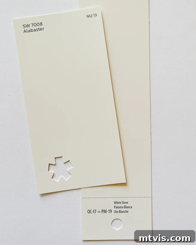
Benjamin Moore White Dove is another highly regarded white paint often considered alongside Alabaster due to their notable similarities. However, there are subtle differences that can sway a decision. To my eye, Alabaster carries a slightly warmer quality than Benjamin Moore’s White Dove, which occasionally hints at a very faint pink undertone. White Dove also has a marginally higher LRV of 85, suggesting it will reflect slightly more light and appear a touch “truer” white than Alabaster. The choice between these two often comes down to personal preference for a hair more warmth or a touch more crispness. See them compared side-by-side in the image below to discern these nuanced differences for yourself.
Alabaster vs. Benjamin Moore Swiss Coffee
While both are popular warm whites, Swiss Coffee by Benjamin Moore differs from Alabaster most significantly in its undertones. Swiss Coffee exhibits a more pronounced yellow undertone and, occasionally, a hint of green, giving it a distinctly warmer appearance on walls compared to Alabaster. Despite having a nearly identical LRV of 82, Alabaster’s balanced “greige” undertone makes it a more universally adaptable creamy white. If your goal is a warm, inviting white without any green or overly yellow leanings, Alabaster is generally the preferred choice, offering a cleaner, softer aesthetic that beautifully complements a wide range of decor styles.
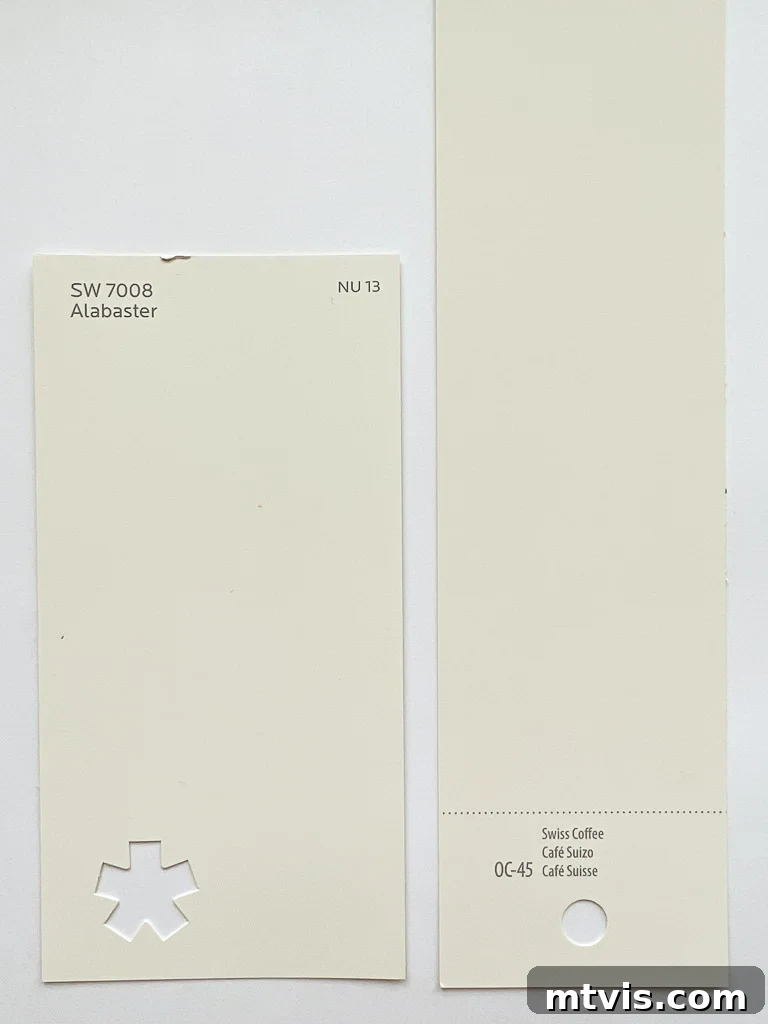
To reiterate, despite its warm undertones, Alabaster rarely presents as yellow in practice. When it stands alone, as the primary color in a room, it consistently reads as a sophisticated and beautiful soft white.
Alabaster in Real Homes: A Design Gallery
Seeing a paint color in diverse real-world settings is invaluable for decision-making. Below, I’ve compiled a collection of inspiring images featuring Sherwin Williams Alabaster in various homes. Keep in mind that Alabaster, like any paint color, will respond uniquely to the specific lighting conditions and existing decor in every home. To ensure it’s the perfect fit for your space, I highly recommend consulting my tips for how to choose paint colors. The easiest and cleanest way to test paint samples is with Samplize peel & stick paint samples, allowing you to confidently evaluate colors without the mess.
Alabaster on Walls
The following photographs illustrate the undeniable beauty and versatility of Alabaster as a wall color. Notice how it adapts effortlessly across different interior styles, from a cozy farmhouse aesthetic to sleek, modern contemporary designs, always maintaining its soft, inviting presence. It provides a clean, yet never stark, backdrop that allows furniture, textiles, and artwork to truly shine.
Image Source: @ouracaciagrovehome on Instagram (Alabaster walls in a stylish living room)
Image Source: @buildingredwhiteandblue on Instagram (Alabaster creating a serene bedroom atmosphere)
Image Source: @kellyscasa on Instagram (Alabaster offering a bright and airy feel in a home office)
Examples of Alabaster on Trim & Cabinets
For those who desire a softer, less stark white for their trim, Alabaster presents an excellent option. Its gentle warmth creates a beautiful contrast or cohesive flow, depending on the wall color. Observe how Alabaster trim elegantly frames grey walls in the image below, softening the transition and adding a touch of sophisticated comfort.
Beyond trim, Alabaster is a highly favored choice for painting kitchen cabinets and other architectural accents, such as built-in bookcases. Its creamy undertones bring a touch of classic elegance to cabinetry, creating a welcoming focal point in the heart of the home. The photo below provides a clear illustration of Alabaster gracing kitchen cabinets. Notice how dramatically the color can shift under artificial interior lighting at night, appearing even softer and more inviting than in daylight – a crucial consideration for any paint selection.
Photo by Crafted Custom Homes + Renovations –
More kitchen ideas
The appeal of Alabaster extends beautifully to built-in features, such as the lockers shown below. Its clean yet soft appearance enhances custom millwork, making these functional pieces feel refined and integral to the home’s design.
Photo by Nautilus Company, LLC –
Look for entryway design inspiration
Alabaster on Ceilings
While pure white ceilings are a common standard, they are by no means the only option. In fact, deviating from stark white can often enhance the overall warmth and cohesion of a room. As you might know from my post on interior trim ideas that aren’t white, we personally opted for a creamy beige on our ceilings and trim, demonstrating the power of a nuanced approach to ceiling color.
Employing a warmer white like Sherwin Williams Alabaster for ceilings is an excellent strategy, particularly for those whose decor and color palettes lean towards warmer tones. The inherent creaminess of Alabaster allows it to harmoniously blend with other warm colors in a room, creating a seamless and enveloped feel rather than a stark separation between walls and ceiling. This can make a room feel cozier and more intentionally designed.
Is Sherwin Williams Alabaster the Right White for Your Home?
If you’re in pursuit of a versatile, neutral white paint color, Sherwin Williams Alabaster should undoubtedly be at the top of your consideration list. With its impressive LRV of 82, it guarantees a bright and airy feel, a quality highly sought after by many (myself included). Its adaptability makes it a superb choice for virtually any room in the house, from a bustling living room to a tranquil bathroom, effortlessly complementing diverse functions and moods. As a slightly warm white, Alabaster offers a noticeably cozier and softer ambiance compared to crisper whites like Sherwin Williams Extra White. This gentle warmth prevents it from feeling cold or impersonal, instead providing a beautiful, inviting backdrop that harmonizes with a vast array of decor styles, from modern minimalist to classic farmhouse.
When considering any white wall color, my most crucial advice is to gather samples of several whites, making sure to include Alabaster in your selection. It is absolutely imperative to follow my recommendations in this comprehensive guide on how to choose paint colors, specifically by painting samples on at least two different walls within the same room. This allows you to observe how the color reacts to varying light exposures throughout the day. You can either purchase traditional paint samples and apply them yourself, or, for a mess-free and highly effective method, try the peel & stick paint samples that I enthusiastically endorse! Simply cut them in half to test on multiple walls. Under no circumstances should you ever choose a paint color based solely on a tiny paint swatch or digital images found online; it’s a surefire recipe for design disappointment.
Ironically, I was convinced that Alabaster would be the perfect white for the walls in our current home, given how much I adore it. However, after extensive testing, I found it didn’t quite harmonize with our existing trim color. Consequently, I opted for Sherwin-Williams Pure White instead. You can find my complete and detailed review of Sherwin-Williams Pure White here to see if that might be a better fit for your space.
More Paint Posts
SEE ALL PAINT POSTS
-
The Best Neutral Paint Colors for Kitchen Cabinets
-
Benjamin Moore Swiss Coffee- Is it Right For You?
-
Samplize Peel & Stick Paint Samples: An Unbiased Review
-
Sherwin Williams Pure White SW7005 Paint Review With Pictures
-
Navy Blue Paint Colors Designers Love
-
Beautiful Blue Paint Colors Designers Love & Use
Other posts you may find helpful in your design journey:
- How to Choose Paint Colors for Your Home: 6 Simple Tips to Follow
- Inspiring DIY Paint Projects to Transform Your Space
- The Best Paint for Kitchen Cabinets: 10 Successful Cabinet Transformations
- A Comprehensive Paint Sheen Guide & Reference Chart
- How to Decorate With Color Even When It Feels Intimidating
Curious about my personal approach to transforming rooms and spaces within our home? Explore Designer in a Binder® – your affordable and straightforward guide to decorating.
For exclusive content, behind-the-scenes glimpses, and additional design insights, don’t forget to subscribe to our newsletter before you leave!