As a self-proclaimed color enthusiast, I often hear the surprise and sometimes even disappointment when people learn we opted for neutral kitchen cabinets in our recent renovation. Many assume my home would be a riot of vibrant hues at every turn. However, I assure you, this decision was a strategic one, laying the perfect foundation for a kitchen that will be bursting with personality and carefully curated color. In this post, I’m pulling back the curtain on our design philosophy, sharing all the details and the reasoning behind our choices. Whether you’re simply curious about our kitchen design journey or you’re seeking inspiration for how to inject life and color into your own neutral kitchen, you’ve landed in just the right spot.
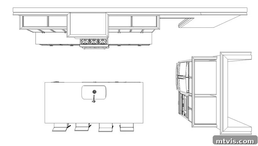
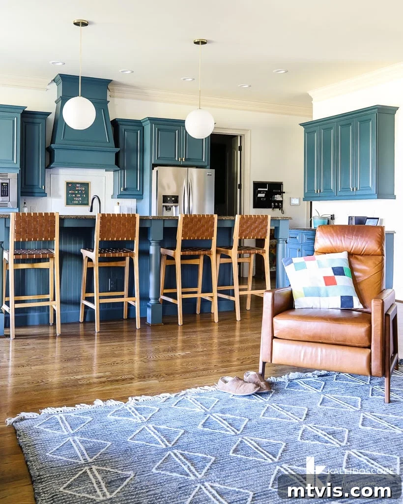
For those who might have missed the backstory, I previously shared an in-depth look at all the compelling reasons behind our decision to completely overhaul our kitchen. That post also featured the crucial functional upgrades we’re implementing and showcased the initial renderings of our envisioned new space. The response was overwhelmingly positive, with many of you expressing anticipation like, “I can’t wait to see the changes! I hope it’s as colorful as your current kitchen.” Indeed, the striking blue cabinetry from our previous budget-friendly kitchen makeover, which I tackled nearly four years ago, was a clear favorite. It truly was one of my top navy blue paint colors, and I absolutely adored it, as you can see in the image below.
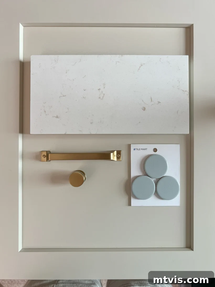
So, when I finally unveiled the chosen color for our new cabinetry on Instagram, it’s safe to say most of you were utterly shocked. We selected Accessible Beige by Sherwin Williams, a shade I consider one of the most versatile and appealing neutral paint colors for kitchen cabinets. To further reinforce this serene foundation, we also chose this understated light-blue oversized penny tile for the backsplash – certainly not a bold color statement by any measure. In essence, the prevailing question from many of you has been: is our new kitchen going to be entirely neutral and devoid of the vibrant personality you’ve come to expect from my designs?
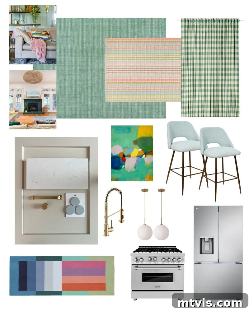
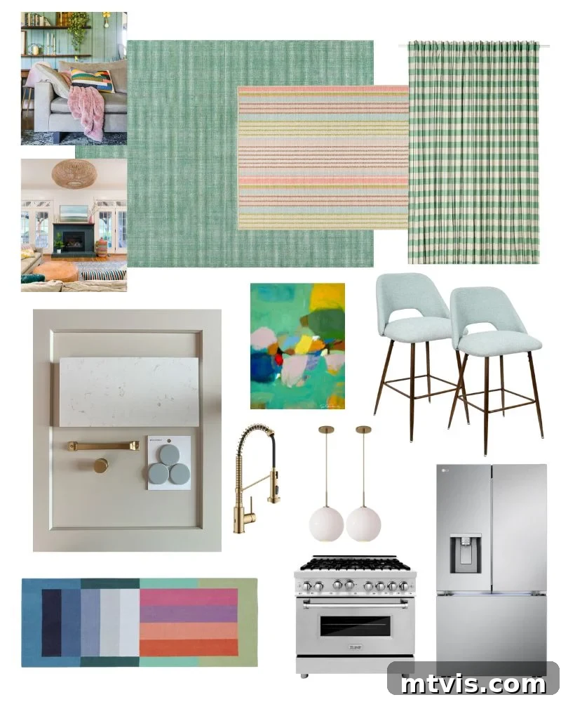
The short, emphatic answer is a resounding NO! The design plan for our new kitchen is, without a doubt, colorful. However, the true genius lies in *how* that color will be introduced. Instead of permanent fixtures like cabinetry, most of the vibrant hues will be layered in through dynamic elements such as rugs, curtains, and artwork. If you’ve been following my design journey for a while, you’re likely aware that almost all the walls in our home are painted Pure White by Sherwin Williams. This isn’t an accident; I strategically love how our curated colorful decor and striking art pieces brilliantly POP against such a clean, neutral backdrop. This same philosophy is precisely what we are aiming for in the kitchen: creating a versatile, timeless base that allows interchangeable, expressive color to truly shine.
A Detailed Explanation of Our Kitchen Design and Mood Board
Crafting a kitchen design that balances both timeless appeal and personal vibrancy is an art, and it all starts with a clear vision. I encourage you to take a few moments to understand our meticulous planning process. While a video typically accompanies this, let me walk you through the essence of how the plans and mood board for our kitchen design came together. (If you’re keen on learning the ropes yourself, I have a dedicated post to teach you how to create your own mood board). As with every space I design in our home, I relied heavily on my proprietary Designer in a Binder® system. This invaluable tool makes developing a cohesive design plan not only effortless but also incredibly enjoyable and truly effective.
Video: Explaining Our Kitchen Design Plans and Mood Board
This post contains affiliate links for your convenience. Click here for my full disclosure policy.
Our New Kitchen Sources: Bringing the Design to Life
Creating a truly personalized space often involves a blend of new acquisitions and cherished existing pieces. As mentioned, some items, like our beloved colorblock runner, have been with us for many years and are regrettably no longer available for purchase. However, I’ve made every effort to link to as many of the currently available sources as possible below, so you can recreate elements of this look in your own home. Each selection plays a crucial role in building the layered, colorful aesthetic we are striving for, from the foundational elements to the decorative accents that inject personality.
- Green check curtains (a vibrant pop of pattern, also available here on Amazon)
- Green area rug (introducing earthy tones and texture)
- Ticking stripe area rug (a classic, subtle pattern for visual interest)
- Colorblock runner (no longer available – a treasured piece from West Elm)
- Pendant lights (essential for both style and functional illumination)
- Counter stools (combining comfort and design at the island)
- Faucet, hardware and more (the small details that tie the entire look together)
- Abstract art print by Eleanor Scott Davis (a key element for layering bold color onto neutral walls)
- Light blue oversized penny tile (a subtle yet distinctive backsplash choice)
- Countertop: Quartz Aspen Gold (a durable and elegant surface that complements our color scheme)
- Cabinet color: Accessible Beige by Sherwin Williams (the perfect neutral canvas)
- Counter-depth refrigerator (seamlessly integrates into the cabinetry for a streamlined look)
- 36-inch Dual Fuel Range (the heart of any functional kitchen, chosen for performance and aesthetics)
So there you have it – the comprehensive unveiling of our neutral yet vibrantly colorful kitchen design! I hope that by now, you can fully appreciate the dynamic and thoughtful vision I have for our kitchen. Even though the “bones” – the permanent, structural elements – of our kitchen are distinctly neutral, they serve as the ultimate blank canvas, ready to be adorned with rich textiles, captivating artwork, and personal touches that truly reflect our style. This approach ensures longevity and adaptability, allowing for effortless refreshes of color and theme over time without costly overhauls.
For daily updates and an exciting behind-the-scenes look at the transformation in real time, be sure to follow along in my Instagram stories. You can also catch up on all the progress we’ve made so far by checking out my dedicated kitchen plan and kitchen reno highlight bubbles. And mark your calendars! We are eagerly anticipating the final reveal, with hopes that the renovation will be completed by the end of September. It’s going to be a masterpiece of layered color and thoughtful design!
MORE INTERIOR DESIGN TIPS
SEE ALL design & decorating posts
-
6 Tips for Decorating With Color When You Are Used to Neutrals
-
Space Planning Basics: How to Create a Space Plan
-
The Dos and Don’ts of Using Area Rugs on Carpet
-
How To Make a Mood Board: A Step-By-Step Guide
-
How to Choose Paint Colors for Your Home: 5 Simple Tips to Follow
-
Interior Trim Color Ideas (That Aren’t White)
Are you eager to learn my proven methods for transforming rooms and spaces in our home from conception to stunning reality? Then you absolutely need to check out Designer in a Binder®. It’s my comprehensive, step-by-step system designed to demystify the interior design process, making it accessible and enjoyable for everyone, regardless of their experience level. This binder provides all the tools, guidance, and inspiration you need to achieve cohesive, beautiful results that truly reflect your personal style and enhance your living space.
And for those who crave even more exclusive content, behind-the-scenes sneak peeks, and direct insights into my latest projects and design tips, be sure to subscribe to our newsletter before you navigate away! Joining our community means you won’t miss a single detail of our ongoing home renovations and design adventures. Plus, you’ll gain access to special resources and inspiration delivered straight to your inbox. Don’t let this opportunity pass you by – become a part of our design family today!