Are you on the hunt for the perfect white paint color to transform your living space? Benjamin Moore Swiss Coffee OC-45 is a name that frequently pops up in conversations about popular white paints, and for good reason. It’s a beloved choice for many homeowners and design professionals alike, promising a soft, inviting backdrop. However, like any significant design decision, choosing the right paint color requires careful consideration. This comprehensive guide will delve deep into Benjamin Moore Swiss Coffee, exploring its unique characteristics, undertones, and how it interacts with different lighting conditions and existing decor. By the end of this review, you’ll have all the insights needed to determine if this highly sought-after shade is the ideal fit for your home.
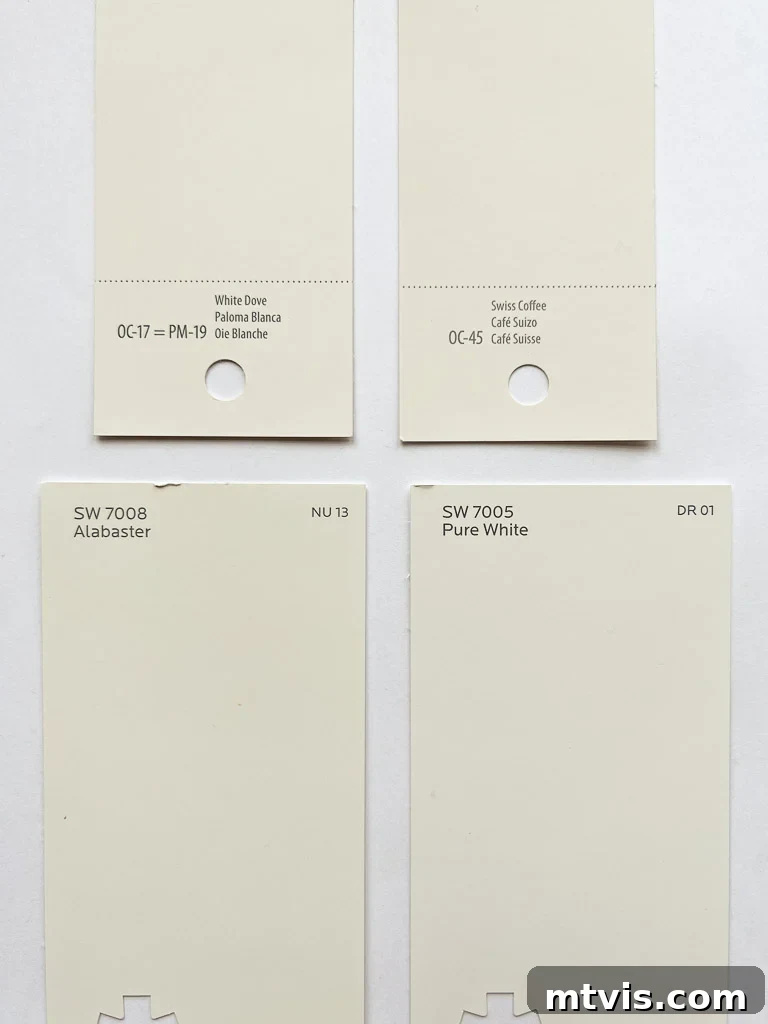
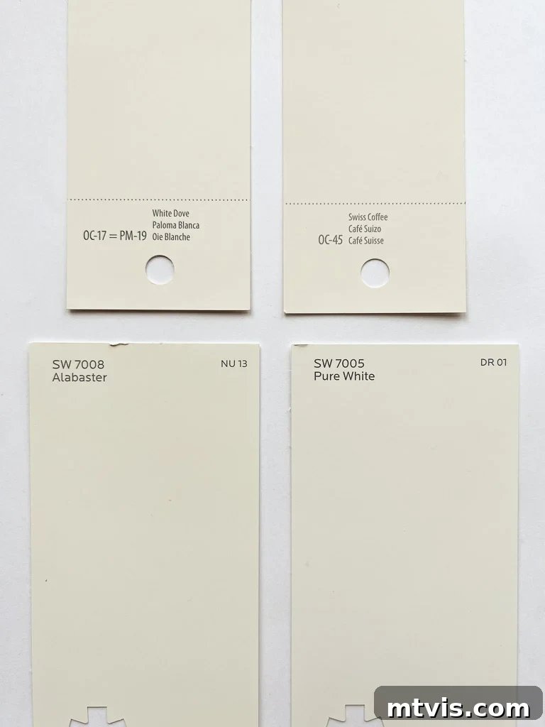
As a passionate advocate for white walls, I understand the desire to find that quintessential shade that brings brightness and elegance to a room without feeling cold or stark. The world of white paints is surprisingly vast, with subtle differences that can dramatically alter the feel of your home. Among the myriad options, four particular shades consistently stand out for their widespread appeal:
- Sherwin-Williams Pure White (a personal favorite, used throughout my own home)
- Sherwin-Williams Alabaster
- Benjamin Moore White Dove
- Benjamin Moore Swiss Coffee
Why Is Benjamin Moore Swiss Coffee So Popular? The Designer’s Choice
Benjamin Moore Swiss Coffee OC-45 has undoubtedly earned its place in the spotlight of interior design. Its surge in popularity can largely be attributed to its frequent use by leading design professionals, making it a highly aspirational choice for many homeowners. One notable endorsement comes from the acclaimed designer Shea McGee of Studio McGee, who has beautifully showcased Swiss Coffee in her sophisticated projects. In fact, she famously applied it at 75% strength throughout much of her own home, a testament to its versatility and appeal. More recently, another industry titan, Nate Berkus, also highlighted Swiss Coffee as a top pick, further cementing its status as a designer favorite.
While the recommendations from such esteemed designers are undeniably influential and valuable, it’s crucial to remember that what works beautifully in a professionally designed, often custom-built space may not translate identically to every home. The appearance of any paint color is profoundly affected by a multitude of factors, including natural and artificial lighting, adjacent colors, and the general ambiance of a room. A paint color that looks stunning in a bright, sun-drenched space might appear entirely different in a room with less natural light or different exposures. This is precisely why personalized testing in your own home environment is an absolutely critical step before committing to a full wall application. Relying solely on a designer’s preference, no matter how reputable, can lead to unexpected results if not carefully evaluated within your unique setting. Understanding the nuances of Swiss Coffee, beyond its popularity, is key to making an informed decision for your personal sanctuary.
Despite its widespread acclaim among top designers, Swiss Coffee holds a unique position for me personally. Among the four popular white paint colors I listed earlier, it is my least favored option for general wall application. My reservation stems primarily from its distinct undertones, which can significantly influence its appearance in a room. While its warmth is often highlighted, it’s these underlying hues that dictate how it truly behaves on your walls.
Unveiling the Undertones: What Are Benjamin Moore Swiss Coffee’s Subtleties?
When selecting paint colors, understanding undertones is paramount. These are the subtle colors beneath the main hue that may not be immediately obvious but significantly impact how a paint color appears in different settings and alongside other decor elements. I’ve covered the importance of undertones extensively in my detailed guide on choosing paint colors for your home. Ignoring them is one of the most common pitfalls in paint selection, often leading to a color that feels “off” or clashes with your furnishings.
To answer the perennial question, “Is Swiss Coffee warm or cool?”, it’s definitively a warm white. Benjamin Moore Swiss Coffee OC-45 incorporates undeniable yellow undertones into its composition. These yellow notes are what provide its creamy, inviting warmth, preventing it from appearing stark or sterile. This warmth makes it a popular choice for creating cozy and traditional aesthetics.
However, the warmth of Swiss Coffee isn’t its only defining characteristic. Crucially, Benjamin Moore Swiss Coffee also possesses slight green undertones. These green nuances, though subtle, can become more pronounced under certain lighting conditions, especially in rooms with cooler natural light or when paired with specific color palettes. It’s this particular combination of warm yellow and soft green undertones that makes Swiss Coffee my least preferred among the popular white wall colors for general use. In some environments, the green can lean towards a muted, almost khaki-like appearance, which might not align with every homeowner’s vision for a clean white wall. You can observe these green undertones, particularly if you have a keen eye for color, in the dining room image below, where they subtly influence the overall warmth and depth of the paint.
It’s a common misconception that paint chips accurately represent a color. In reality, the tiny swatches you pick up from stores are often printed, not made with actual paint, and can therefore be misleading. The true test of any paint color, especially one with complex undertones like Swiss Coffee, lies in seeing it on a larger scale, directly on your walls, and under varying light conditions throughout the day. This is why testing paint colors using real paint samples, such as Samplize peel-and-stick samples, is an indispensable step. These larger, accurate representations allow you to observe how the yellow and green undertones of Swiss Coffee truly manifest in your home, ensuring you make a choice you’ll love for years to come.
Is Benjamin Moore Swiss Coffee a True Warm White, or Something More?
Many people searching for the ideal white paint wonder, “Is Swiss Coffee too white?” The answer, quite frankly, is a resounding no. Benjamin Moore Swiss Coffee is indeed categorized as a warm white, largely due to the subtle yellow pigments woven into its formula. However, describing it simply as “white” might be an oversimplification. From my perspective, Swiss Coffee often reads more as a sophisticated beige or a soft off-white rather than a crisp, pure white.
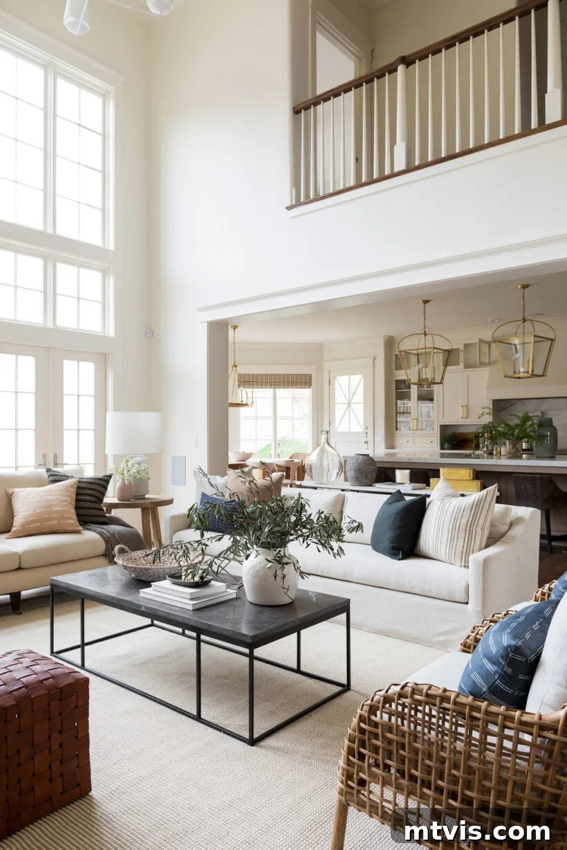
Consider the image provided by Benjamin Moore themselves, showcasing Swiss Coffee. To many, it presents as a creamy, almost light beige hue rather than a bright white. This perception is critical, especially if your goal is to achieve truly white walls. The “whiteness” of Swiss Coffee is highly dependent on environmental factors. For instance, in spaces with an abundance of natural light, like those featured in Studio McGee’s designs with their expansive windows (such as the one at the beginning of this post), Swiss Coffee can appear much closer to a pure white. This is because ample natural light helps to wash out some of its deeper undertones, allowing its brighter qualities to shine through.
However, most homes don’t boast such generous natural light. In rooms with standard window sizes, north-facing light, or artificial lighting, Swiss Coffee’s yellow and green undertones tend to become more evident, making it lean distinctly into the beige-off-white spectrum. This characteristic can be a huge asset if you’re specifically seeking a softer, more enveloping off-white that avoids the starkness of a true white. It adds warmth and coziness, making a room feel grounded and inviting.
Interestingly, while I don’t typically recommend Swiss Coffee for walls if a crisp white is desired, I do believe it could be an exquisite choice for trim when paired with cooler white wall colors. Using a slightly warmer, off-white like Swiss Coffee on trim can add a subtle layer of depth and sophistication, creating a gentle contrast that highlights architectural details without being jarring. I’m a big proponent of trim colors that aren’t pure white—it’s a design choice we’ve embraced in our current home to great effect.
Benjamin Moore itself categorizes Swiss Coffee within its “Off-White Color Collection,” reinforcing its identity as more than just a standard white. They describe this collection as “inherently sophisticated and endlessly versatile, offering subtle nuances of whites that suit tranquil, serene environments as well as creating color-enhancing accents for dynamic spaces.” This description perfectly encapsulates Swiss Coffee’s role: a nuanced, adaptable shade designed to create soft, inviting atmospheres rather than bright, stark ones. If an off-white with undeniable warmth and a touch of organic softness is what you envision, then Swiss Coffee certainly warrants your attention.
Harmonizing Hues: What Colors Pair Beautifully with Benjamin Moore Swiss Coffee?
The undertones of a paint color are not only crucial for how the color appears on its own but also for determining which other colors it will beautifully complement or subtly clash with. In the case of Benjamin Moore Swiss Coffee, its underlying characteristics provide clear guidance on ideal color pairings.
It’s quite telling that on Benjamin Moore’s official website, the recommended “matching colors” for Swiss Coffee predominantly feature various shades of beige and green. This is not a coincidence; it’s a direct reflection of Swiss Coffee’s inherent slightly green and strong yellow undertones. These earthy undertones mean that Swiss Coffee truly shines when paired with a palette of warm, natural colors. Think of deep forest greens, soft sage, muted olives, rich browns, sandy beiges, and terracotta tones. When surrounded by these colors, Swiss Coffee’s own subtle green and creamy yellow notes are enhanced, creating a cohesive, organic, and incredibly harmonious environment. It feels grounded, natural, and inviting, making it an excellent choice for homes aiming for a relaxed, nature-inspired aesthetic.
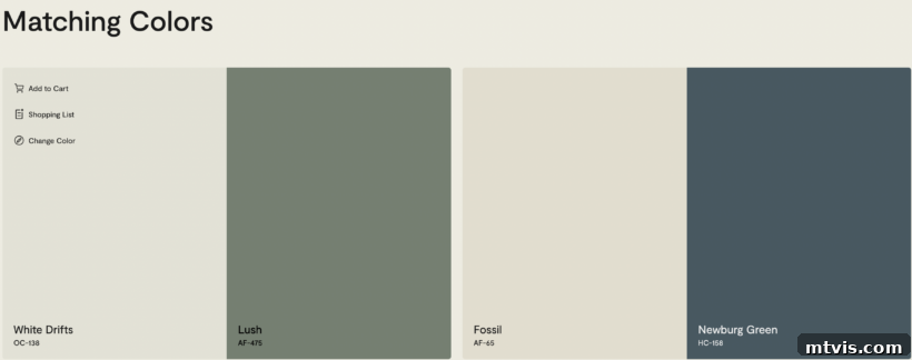
Conversely, those same undertones suggest that Swiss Coffee would generally not be the best companion for cooler color palettes. Blues and grays, especially those with strong cool undertones themselves, might struggle to find harmony with Swiss Coffee. The yellow and green in Swiss Coffee can make cooler blues appear less vibrant or even slightly dingy, and may make grays look muddy or washed out. The warmth of Swiss Coffee can create an unintended visual tension with cool tones, preventing a truly balanced and serene look. Therefore, if your home decor leans heavily into cool blues, grays, or jewel tones, you might find Swiss Coffee to be an uncooperative partner, and a different white with cooler or more neutral undertones might be a more successful choice.
To illustrate this point, let’s examine an example. In Blesser House’s living room below, Swiss Coffee works beautifully because the space is thoughtfully curated with earthy tones. The furniture, textiles, and decor echo the warmth of the paint, creating a seamless and inviting atmosphere. You’ll also notice that in this particular setting, Swiss Coffee appears less yellow than it might in other rooms. This is likely due to the generous amount of natural light flooding the space, which helps to dilute the intensity of its yellow undertones. In a room with less direct sunlight, or with different artificial lighting, the yellow cast of Swiss Coffee would likely be more apparent. This serves as another powerful reminder that surrounding colors and lighting are fundamental in how any paint color, especially nuanced whites like Swiss Coffee, ultimately presents itself.
Is Benjamin Moore Swiss Coffee the Right Choice for Your Home?
Ultimately, the suitability of Benjamin Moore Swiss Coffee for your home boils down to your personal aesthetic preferences and the existing elements within your space. It’s not a one-size-fits-all solution, but for the right home, it can be absolutely exquisite.
Yes, Swiss Coffee by Benjamin Moore could indeed be a magnificent choice for your home, particularly if your design leanings favor green or earthy tones. If you frequently incorporate natural wood finishes, warm textiles, and botanical elements into your decor, Swiss Coffee will act as a beautiful, grounding backdrop. Reviewing the “matching paint colors” from Benjamin Moore (as shown above) can be a helpful exercise: if those complementary beige and green hues resonate with your personal style and the colors you love to use in your home, then Swiss Coffee is likely a harmonious fit. It will create a cohesive, flowing design that feels deeply connected to nature and warmth.
Furthermore, if your primary objective is to find a white paint color that is distinctly more off-white than a stark, pure white, then Benjamin Moore Swiss Coffee stands out as an excellent option. Its creamy depth and subtle undertones provide a soft, enveloping feeling that bright whites simply cannot. It’s ideal for spaces where you want to evoke a sense of comfort, coziness, and understated elegance, steering clear of any clinical or overly modern vibes.
However, if your vision for your home involves bright white walls, a crisp white backdrop, or a minimalist aesthetic that relies on clean, cool whites, then Swiss Coffee may not meet your expectations. Its inherent warmth and the noticeable presence of yellow and green undertones mean it will never read as a “true white” in most settings. In such cases, continuing your search for a white with fewer discernible undertones or cooler characteristics would be advisable to achieve the desired bright and airy feel. Always remember to test paint samples in your actual home to observe how Swiss Coffee interacts with your unique lighting and existing decor before making a final decision.
Understanding Swiss Coffee’s Light Reflectance Value (LRV)
When evaluating paint colors, especially whites and off-whites, the Light Reflectance Value (LRV) is a crucial metric that provides an objective measure of how much light a color reflects. LRV values range from 0 to 100, where 0 represents absolute black (absorbing all light) and 100 signifies pure white (reflecting all light). A higher LRV indicates a lighter, more reflective color, while a lower LRV suggests a darker, more light-absorbing hue.
There’s often confusion surrounding the LRV of Benjamin Moore Swiss Coffee. Many online sources incorrectly report its LRV as nearly 84. However, according to Benjamin Moore’s official specifications, the accurate Light Reflectance Value for Swiss Coffee (OC-45) is 81.91. This figure is significant because it places Swiss Coffee firmly in the lighter spectrum of colors, indicating that it does reflect a substantial amount of light, contributing to its luminous quality.
An LRV of 81.91 confirms that Swiss Coffee is indeed a bright paint, but its position on the scale also reveals its warmth and subtle depth. While it reflects light well, it is not at the very top of the LRV scale, differentiating it from purer, crisper whites. For context, its LRV is notably lower than some of its popular counterparts that often get grouped into similar categories. For instance, Sherwin-Williams Pure White typically has an LRV around 84. Sherwin-Williams Alabaster, another warm white, has an LRV of 82, making it very close to Swiss Coffee. Benjamin Moore White Dove, a frequently chosen soft white, boasts an LRV of 83.16. This means that while Swiss Coffee is undeniably light, it is slightly less reflective than these other popular whites, which contributes to its creamy, softer appearance and allows its undertones to come through more noticeably. This subtle difference in LRV reinforces its identity as a warm off-white rather than a bright, clean white, further guiding your decision-making process.
Benjamin Moore Swiss Coffee vs. Sherwin-Williams Alabaster: A Detailed Comparison
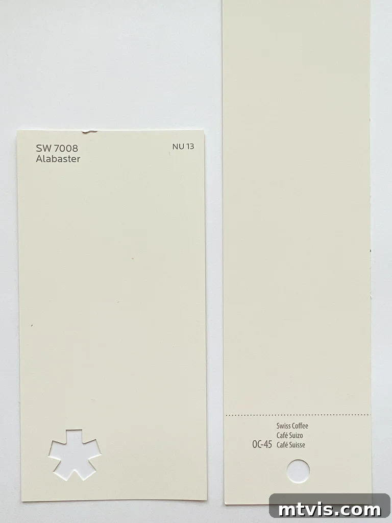
When exploring popular warm white paint colors, Benjamin Moore Swiss Coffee and Sherwin-Williams Alabaster are frequently compared, and for good reason—they both offer a soft, inviting warmth that many homeowners desire. However, despite their superficial similarities, key differences in their undertones set them apart and make them suitable for distinct aesthetic preferences.
The most significant distinguishing factor between these two beloved warm whites lies in their undertones. Benjamin Moore Swiss Coffee undeniably carries more pronounced yellow undertones, giving it a creamier, often slightly richer appearance on walls. This yellow base contributes heavily to its inherent warmth, making it feel cozy and traditional. When light hits it, the yellow can make it lean towards a subtle beige or ivory, especially in rooms with less natural light or a warmer light source.
In contrast, Sherwin-Williams Alabaster, while also a warm white, possesses much softer and more neutral undertones. It has a gentle creaminess, but its warmth is derived from a very subtle, almost imperceptible blend of yellow and a touch of greige, rather than an obvious yellow cast. This means Alabaster tends to appear as a cleaner, less overtly yellow warm white compared to Swiss Coffee. Its neutrality makes it incredibly versatile, allowing it to adapt beautifully to a wider range of existing decor and lighting conditions without revealing strong secondary colors.
In terms of Light Reflectance Value (LRV), the two are incredibly close, with Alabaster typically registering an LRV of 82, which is nearly identical to Swiss Coffee’s 81.91. This indicates that both colors reflect a similar amount of light, contributing to their bright yet soft presence. However, the subtle difference in undertones is what truly creates their distinct personalities.
If your aim is to achieve a truly creamy, deeply warm white with visible yellow notes that can lean into a soft beige, then Benjamin Moore Swiss Coffee might be your preferred choice. It’s excellent for creating a historic, cozy, or Mediterranean-inspired feel. However, if you are seeking a creamy warm white that is more understated, more balanced, and lacks the discernible green undertones that Swiss Coffee can sometimes exhibit, then I would wholeheartedly recommend Sherwin-Williams Alabaster. Its gentle warmth without strong chromatic distractions makes it a more universally adaptable and consistently pleasing choice for those desiring a soft white that remains distinctly white without venturing too far into yellow or green territory.
Benjamin Moore Swiss Coffee vs. Sherwin-Williams Pure White: A Clash of Whites
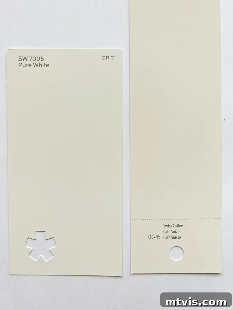
When we place Benjamin Moore Swiss Coffee alongside Sherwin-Williams Pure White, we are comparing two whites that, despite their popularity, represent quite different approaches to a white palette. The primary distinction once again lies in their undertones and resulting warmth, establishing them as suitable for varying design objectives.
As previously discussed, Swiss Coffee stands out for its prominent yellow undertones, which give it a distinct creamy, almost beige-like warmth. It’s a soft, enveloping white that actively contributes warmth to a space. Sherwin-Williams Pure White, on the other hand, is known for its remarkable neutrality. While it has just enough warmth to prevent it from feeling stark or cold, it lacks any strong, discernible yellow, blue, or green undertones. Its warmth is subtle and balanced, making it a truly versatile “clean” white.
To put it on a spectrum of warmth among these popular whites: Alabaster is warmer than Pure White, and Swiss Coffee is warmer still, boasting the most overt yellow characteristics of the three. This makes Swiss Coffee the creamiest and most yellow-leaning in appearance when compared directly to both Alabaster and Pure White.
In terms of Light Reflectance Value, Pure White has a slightly higher LRV of 84, compared to Swiss Coffee’s 81.91. This marginal difference in LRV translates to Pure White being a touch brighter and more reflective, contributing to its crisp and airy feel. Its higher reflectivity means it can make rooms feel larger and more illuminated, without the starkness often associated with cooler whites.
This fundamental difference in undertones and LRV makes Pure White a far more versatile option for walls in a broader range of homes and lighting conditions. Because Pure White doesn’t commit to strong yellow or green undertones, it truly acts as a blank canvas, allowing other colors and elements in your decor to take center stage. It looks beautiful in nearly all lighting conditions, from bright, sun-drenched rooms to those with cooler, indirect light, consistently reading as a clean, soft white. This is precisely why Pure White is my personal go-to white wall color and the one I most frequently recommend to those seeking advice for a reliable, adaptable white that brightens without overwhelming. If you want a white that offers warmth without being overtly creamy or yellow, Pure White is an excellent contender; if you desire a deeper, richer, almost beige-white, Swiss Coffee is your shade.
Benjamin Moore Swiss Coffee vs. Benjamin Moore White Dove: Nuances of Off-White
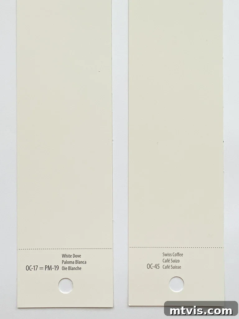
Delving deeper into the Benjamin Moore family of whites, a comparison between Swiss Coffee and White Dove is often sought, as both are popular choices for those desiring a softer, more nuanced white. While they share the characteristic of being warm off-whites, their subtle differences in undertones and reflectivity lead to distinct appearances in a home.
The primary distinction lies in their creaminess and warmth. Benjamin Moore Swiss Coffee is notably creamier and possesses a more pronounced yellow undertone compared to White Dove. This makes Swiss Coffee feel warmer and can often appear as a deeper off-white or light beige, especially in varying light conditions. Its warmth is more overt, creating an enveloping and cozy atmosphere. As discussed, it can also reveal faint green undertones, adding another layer of complexity to its character.
Benjamin Moore White Dove, while undoubtedly a warm white, is a touch brighter and more neutral in its warmth. It features a soft, almost greige undertone that is less yellow than Swiss Coffee, and it typically avoids any strong green leanings. This allows White Dove to maintain a clearer, cleaner white appearance while still providing a gentle, inviting warmth. It’s often praised for its ability to work well with both warm and cool palettes due to its balanced nature.
In terms of Light Reflectance Value, White Dove has a slightly higher LRV of 83.16, making it marginally brighter and more reflective than Swiss Coffee, which has an LRV of 81.91. This slight difference in reflectivity contributes to White Dove often reading as a “truer” white compared to Swiss Coffee, even though both are categorized as off-whites. White Dove offers that perfect balance of softness and brightness, making it an incredibly versatile choice for walls, trim, and cabinets.
Therefore, if your design goal is to achieve a white paint color that is distinctly more off-white, with a noticeable creamy depth and a clear warmth that might lean towards beige or a soft ivory, then Benjamin Moore Swiss Coffee is likely the better choice. It’s ideal for spaces that aim for a rich, inviting, and slightly traditional feel.
However, if you are looking for walls that read as a true white—bright, clean, yet still soft and warm—without pronounced yellow or green undertones, then Benjamin Moore White Dove would be the superior option. Its balanced warmth and higher reflectivity offer a classic, sophisticated backdrop that feels both fresh and welcoming, making it one of the most beloved and adaptable off-whites on the market.
I sincerely hope this comprehensive review has shed considerable light on Benjamin Moore Swiss Coffee OC-45 and helped you understand its unique characteristics. The journey to selecting the perfect paint color can be intricate, especially with nuanced whites, but armed with knowledge about undertones, LRV, and real-world comparisons, you are better equipped to make a confident decision. Please, I cannot emphasize this enough: never, ever make a final paint choice based solely on tiny paint chips or static photos found online. These mediums cannot accurately capture how a color will truly appear in your home. Your unique decor, the orientation of your rooms, the amount and type of natural light throughout the day, and even your artificial lighting choices will all profoundly impact how a paint color is perceived.
To avoid costly mistakes and the frustration of repainting, I strongly encourage you to follow my 5 simple tips for choosing paint colors. These practical steps, which include using large peel-and-stick samples like Samplize (a truly game-changing tool!), will guide you through the process of testing colors in your actual home environment. By observing how Swiss Coffee (or any other color you’re considering) interacts with your specific space under various conditions, you can confidently determine if it’s the right shade to create the ambiance you envision. Happy painting!
More Paint Color Posts
SEE ALL paint color posts
-
The Best Neutral Paint Colors for Kitchen Cabinets
-
Benjamin Moore Swiss Coffee: Is It Right For You?
-
Samplize Peel & Stick Paint Samples: An Unbiased Review
-
Sherwin Williams Pure White SW7005 Paint Review With Pictures
-
Navy Blue Paint Colors Designers Love
-
Beautiful Blue Paint Colors Designers Love & Use
Curious about my approach to transforming rooms and spaces within our own home? Discover the secrets and strategies inside Designer in a Binder®, where I share my accessible and simple methods for decorating your home with confidence.
For exclusive content, behind-the-scenes glimpses, and the latest design inspiration delivered straight to your inbox, be sure to subscribe before you go!